What agile analytics really means

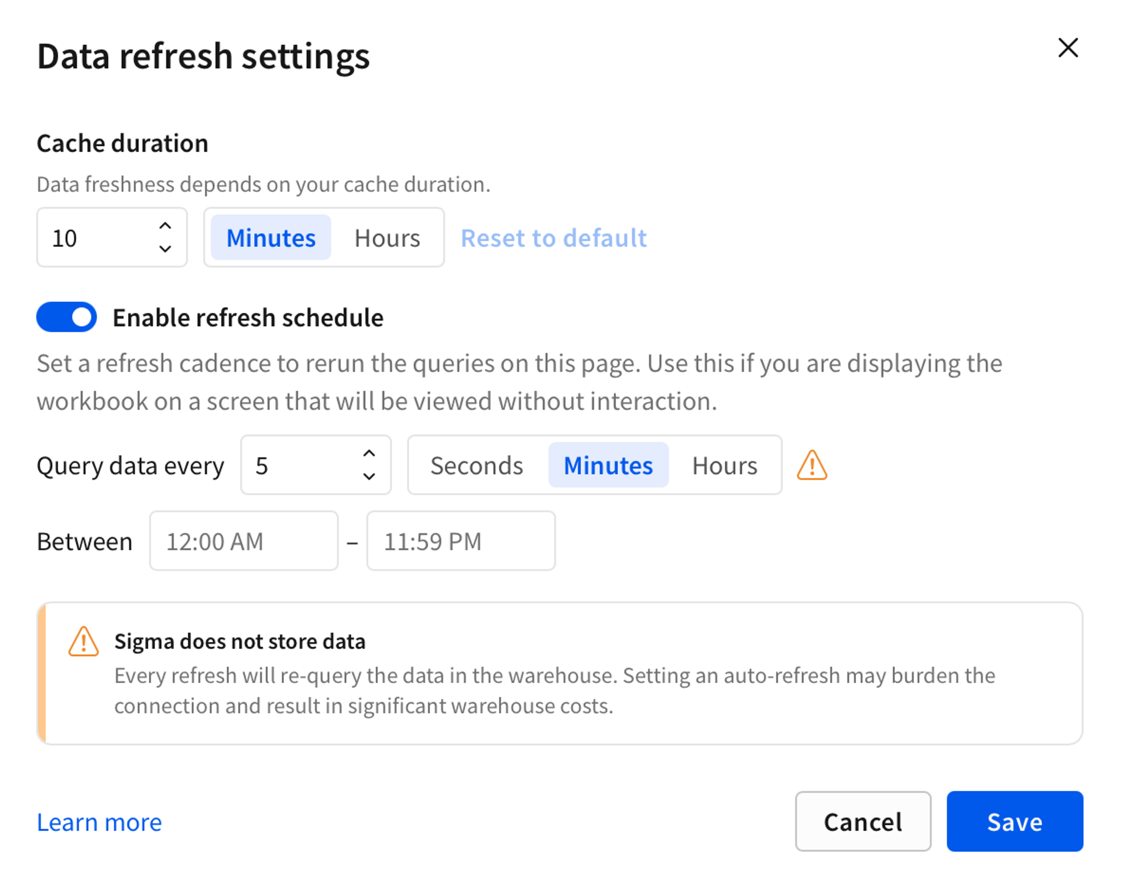
Most tools that call themselves "agile analytics" borrowed the word from software development without fixing what makes analytics slow in the first place. The fix is architectural: query the live warehouse instead of waiting on someone to rebuild a report.
Why most BI can't move fast
The real numbers, sales today, inventory right now, live in a database that updates constantly, like a scoreboard nobody in the room can see directly. Most BI tools handle that by sending someone to photograph the scoreboard, print it, and build a report from the printout. That printed report is the dashboard.
The trouble starts the moment the score changes and someone wants a current answer. By the time a new photo gets taken, printed, and turned back into a report, the moment has usually passed, and what's left is a request sitting in a queue.
The bottleneck is the photo itself: someone has to stop and take one before anyone can see a current number.
How Sigma skips the photo
Skip the photo entirely, and the workflow changes shape. That's the bet behind a warehouse-native platform like Sigma: instead of printing a copy of the scoreboard, it shows you the real one, live. A business user opens a workbook, writes a formula the way they'd write one in a spreadsheet, and the number on screen matches whatever is in the database right now.
That's what makes analytics agile: a tool that never needed the photo in the first place.
Faster cycles create a collaboration problem
When more people can see live numbers at once, they start looking at the same thing at the same time, often before anyone is sure what it means. A workbook with comments and shared edits in one place keeps that from splintering into five spreadsheets with five different answers.
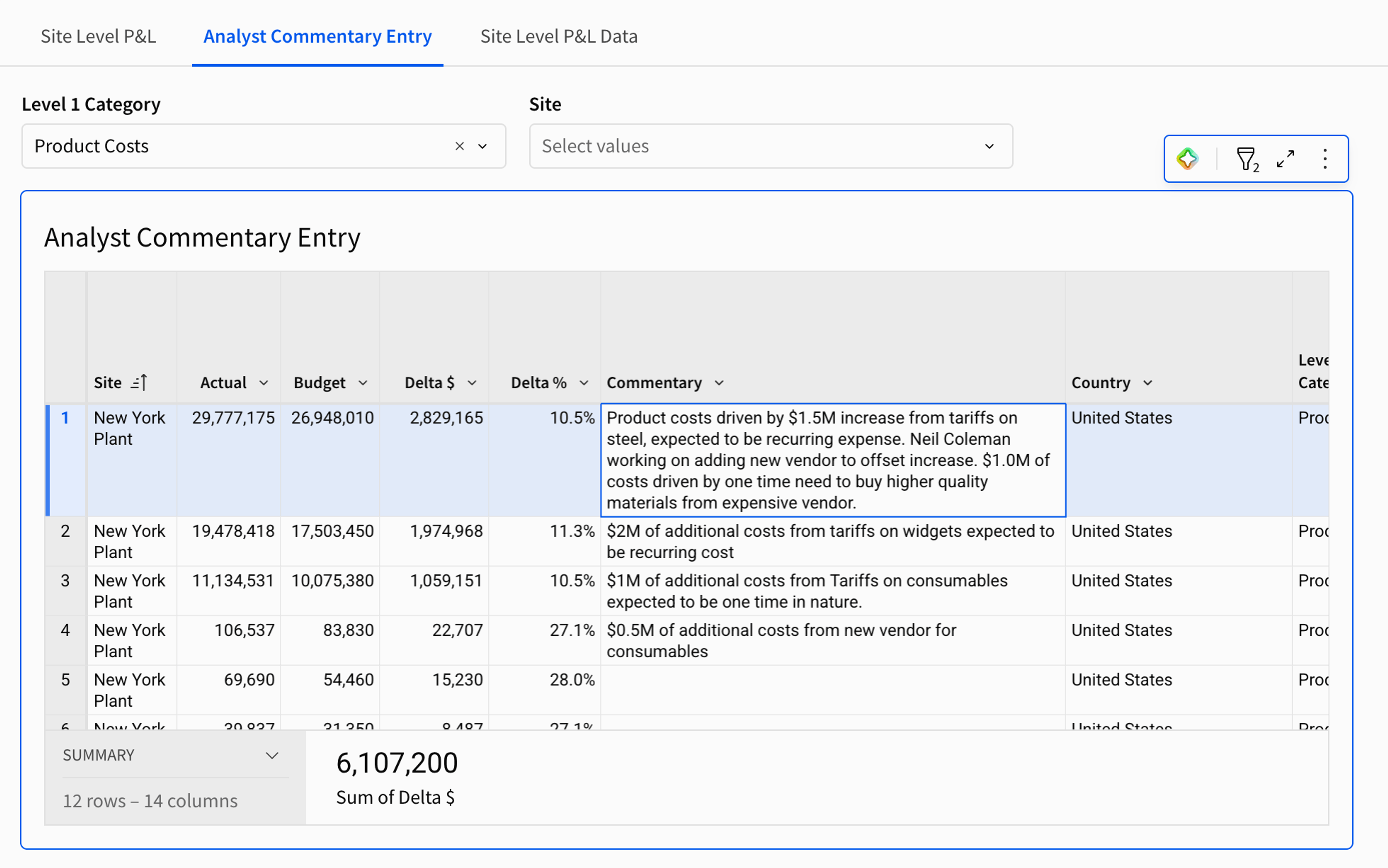
Version history matters here for the same reason it matters to a programmer checking a project's history: someone always wants to know who changed what, and why.
What it takes to run this way
Adopting an architecture like this asks more of a data team's habits than of its tooling. Decisions that used to hide inside a six-month dashboard project now show up in a workbook someone built over lunch, which means giving business users more room to work directly with the analysis.
A better sign is a workbook that gets argued over and rebuilt twice in a week: the business is working inside the data instead of checking in on a picture of it once a month.
See it on your own data
The clearest way to tell a live number from a photo of one is to point a real dataset at it. Request a demo and bring a warehouse table instead of a slide.