Master Data Storytelling Infographic: Choose The Right Chart Every Time

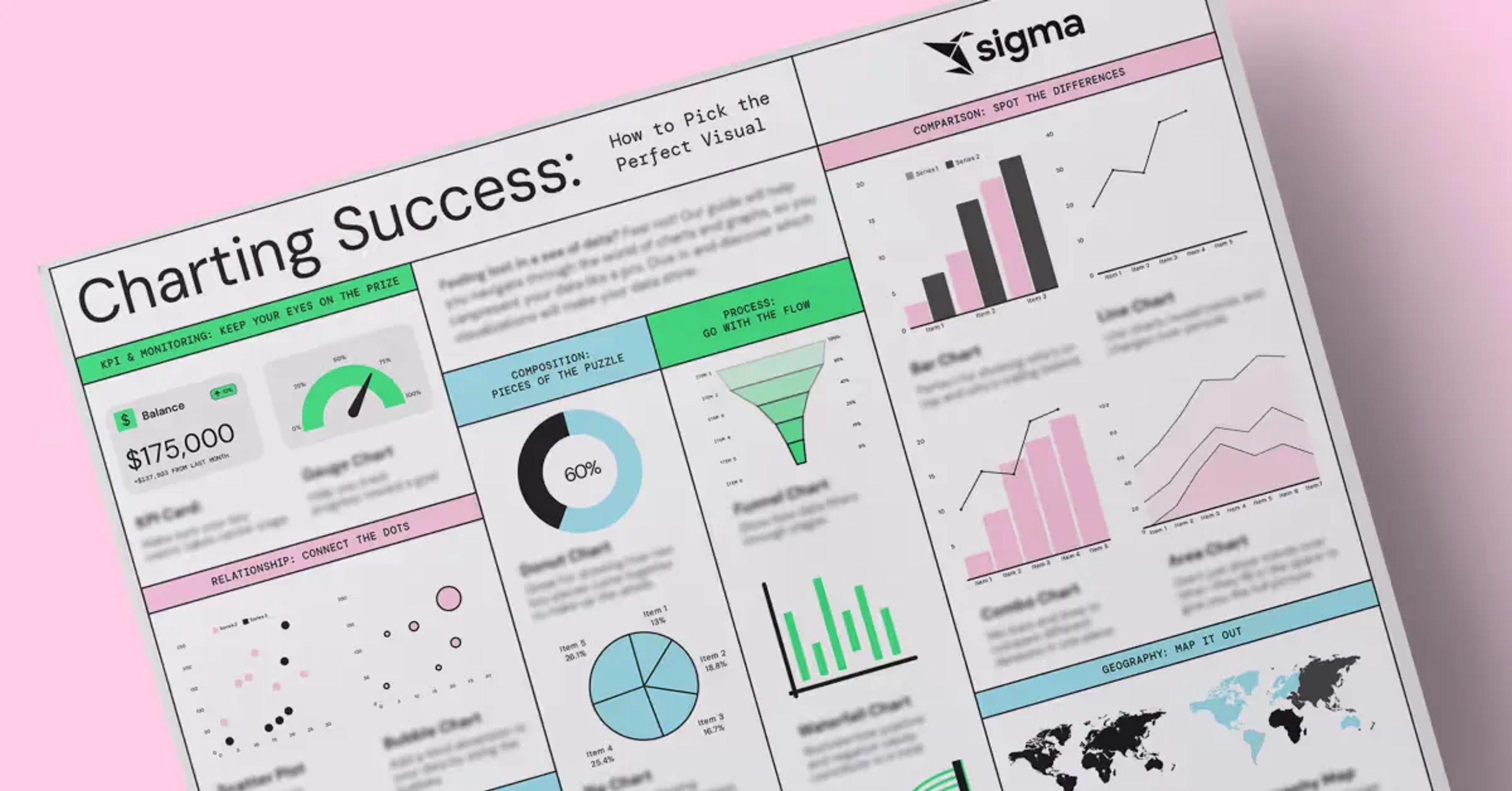
Feeling lost in a sea of data? Not sure how to bring your insights to life? This guide breaks down which chart types to use so you can present data like a pro.
Dive in, choose the right visuals, and let your data do the talking.
KPI & Monitoring: Keep Your Eyes On The Prize
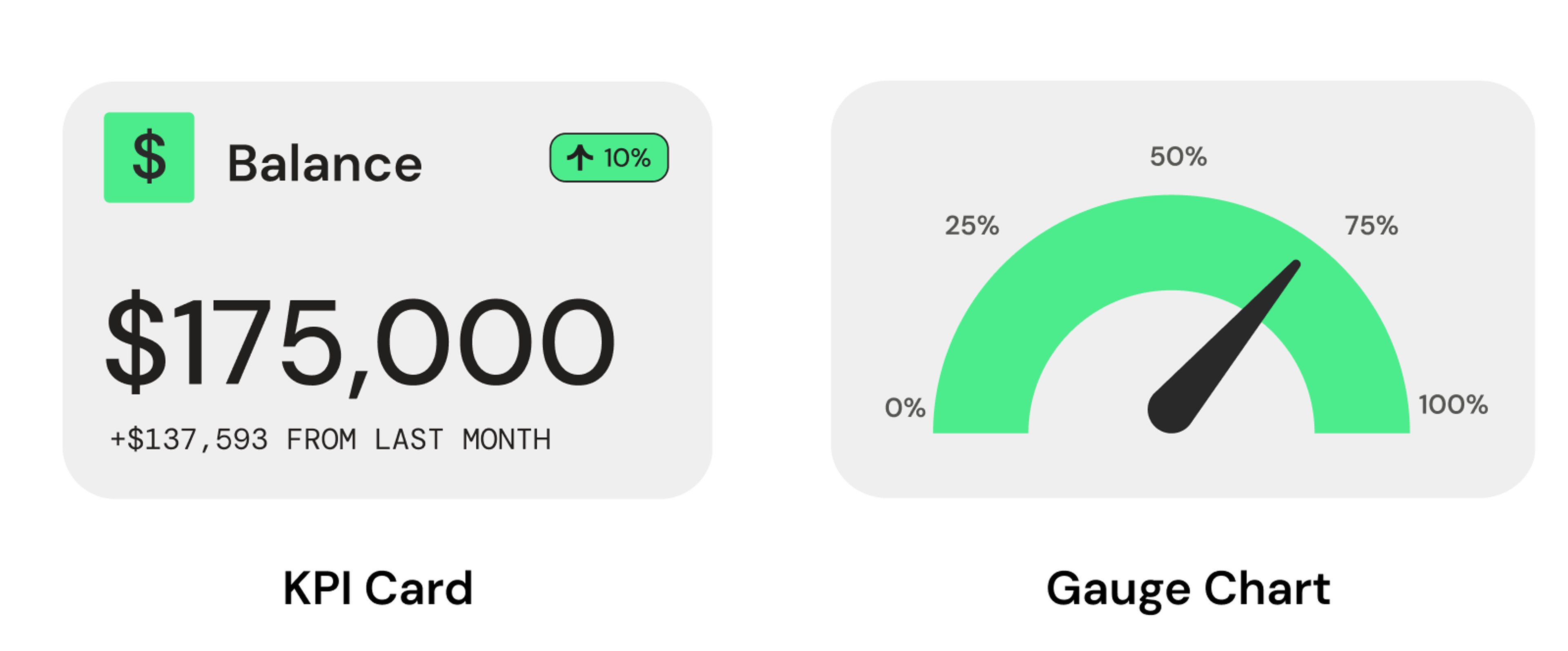
Gauge Chart: Show progress toward a goal, whether it’s a project milestone, customer satisfaction, or even how close you are to inbox zero.
Visualize Data Like a Pro GET THE INFOGRAPHIC
Relationship: Connect The Dots
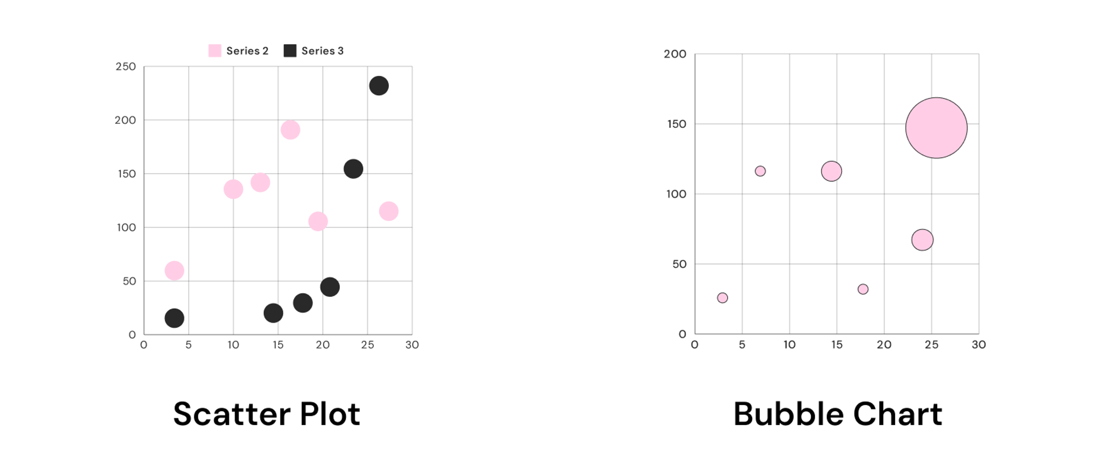
Bubble Chart: Need more depth? Add a third variable with bubble size—ideal for showing dimensions like revenue and cost side by side.
Distribution: Spread The Word
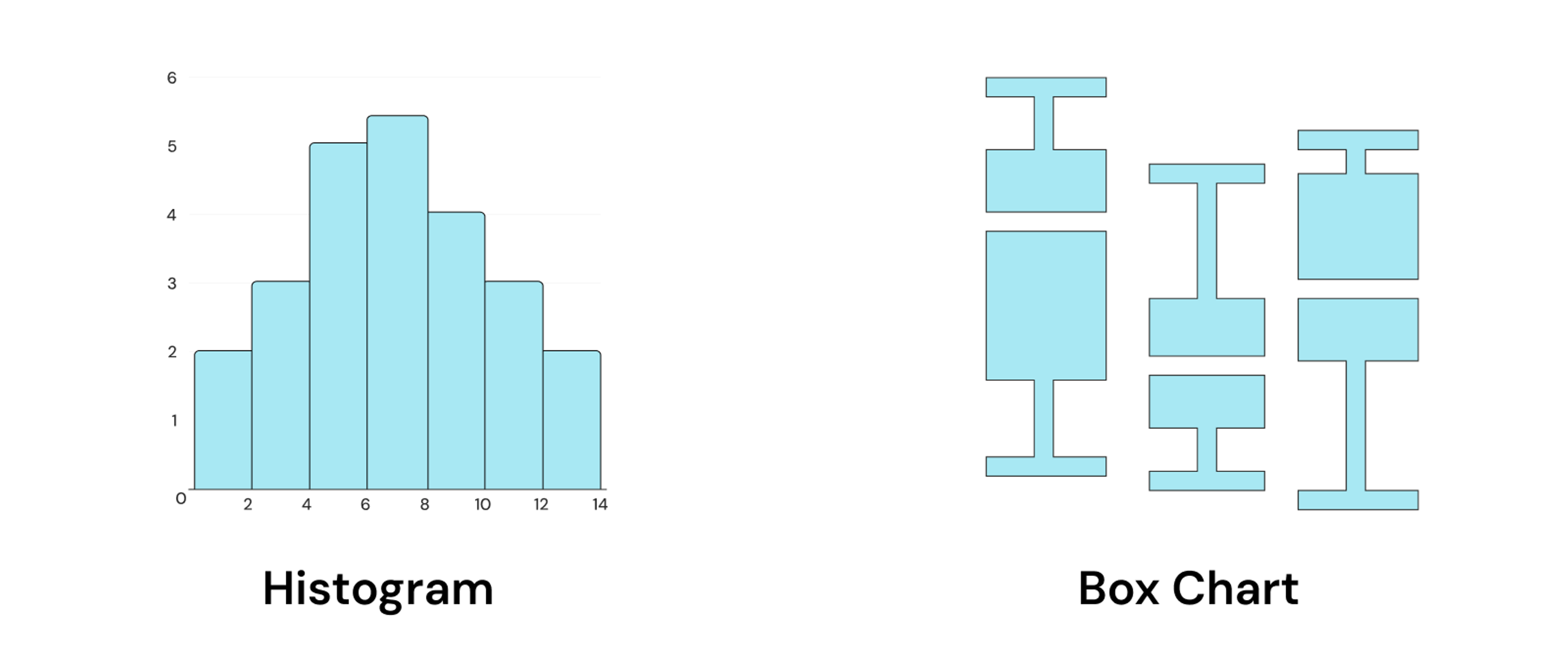
Histogram: Show the frequency of data points within certain ranges. Perfect for spotting trends in any dataset.
Box Chart: Want a quick summary of your data's spread? Box charts show medians, quartiles, and outliers in a single glance.
Master Your Data Story GET THE INFOGRAPHIC
Composition: Pieces Of The Puzzle
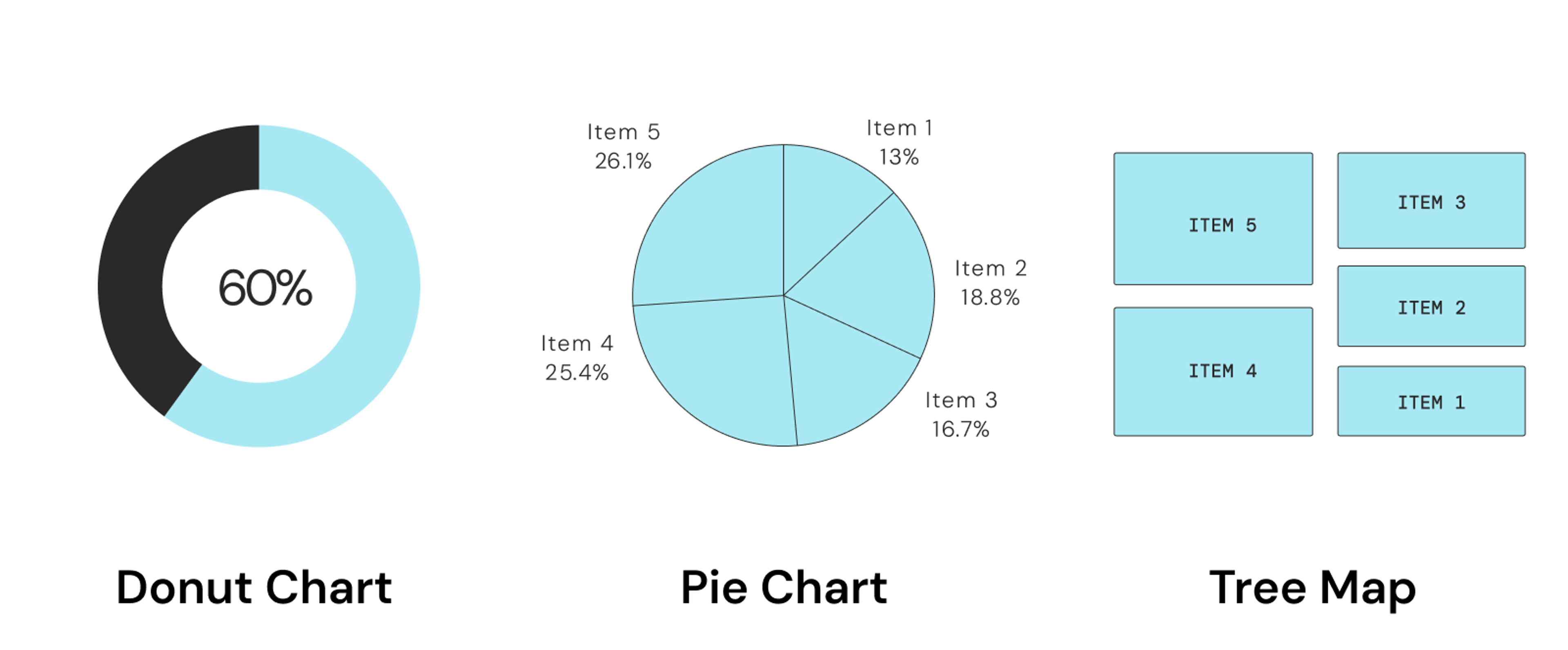
Pie Chart: Highlight proportions at a glance. Perfect for visualizing where time goes in a day—or how a budget breaks down across categories.
Tree Map: For hierarchical data, tree maps provide an easy way to visualize proportions, making it clear how each piece fits within the whole.
Process: Go With The Flow
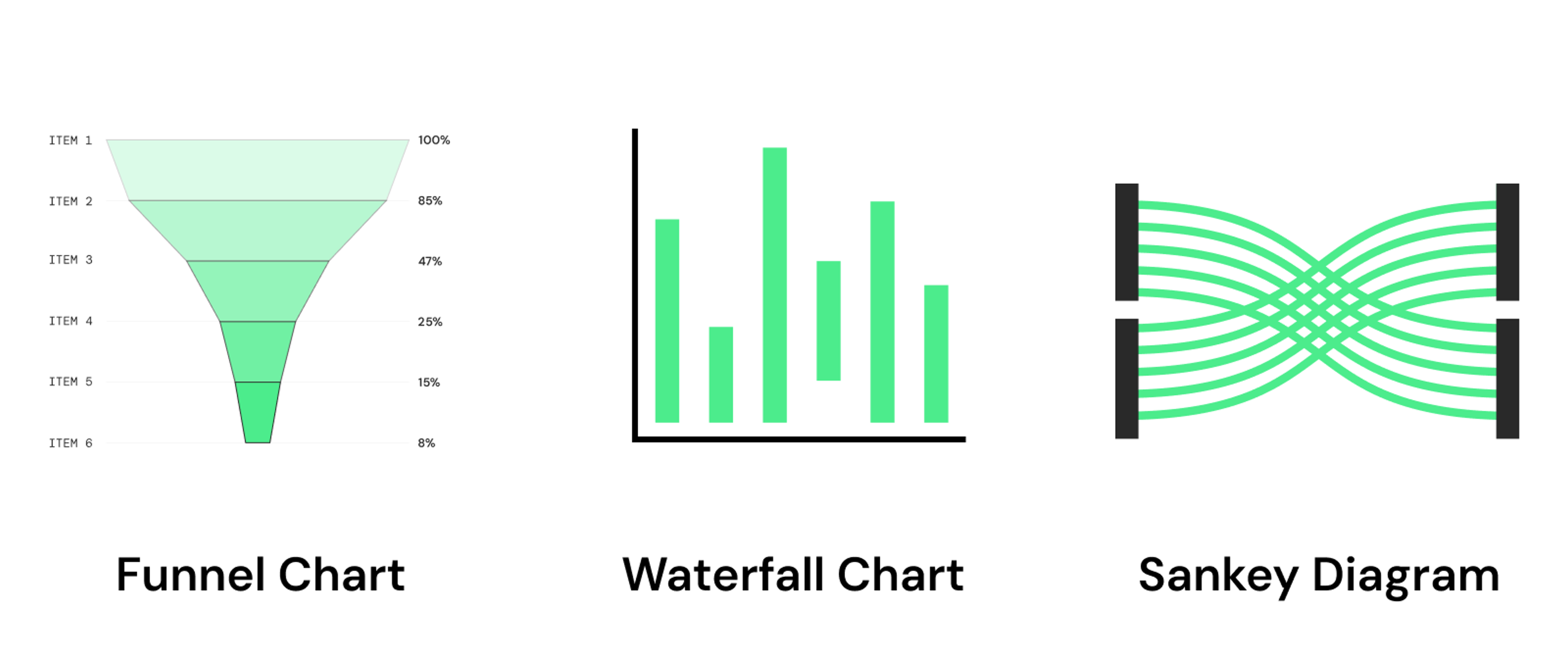
Waterfall Chart: Show cumulative changes, perfect for breaking down shifts in financials, project costs, or budget allocations.
Sankey Diagram: Highlight the flow of resources, like energy or funds, from one area to another. Great for journey mapping.
Choose the Perfect Chart GET THE INFOGRAPHIC
Comparison: Spot The Differences
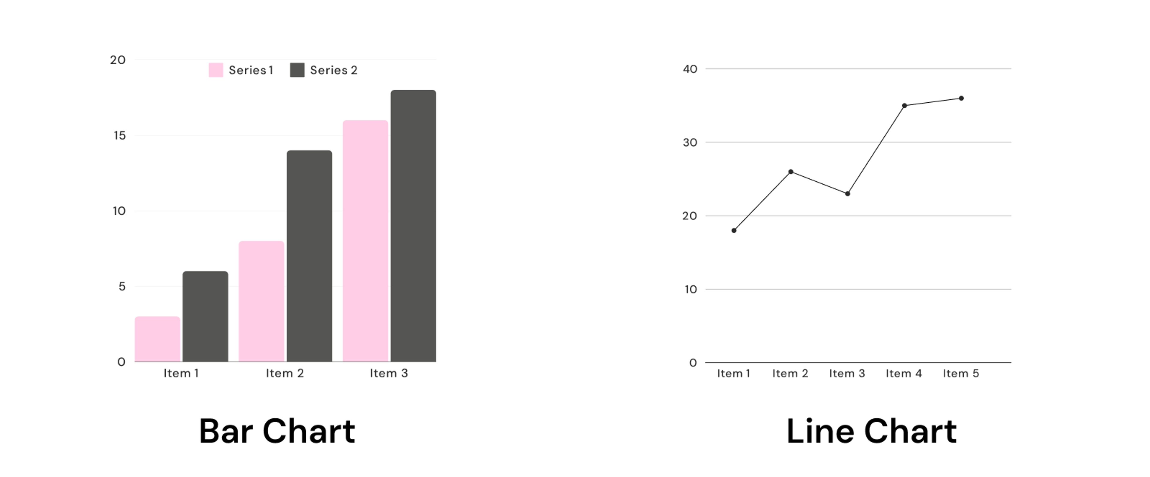
Line Chart: Show data over time to reveal trends, seasonality, or patterns in growth or decline.
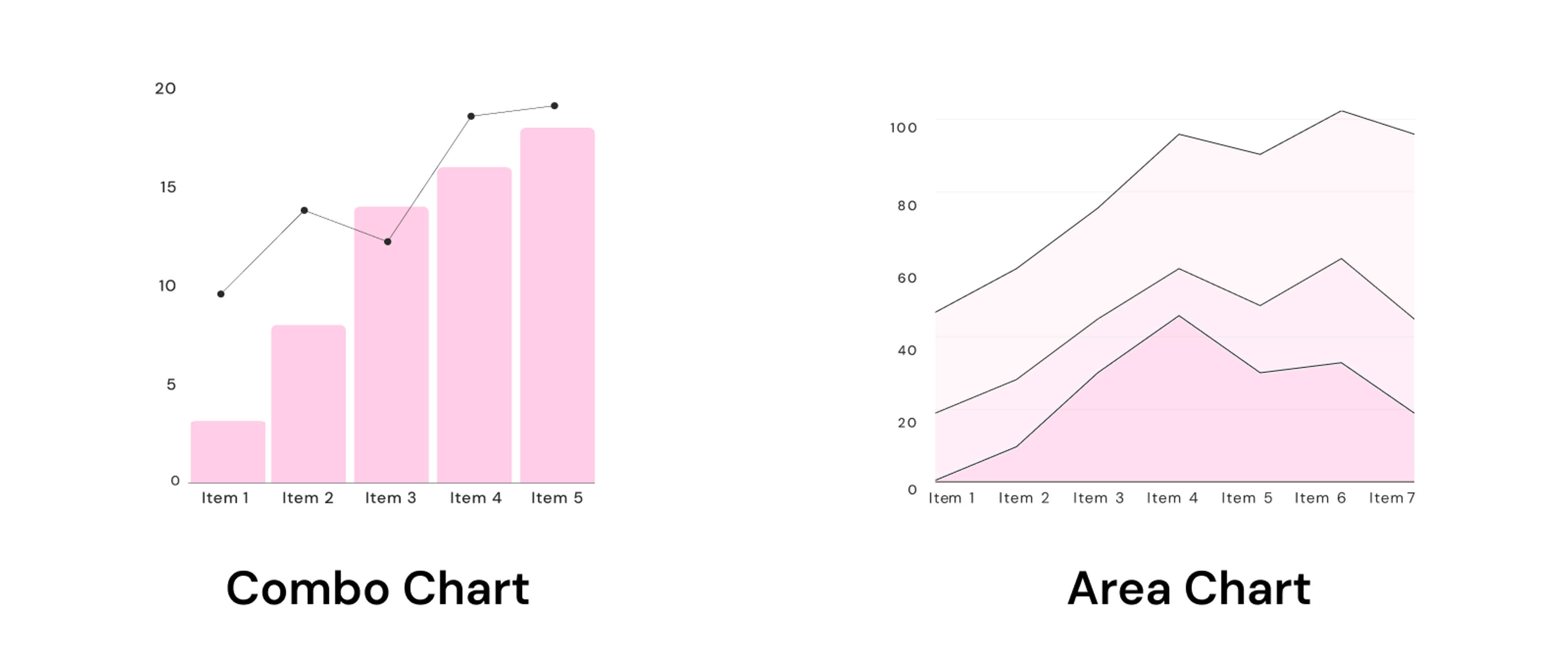
Area Chart: Similar to line charts but with a fill that makes trends even more visible—ideal for tracking metrics like sales or cumulative growth.
Present Insights with Clarity GET THE INFOGRAPHIC
Geography: Map It Out
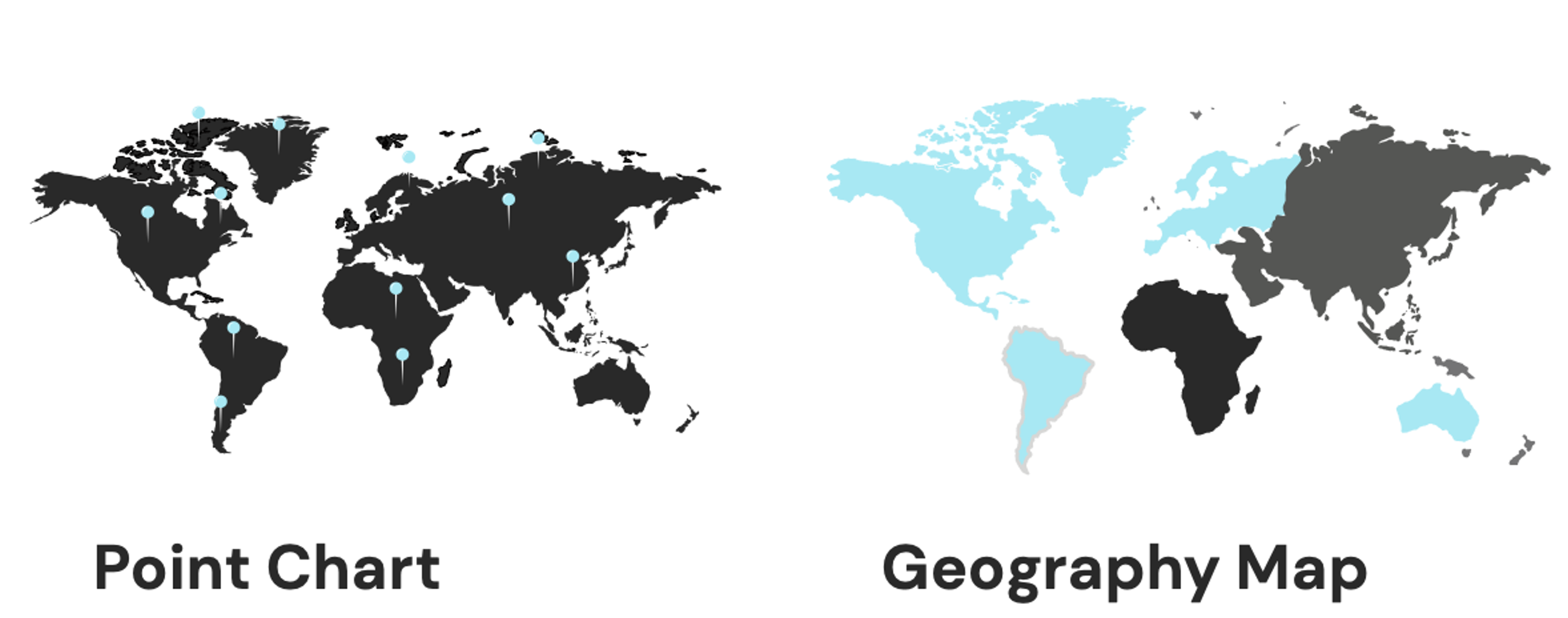
Geography Map: Take your data global. Geography maps make it easy to see patterns by region, ideal for showcasing change over geographic areas.
Ready to Create Stunning Visuals?
Turn data into insights with the right chart. Whatever story you’re telling, there’s a visualization here to help make it shine. Download our full infographic to keep all these powerful visual options at your fingertips — because choosing the perfect chart can be the difference between data that tells a story and data that just sits there.
Make your data work harder, so you don’t have to.
Download The Full Infographic