The Guide to Data Storytelling

Picture a world where numbers aren't just cold, heartless entities but vibrant characters with tales to tell. That is the magic of data storytelling. It's the art of weaving a captivating narrative using data as your trustworthy sidekick. Now, why is this art form so important? Hold onto your pie charts because we are about to find out!
First and foremost, data storytelling is the secret sauce that transforms mundane statistics into a meaningful story. Who wants to drown in a sea of raw data? No one, but when you sprinkle some storytelling magic, suddenly, those numbers come to life. By presenting data in a compelling narrative, we can captivate our audience, engage with their emotions, and make them hungry for more.
Beyond mere entertainment, data storytelling plays a crucial role in unlocking the hidden value buried within those tables of rows and columns. It's like a treasure map, guiding us through the labyrinth of information to discover hidden patterns, insights, and opportunities. Imagine being a detective, but you're solving data mysteries instead of crimes. By harnessing the power of data storytelling, we can: (1) unravel complex phenomena, (2) make informed decisions, and (3) predict future trends. It's like having a crystal ball without needing a pointy hat.
By incorporating data into our stories, we bridge the analytical and empathetic gap. We create a common language that enables us to communicate complex ideas, influence opinions, and drive meaningful change. In a world where information overload is the norm, data storytelling helps us cut through the noise and make a lasting impact.
Data Storytelling: A More Formal Definition
Data storytelling refers to the practice of using data to communicate a narrative or a compelling story. It involves combining data analysis and visualization techniques with storytelling principles to convey insights, trends, or patterns in a meaningful and engaging way. Data storytelling aims to make complex information more accessible, understandable, and memorable to a wide range of audiences, including both technical and non-technical stakeholders.
According to Gartner, data storytelling will be the most widespread means of consuming analytics by 2025. In addition, by then a full 75% of data stories will be automatically generated using augmented intelligence and machine learning rather than generated by data analysts.
Here are a few examples of how and where data storytelling can help:
- Presenting data in a narrative format, enabling decision makers to easily grasp the significance of the data and understand its implications.
- Data storytelling can be helpful in various fields, such as marketing, advocacy, or sales, where the goal is to communicate the value or impact of a product, service, or cause.
- Data storytelling can be applied in classrooms, training sessions, or e-learning platforms to engage students or participants, and help them grasp and retain key insights effectively.
Benefits of Data Storytelling
Data storytelling offers several benefits. Firstly, it enhances comprehension and understanding of complex data by presenting it in a narrative format, making it more accessible and relatable. This leads to increased engagement, retention of information, and a higher likelihood of influencing decisions or actions based on the presented data.
Data storytelling can help with:
- Enhancing comprehension and understanding of complex data.
- Engaging and captivating the audience, making data more memorable.
- Simplifying the communication of data to both technical and non-technical stakeholders.
- Facilitating data-driven decision making by presenting insights in a meaningful and accessible way.
- Presenting data in a compelling narrative, thereby increasing the persuasiveness and impact of data.
Data Storytelling vs. Data Visualization
Data visualization refers to the graphical representation of data using charts, graphs, maps, and other visual elements. Its primary goal is to present data in a visually appealing and easily understandable format. Data visualization focuses on conveying information efficiently, enabling users to grasp patterns, trends, and insights from the data at a glance. It involves selecting appropriate visual representations, applying effective design principles, and utilizing interactive features to enhance user engagement. Data visualization is essential for exploratory analysis and communicating quantitative information in a concise and accessible manner.
On the other hand, data storytelling involves using narratives, context, and visual elements to effectively communicate insights derived from data. It goes beyond the mere presentation of data and aims to engage the audience on an emotional level, making the data relatable and memorable. Data storytelling often follows a narrative structure with a clear beginning, middle, and end. It incorporates storytelling elements, such as characters, conflicts, and resolutions to create a compelling and impactful narrative. Data storytelling also allows data analysts and business users to convey the meaning behind the data, highlight key insights, and influence decision making by evoking empathy and understanding from the audience.
In summary, data visualization is an essential tool used within the broader practice of data storytelling, but data storytelling encompasses additional aspects beyond visualization to create a compelling narrative with data. Learn more about using data visualization for better storytelling.
The Importance of Data Storytelling
Data storytelling is important for several reasons. Firstly, it helps to humanize data and make it relatable to the audience. While raw data can be overwhelming and difficult to understand, storytelling weaves a narrative around the data, making it more accessible and engaging. This emotional connection facilitates better comprehension, retention, and recall of the insights derived from the data.
Secondly, data storytelling is a powerful tool for influencing decision making. By combining data with a compelling narrative, it helps product and business leaders to understand the implications and significance of the data in a real-world context. Storytelling can evoke empathy, create a sense of urgency, and inspire action. It enables data analysts to effectively communicate the "so what" of the data, emphasizing the impact and consequences of the insights. By presenting data in a persuasive and memorable manner, data storytelling can drive decision makers to act upon the insights and recommendations derived from the data analysis.
Data Storytelling Examples
Marketing
In a marketing campaign analysis, data storytelling could involve presenting a customer's journey, illustrating how data-driven strategies led to personalized recommendations, increased engagement, and ultimately, a significant boost in sales.
Health care
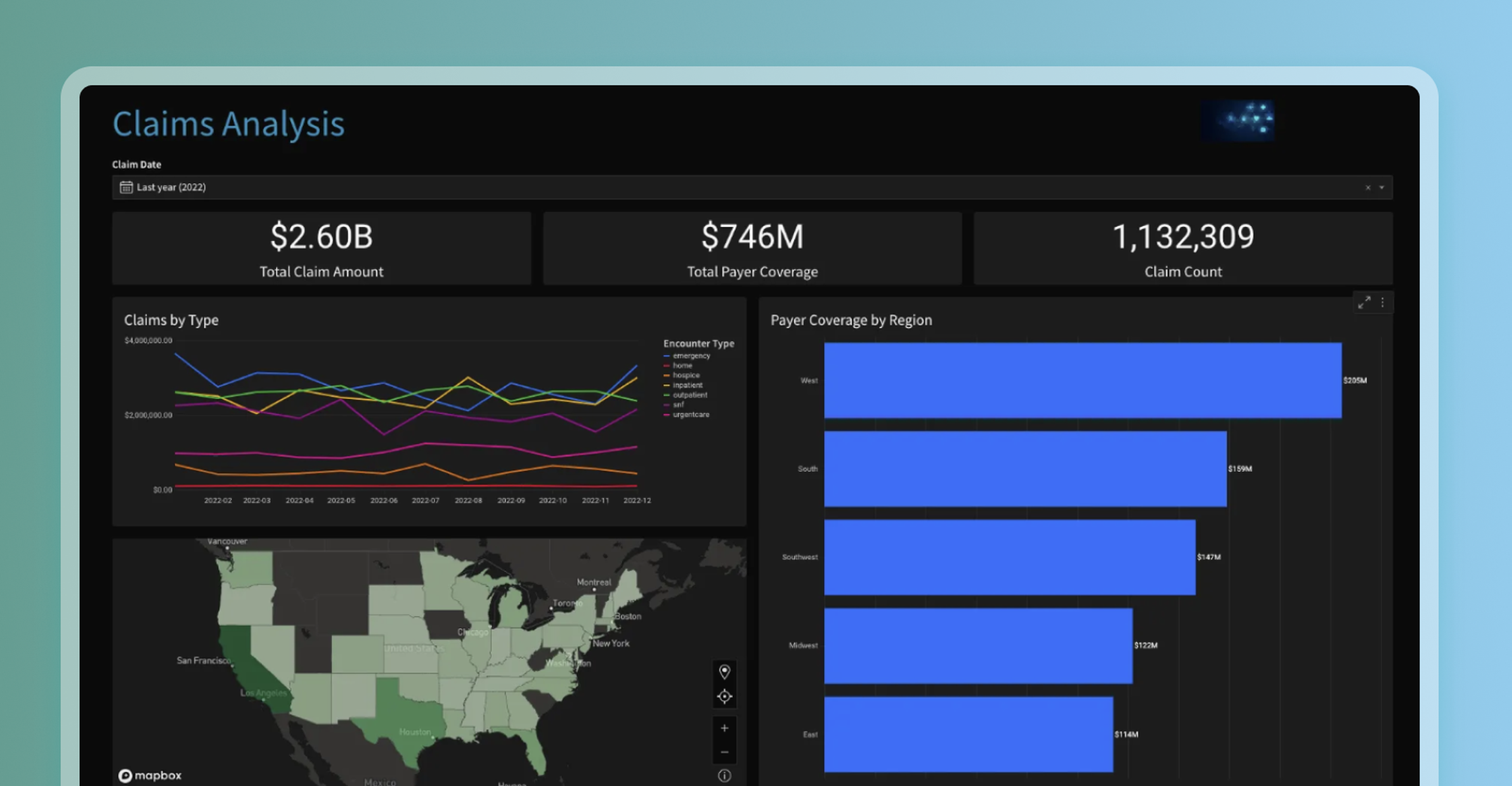
Data storytelling can improve a health care organization's claims processing system by leveraging predictive modeling and real-time data analytics. This data-driven approach can significantly reduce fraudulent claims, accelerate reimbursements for policyholders, and improve customer satisfaction.
Environmental Research
In an environmental study, data storytelling might involve presenting the impact of climate change through a combination of visualizations and narratives, illustrating the consequences on ecosystems, communities, and future generations, in order to drive awareness and inspire action.
Financial Services
Within a financial institution, data storytelling could focus on narrating the journey of a struggling customer, demonstrating how data analysis enabled personalized financial recommendations and interventions that helped the individual overcome financial challenges and achieve long-term stability.
Education
In an educational setting, data storytelling could involve showcasing the progress and achievements of students over time, using data visualizations and narratives to highlight the impact of tailored interventions and educational programs on student success rates and overall educational outcomes.
Evaluating Data Storytelling Tools
When looking for a data storytelling tool, there are several key considerations to keep in mind:
Ease of Use
Ensure the tool has a user-friendly interface and intuitive features that make it easy for users of various technical and non-technical backgrounds to create compelling data stories. It should offer drag-and-drop functionality, pre-built templates, and a straightforward workflow, allowing users to quickly assemble and visualize their data without the need for extensive coding or design skills.
Visualization Capabilities
Look for a data storytelling tool that offers a wide range of visualization options to effectively represent different types of data. It should support various chart types, maps, infographics, and interactive elements, enabling users to create visually appealing and engaging data stories. The tool should also provide customization options for colors, fonts, and layouts, allowing users to tailor the visualizations to match their storytelling goals and branding requirements.
Integration and Data Connectivity
Ensure the tool integrates well with your existing data sources and platforms. It should have the ability to connect to multiple data formats and data storage systems, such as databases, spreadsheets, and cloud services. The tool should also support real-time or automated data updates, enabling users to work with up-to-date information. Additionally, check if the tool allows for easy sharing and collaboration, facilitating seamless collaboration among team members or sharing data stories with a broader audience.
Interactivity and Engagement
Look for a tool that provides interactive features, such as drill-down capabilities, filters, and tooltips, allowing users to explore the data and interact with the visualizations. This interactivity enhances engagement and enables the audience to dive deeper into the insights. Additionally, consider whether the tool supports embedding or sharing data stories in various formats (e.g., HTML, PDF, or interactive web links) to ensure easy distribution and accessibility across different platforms and devices.
Data Security and Privacy
Ensure the tool prioritizes data security and offers robust privacy measures. It should provide options for controlling access to data, implementing user roles and permissions, and adhering to industry-standard encryption protocols. Consider whether the tool allows you to manage and control data-sharing settings, especially when dealing with sensitive or confidential information.
Support and Documentation
Evaluate the level of support and documentation provided by the tool's developers. Check for user guides, tutorials, and a knowledge base to assist with troubleshooting and learning the tool's features. Additionally, consider the availability of customer support channels, such as email, chat, or forums, in case you need assistance or have specific inquiries.
Take The Next Step & Start Telling Stories With Data
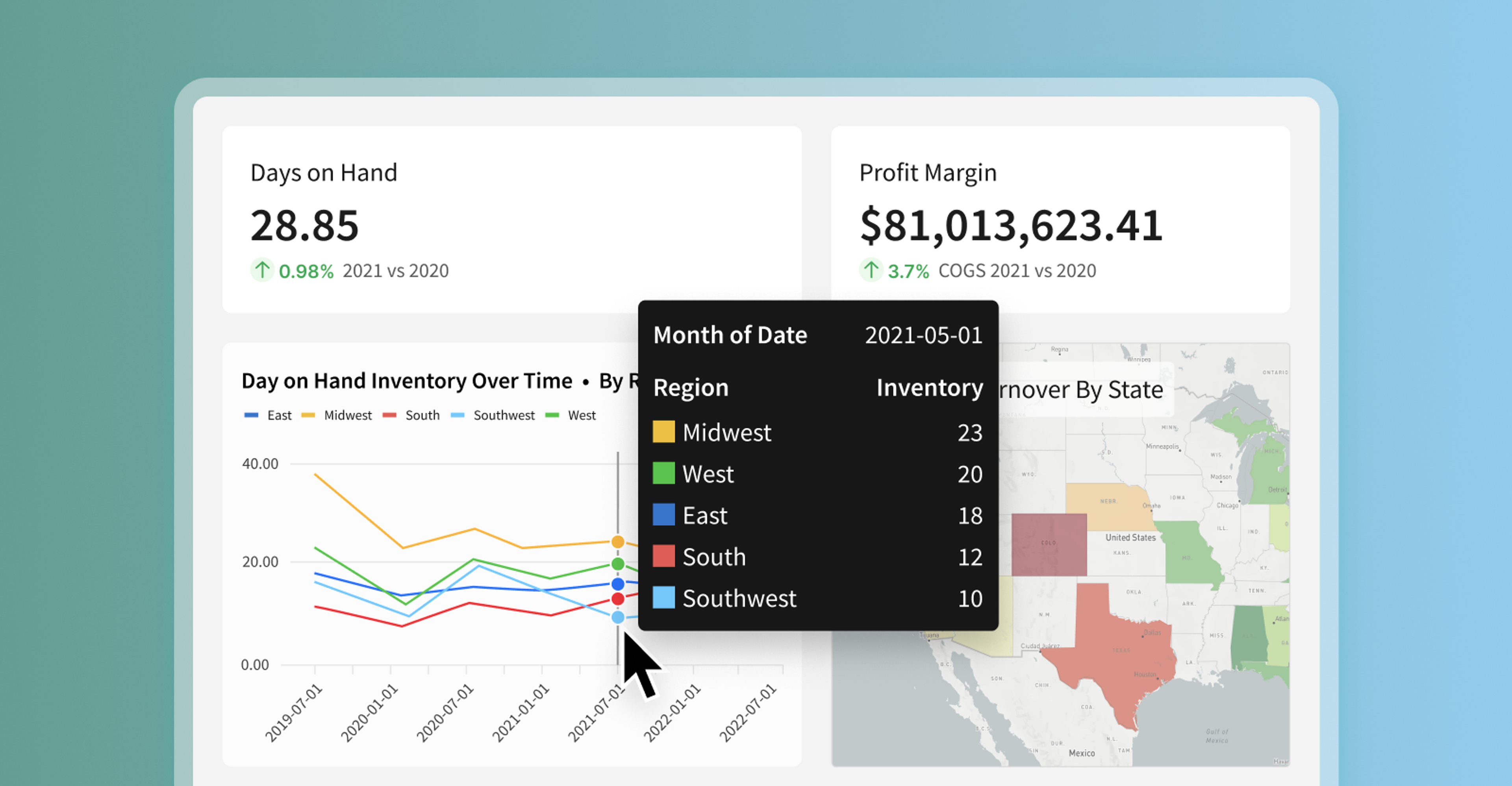
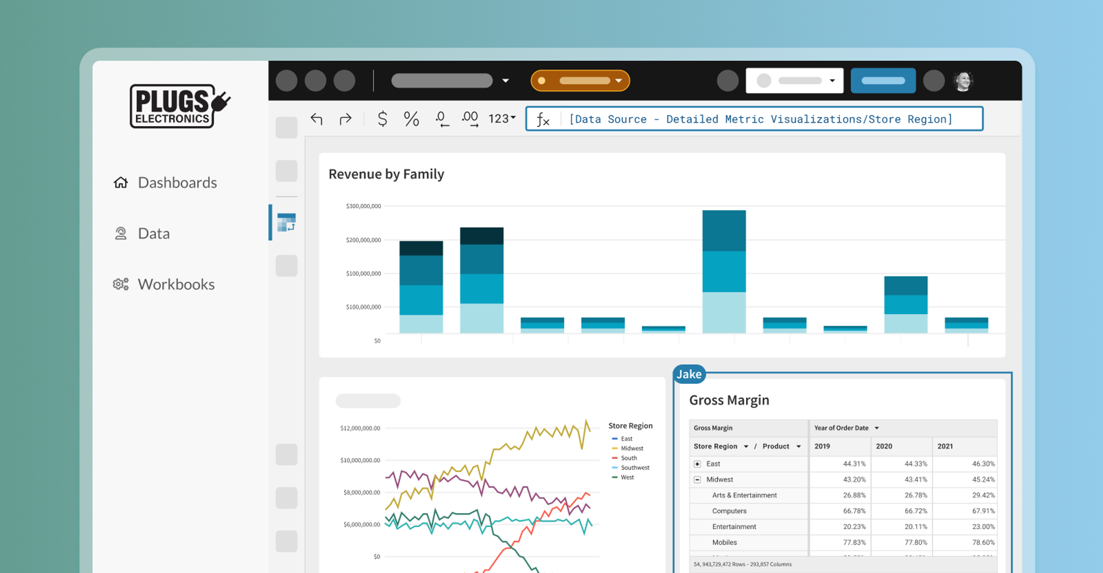
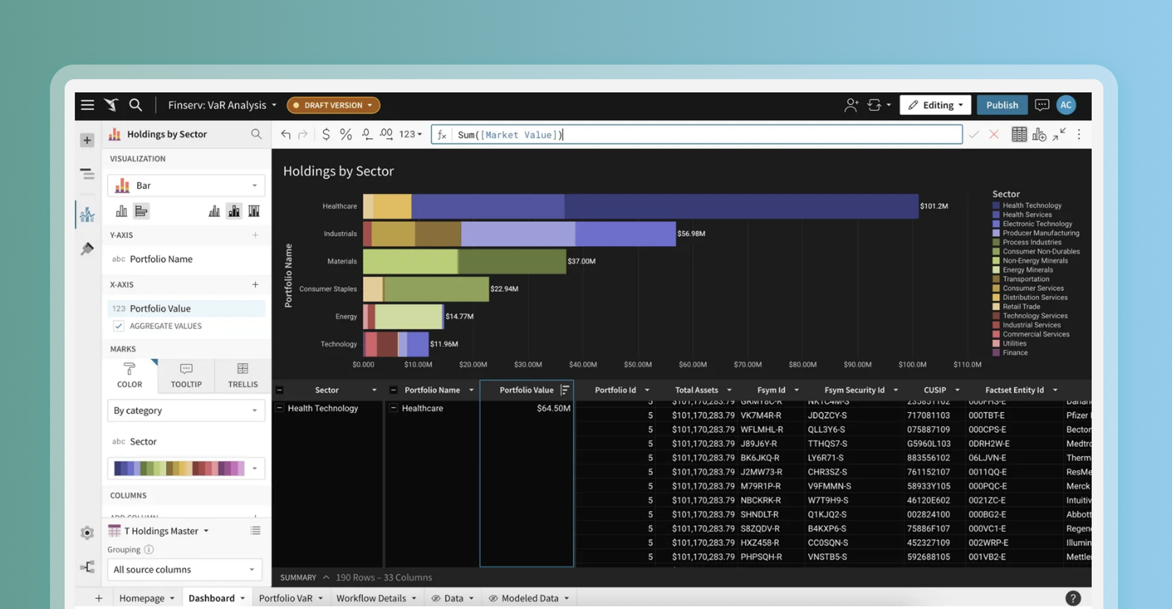
Sigma offers robust data exploration and analysis capabilities. Users can connect to various data sources, manipulate data in real time, and perform advanced calculations and aggregations. By deeply understanding the data, users can uncover meaningful insights and identify the key elements of their data story. Sigma's interactive spreadsheet interface and drag-and-drop functionality make it easy to visualize the data through charts, graphs, and other visual elements, setting the foundation for compelling data storytelling.
In addition, Sigma's collaborative features enhance the data storytelling process. Multiple users can collaborate on a shared data set, work on visualizations together, and provide real-time feedback. This collaborative environment fosters the exchange of ideas and perspectives, enabling teams to collectively shape the narrative of the data story. By seamlessly integrating data exploration, analysis, and visualization, Sigma supports the entire data storytelling workflow, providing a comprehensive platform for users to create impactful and persuasive data narratives.
Checkout how Blackstone, one of the world’s largest alternative asset managers with $991B in assets under management, leverages Sigma to tell better data stories.
Start a free trial to see how you can easily build compelling data stories with Sigma.