What Is Data Visualization?
Table of Contents

The sheer amount of data generated today means we need new ways to understand what’s happening in order to take action faster. Every click, transaction, subscription, loyalty card swipe, and social media interaction contributes to a digital footprint that continues to grow exponentially. The result? A massive explosion of data that is revolutionizing the way we live and work.
Data visualization, in particular, plays a critical role in presenting data in a meaningful and understandable format. By using a visual representation of data, it’s much easier to identify patterns, trends, and relationships that may not be immediately apparent when sifting through large data sets.
Here’s what we’ll cover in this guide to data visualization:
- Data Visualization Definition
- Benefits of Data Visualization
- Why Data Visualization Is Important
- Types of Data Visualization and Examples
- Evaluating Data Visualization Tools
- Take the Next Step and Start Analyzing With Data Visualization
Data Visualization Definition
Data visualization is the process of transforming raw data into visual formats, such as charts, graphs, or maps, to help identify patterns, trends, and insights that might not be apparent from numerical data alone.
Additionally, it enables data to be more accessible, understandable, and impactful, especially when communicating with stakeholders, investors, or team members who may not be familiar with the data.
For example, data visualization could help:
- In retail, gaining insights into customer behavior, purchase patterns, and product performance.
- In finance, monitoring market trends, tracking portfolio performance, and conducting risk analysis.
- In public health, showing the geographical distribution of outbreaks and helping track the spread of infectious diseases.
- In supply chain industries, tracking inventory levels, monitoring logistics operations, and optimizing resource allocation.
- In sports, evaluating player performance, game strategies, and match statistics.
- In education, tracking student performance, analyzing learning outcomes, and identifying areas for improvement.
Benefits of Data Visualization
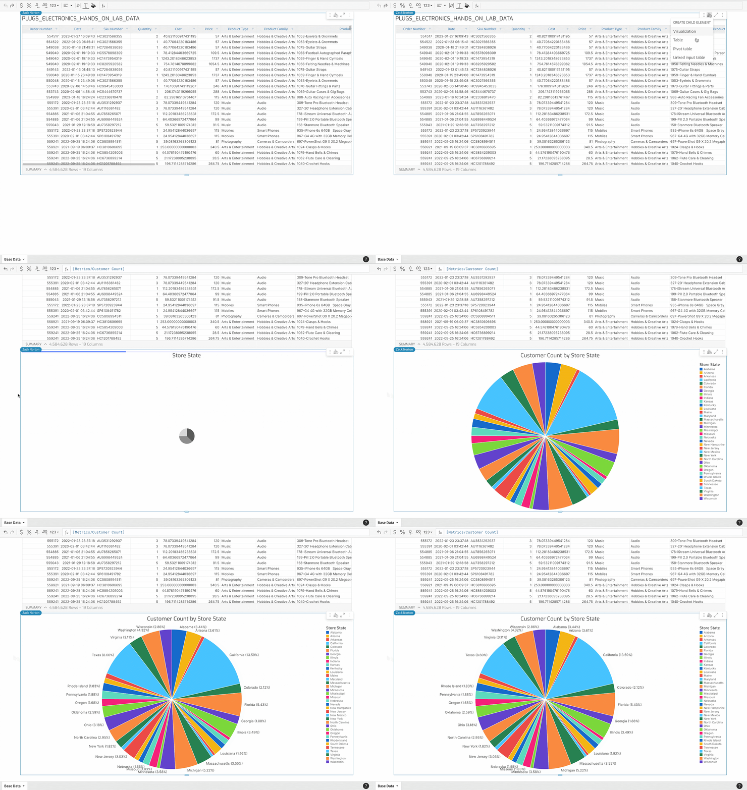
Data visualization has several benefits for businesses including: the ability to process information faster, identify trends at scale, and make data more digestible. Companies regularly use data to make decisions, and through data visualization, can find insights quickly and move to action. Data visualization specifically helps with the following:
- Visualizing patterns and relationships
- Storytelling, including specifically data storytelling
- Accessibility to information
- Exploration
Let’s take a look at each of these benefits in detail.
Visualize patterns and relationships
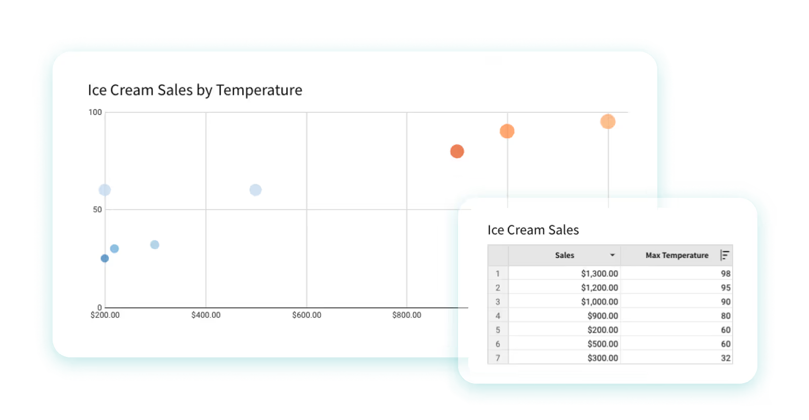
Data visualization constitutes an excellent method for the discernment of interconnections and patterns amidst vast collections of information. For example, a scatter plot can be used to display the relationship between two variables, such as the correlation between temperature and sales. This enables users to understand the relationship and identify trends and outliers more quickly and easily.
Read a guide of Sigma’s visual library.
Storytelling
Your audience, whether it's coworkers or clients, want to hear a coherent story from your data. Storytelling with data cannot be done successfully without visualizations. Colorful charting and dynamic pivots are just as important as characters and plots are in a traditional story, so using them to communicate information makes data that much more engaging and memorable for audiences. Data can be complex and convoluted for some audiences, so data storytelling is an approach to convey important information effectively through a captivating narrative. Good visualizations are a vital part of that narrative.
For example, if an analyst is investigating the performance of e-commerce sales for their retail company over time, they may leverage several data sources such as spreadsheets, calculations, code, etc. to do so. However, when they report these new insights to their stakeholders, the analyst will need to summarize and communicate their findings in a digestible way.
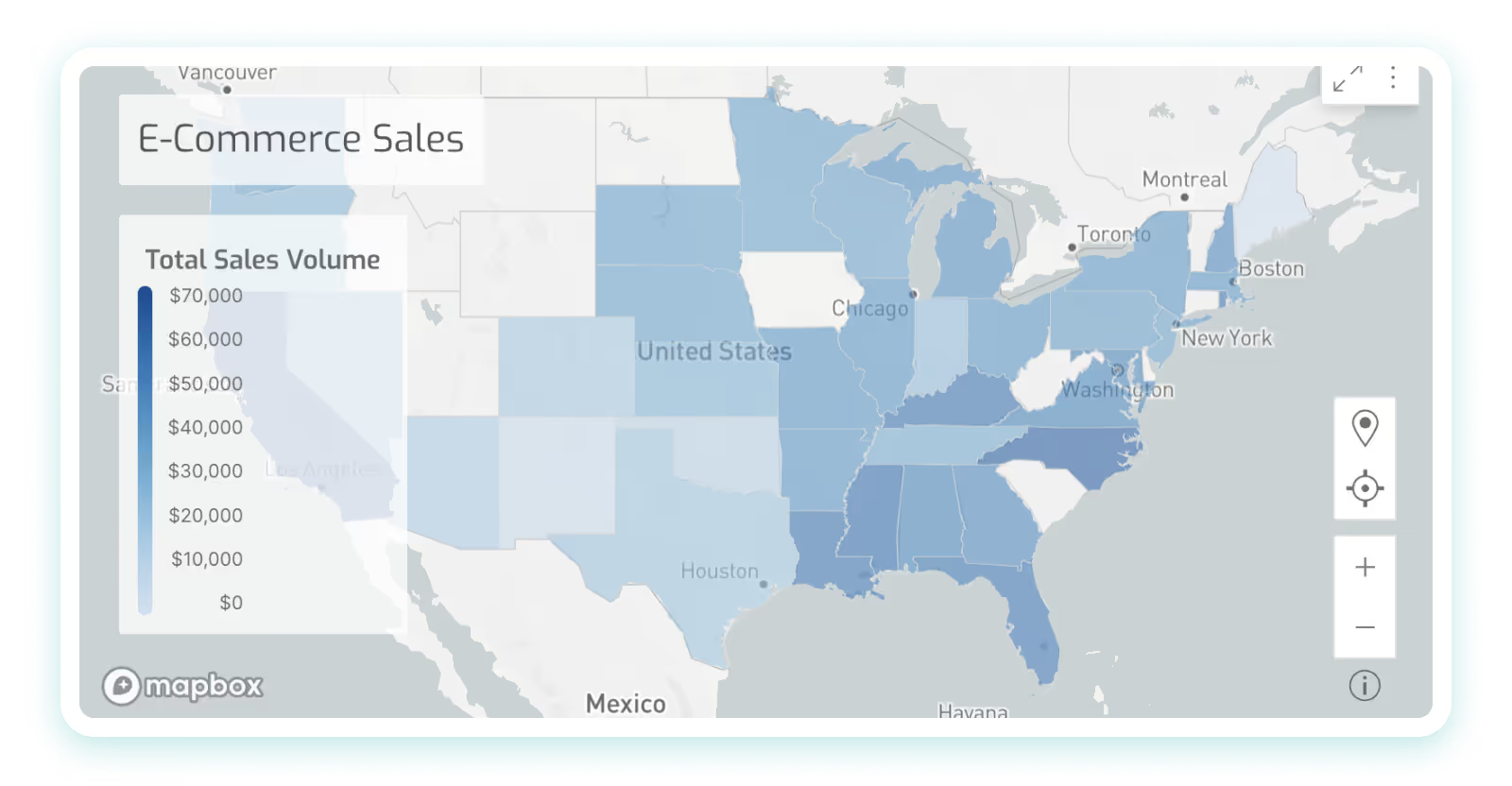
An easy way the analyst could do this is by using the data to create a map of the U.S. with a color gradient overlaying every state that is lighter or darker based on its total sales volume. This visual story tells the least and most successful retail locations at a glance.
Accessibility / Easily Share Information
Data visualization serves as an invaluable mechanism for the facilitation of accessibility, allowing for the communication of information amongst individuals, even for those who may not usually engage with data, which broadens the audience.
Visualizations help simplify complex information by leveraging people’s ability to naturally recognize patterns. A viewer typically does not have to be taught that bigger means more and that smaller means less. In a case where an analyst wants to highlight the difference in scale between one product’s profitability vs. another, a bar chart can clearly show the user which product is more profitable and by how much, making it easy for even non-technical team members to understand and compare the performance of different products.
Exploration
Exploration is a key component of successful data visualization. The more flexible charting and dashboarding is, the more follow-up questions end users can ask directly of their data. For example, an interactive dashboard can be used to explore retail sales data over time, enabling users to filter and drill down into the data to identify trends and patterns.
Data visualization exploration is often associated with the concept of “drill downs.” Drill downs in data visualization refer to the process of starting with an overview of data and then narrowing the focus to more specific aspects of it. As an example, one might start with a visualization of global climate data and drill down to data about a specific country, a specific state, a specific city, or even a specific neighborhood within that city. Each drill down reveals more precise, detailed, and nuanced information.
Why Data Visualization Is Important
The main goal of data visualization is that it helps unify and bring teams onto the same page. The human mind is wired to grasp visual information more effortlessly than raw data in spreadsheets or detailed reports. Thus, graphical representation of voluminous and intricate data is more user-friendly. Data visualization offers a swift and straightforward method to communicate ideas in a universally understood format, with the added benefit of enabling scenario testing through minor modifications.
By translating information into visual form, it ensures everyone, irrespective of the complexity of the data or the depth of the analysis, can share a unified understanding. Any industry can benefit from using data visualization, because pretty much every industry relies on data to power it. That includes finance, marketing, consumer goods, education, government, sports, history, and many more.
Another thing to keep in mind is that data visualization can be a double-edged sword. For example, charts can be manipulated and skewed to force a desired outcome. Ungoverned, static, desktop tools can become the wild west in suggesting an inaccurate outcome “proven by data.” Even in the cases where the visualization builder is acting in good faith, there are still pitfalls to watch out for.
Always be considerate of:
- Individual outliers having an outsized impact, skewing the visual direction of a chart
- The need for for business users to see the underlying data
- Allowing for transparency down to row-level detail in data sets
Types of Data Visualizations & Examples
There is a long list of types of data visualization techniques and methods that can be used to represent data. While no type of data visualization is perfect, we’ll walk through different examples and when to apply each one.
We’ll be looking at:
- Tables
- Pie charts
- Bar charts
- Line charts and area charts
- Scatter plots
- Pivot tables
- Heat maps
- Tree maps
- Box-and-whisker plots
- Histogram
- Sankey charts
Tables
Tables, although more commonly thought of as a data source, can also be considered a type of data visualization. Especially when conditional formatting is applied to the table’s rows and columns, the data within the table becomes more visually engaging and informative. With conditional formatting, important insights and patterns can be highlighted, making it easier for viewers to identify trends and outliers at a glance. Additionally, tables offer a structured and organized way to present information, allowing for a comprehensive comparison of data points, which further enhances data understanding and analysis.
For example, Sigma’s UI is based on a spreadsheet-like interface, which means almost everything in Sigma begins in a table format. That said, you can also create visual tables that display a smaller amount of data in order to tell a clearer story. In data visualization, tables are a simplified way of representing this interface.
When to use tables:
- For detailed numeric comparisons, or when precision of data is key
- For displaying multidimensional data; tables can handle this complexity quite well
When to avoid tables:
- When patterns, trends, or relationships need to be highlighted at a glance
- When dealing with large amounts of data
Pie Charts
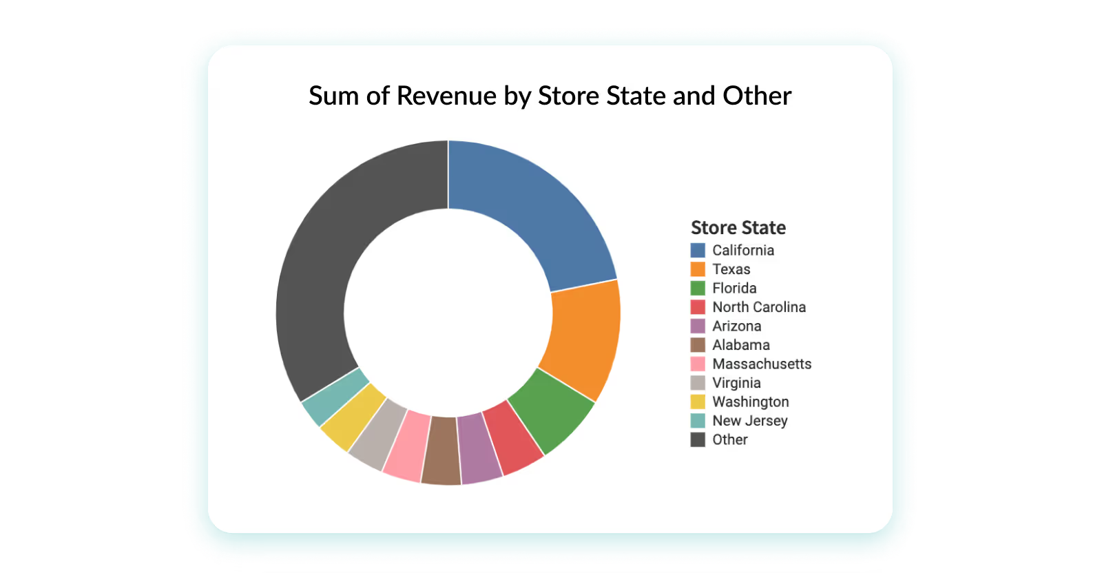
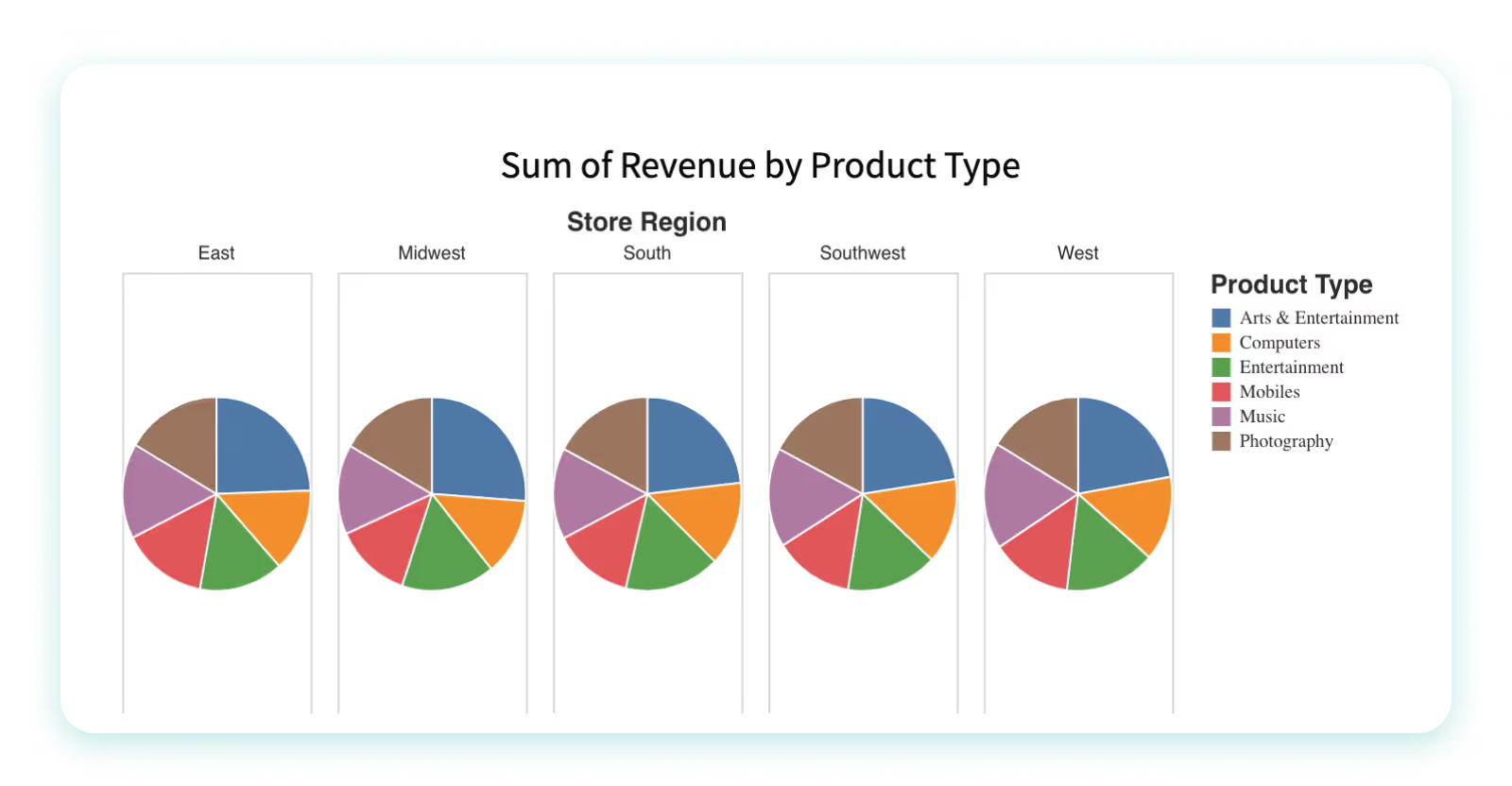
Pie charts—similar to stacked bar charts—are useful for displaying categorical data, such as market share or customer demographics. Pie charts are often used to display data that can be divided into categories or subgroups, and to show how each category or subgroup contributes to the whole. For example, a pie chart could be used to show the proportion of sales for different product categories in a given period of time, or the percent of a company's revenue broken down by various regions.
When to use pie charts:
- You want to display a proportion or percentage of a whole
- You’re visualizing only seven categories or less
When to avoid pie charts:
- You’re visualizing more than seven categories
- You want to compare something with more details, rather than just proportion
- You want to display and pinpoint exact values
Bar Charts
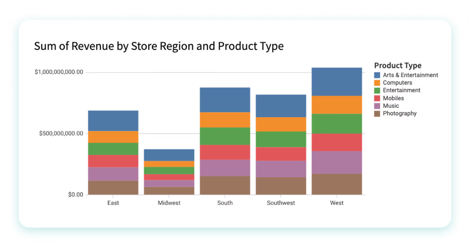
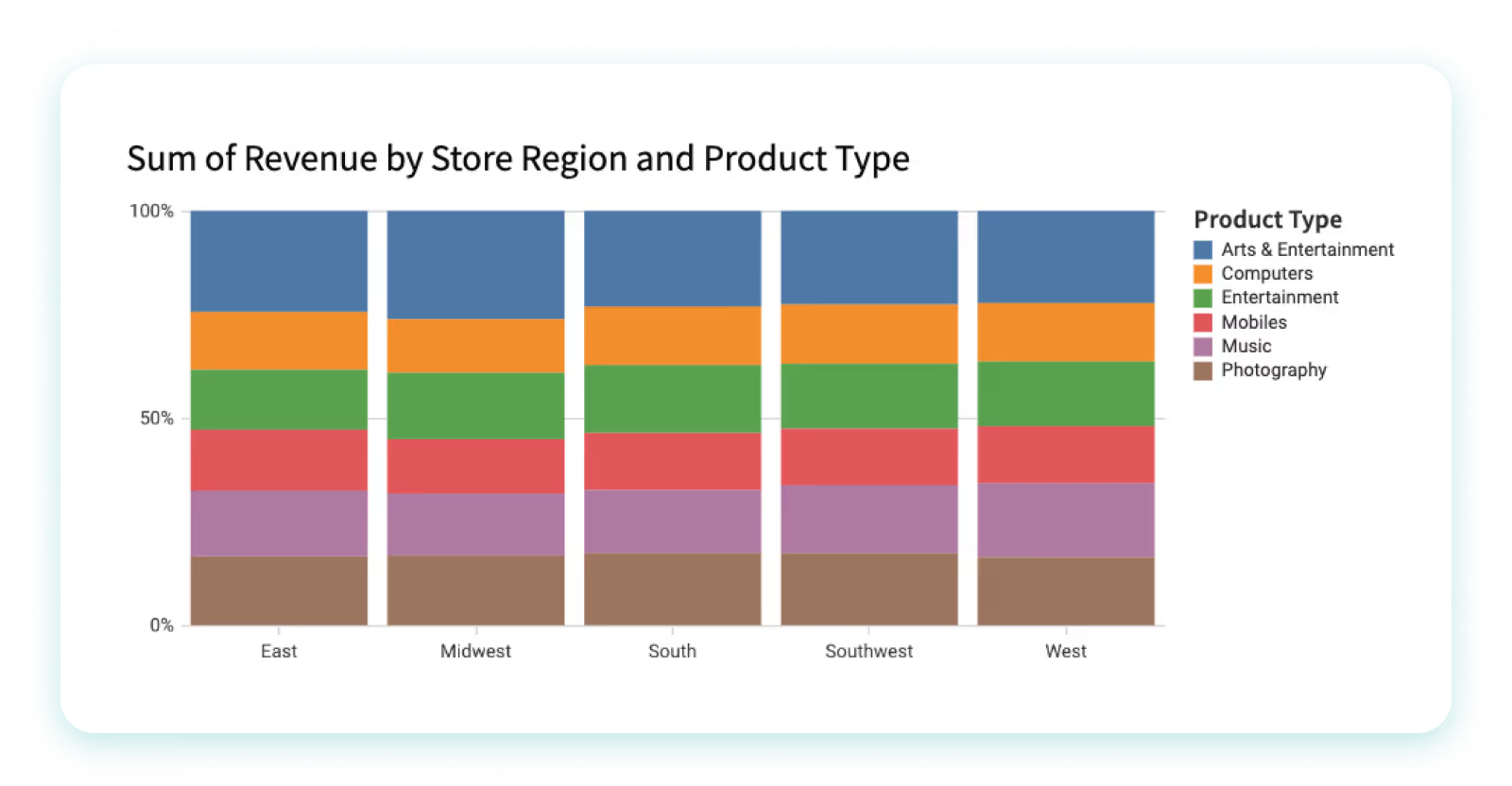
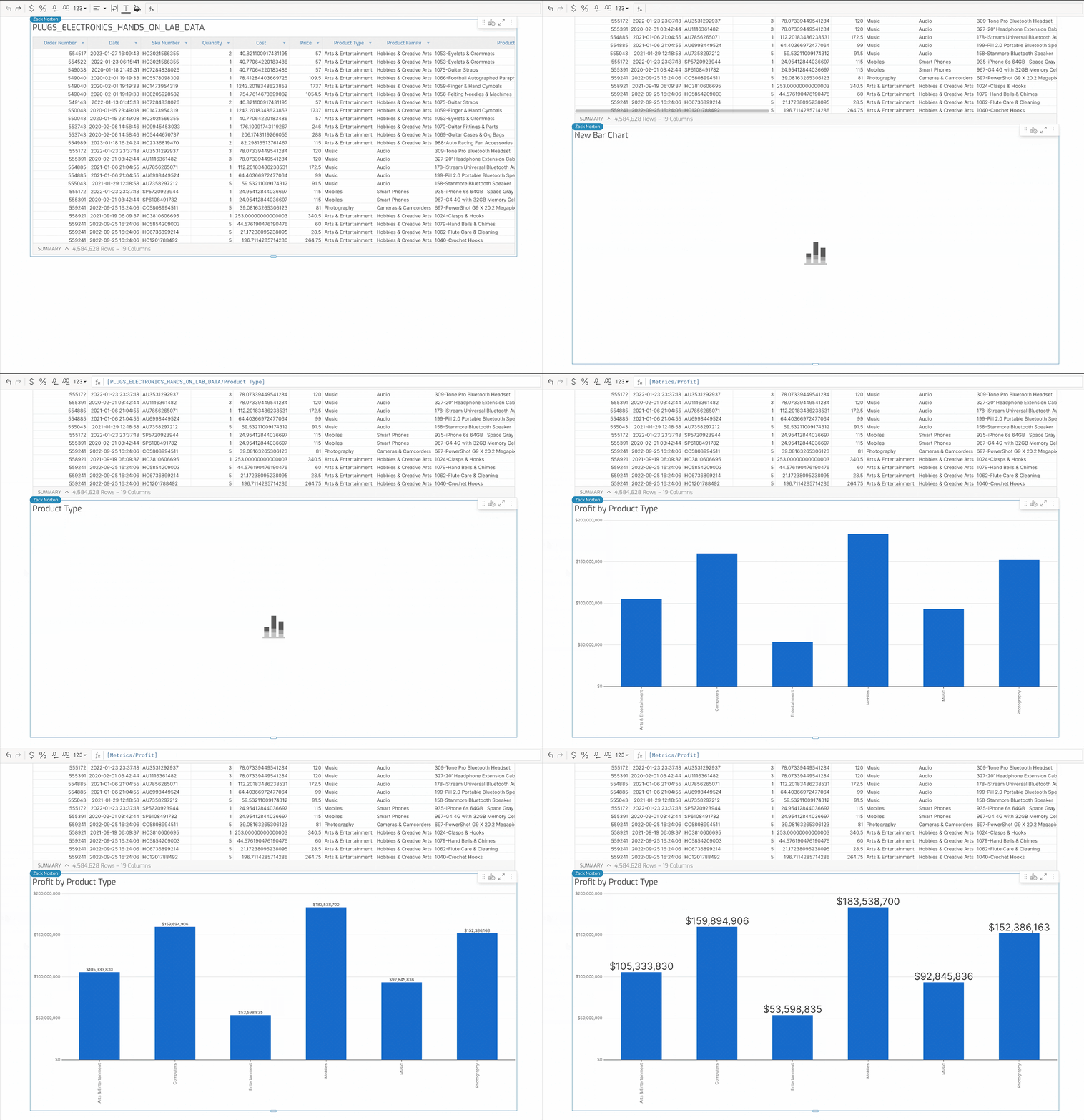
A bar chart, or bar graph, constitutes a variety of graphs that employ rectangular bars to depict data. These bars can be oriented either horizontally or vertically, with their extent being directly proportional to the numerical values they are intended to embody. Predominantly utilized for juxtaposing data across disparate categories or illustrating shifts in data over temporal progressions, bar charts offer a straightforward, yet potent means of conveying information visually. They frequently function as the initial tool in the exploratory process of data investigation.
When to use bar charts:
- Emphasizing and contrasting different sets of data, making the disparities or similarities between categories clear
- To display a subset of a larger dataset
When to avoid bar charts:
- When a particular field encompasses an overwhelming variety of data types
- When the differences between fields are too subtle, or when these differences exist on different scales, as it could lead to confusion or misinterpretation
Line Charts & Area Charts
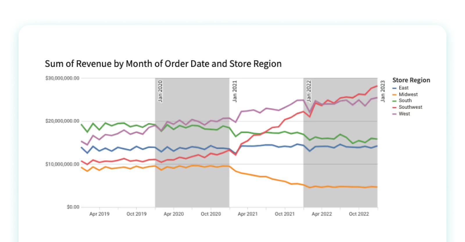
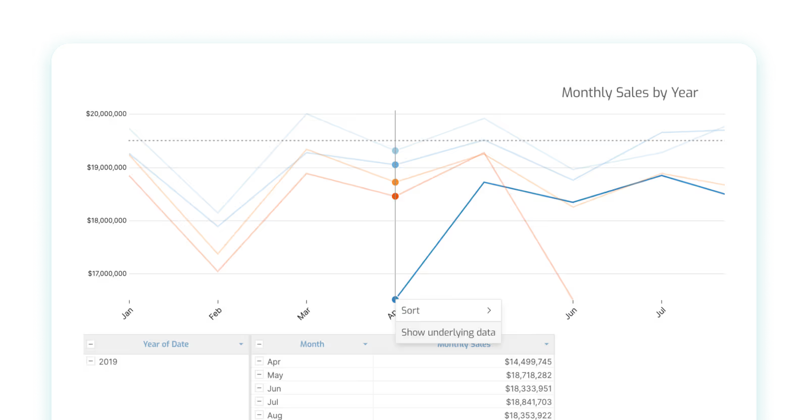
Line charts and area charts are two types of charts that are commonly used to visualize data trends over time. A line chart, also called a line graph, is a distinct type of graphical representation that exhibits information in the form of a multitude of data points, which are interconnected by unbroken lines. These line charts are typically employed to demonstrate transformations in data over a certain duration, where the horizontal axis symbolizes time, and the vertical axis signifies the values under scrutiny. Furthermore, they can serve to juxtapose several series of data within the same chart, or to graphically illustrate predicted time periods.
For example, a line chart can be used to visualize a company's stock prices over the course of a year. Similarly, an area chart can be used to visualize the temperature changes over a day.
When to use line charts:
- When you’re displaying time-based continuous data
- When you have multiple series or larger datasets
When to avoid line charts:
- When you have smaller datasets, bar charts are likely a better way to present the information
- Avoid when you need to compare multiple categories at once
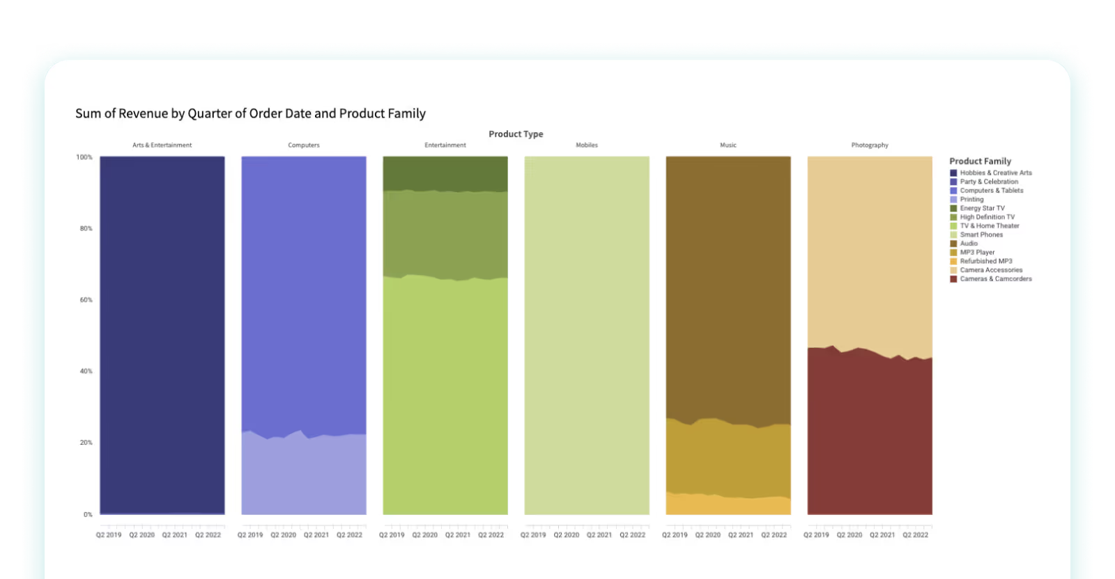
When to use area charts:
- When you want to display the volume of the data you have
- When comparing data across more than one time period
When to avoid area charts:
- Avoid if you need to compare multiple categories, as well as when you need to examine the specific data value
Scatter Plots
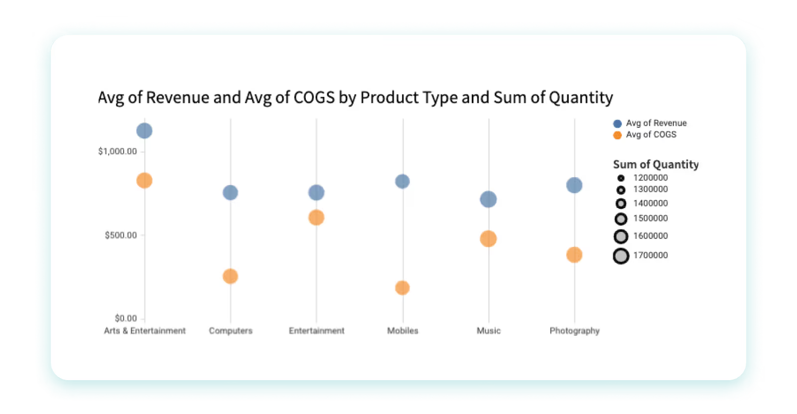
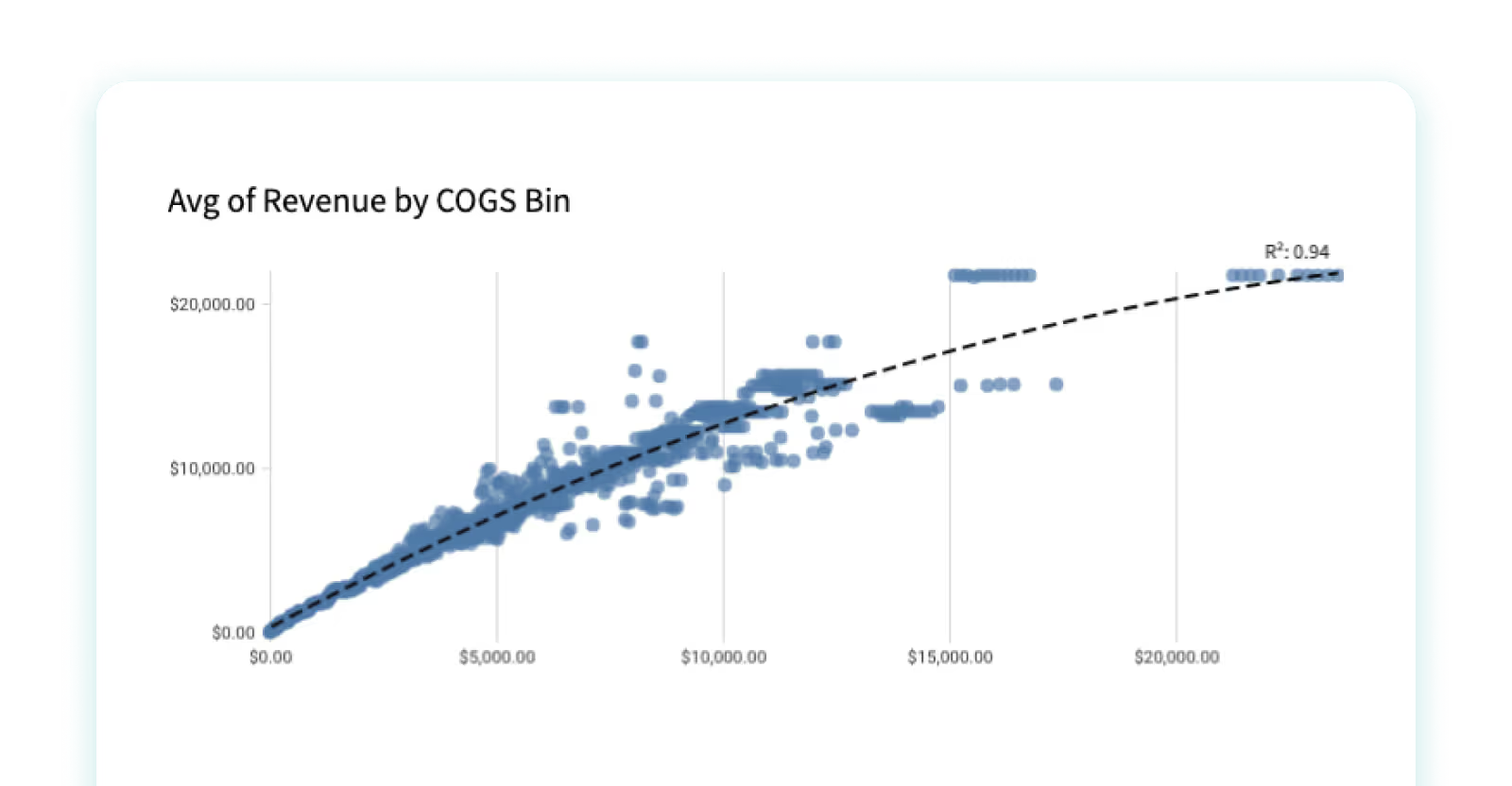
A scatter plot, also called a scatter chart or scatter graph, is a specialized form of chart that demonstrates the correlation between two distinct variables by mapping them as a succession of individual data points. Each data point denotes a combined value of the two variables, with its specific placement within the chart dictated by these values.
Scatter charts prove instrumental in discerning patterns and trends within data, and they also help us understand how strong and in what direction the relationship is between two variables. They also serve as effective tools for identifying outliers, or those data points that deviate significantly from anticipated values based on the pattern displayed by other data points. These charts find widespread use across a range of fields including, but not limited to, statistics, engineering, and social sciences, for the purpose of analyzing and visualizing intricate data sets. In the realm of business, they are frequently utilized to identify correlations between different variables, for instance, examining the relationship between marketing outlays and resultant sales revenue.
For example, a scatter plot might be used to visualize the relationship between the age and income of a group of people. Another example would be to plot the correlation between the amount of rainfall and the crop yield for a particular region.
When to use scatter plots:
- Highlight correlations within your data
- They are useful tools for statistical investigations
- Consider scatter plots to reveal underlying patterns or trends
When to avoid scatter plots:
- For smaller datasets, scatter plots may not be optimal
- Avoid scatter plots for excessively large datasets to prevent unintelligible data clustering
- If your data lacks correlations, scatter plots may not be the best choice
Pivot Tables
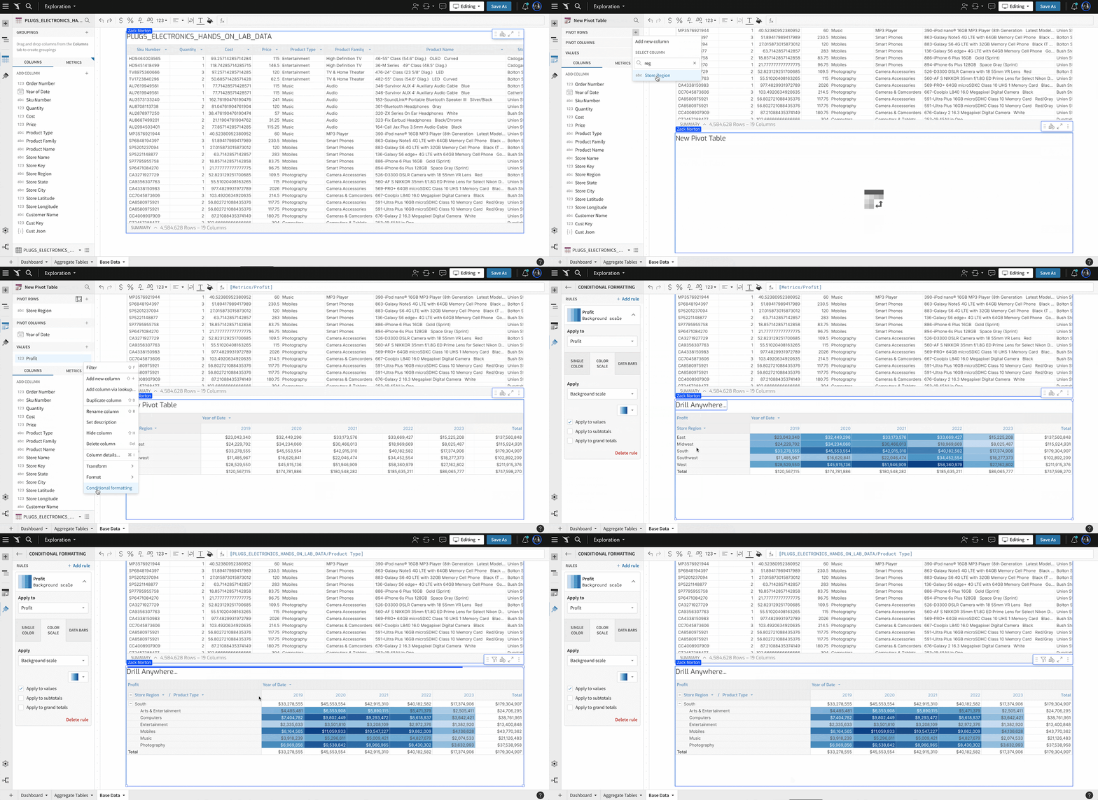
While pivot tables may not be what first comes to mind for data visualization, they can give important context with hard numbers and provide strong visual indicators through formatting.
Pivot tables can also be enhanced with conditional formatting to provide color scales that make performance trends more visible. Data bars can also be added to cells to run either red or green for positive and negative values.
When to Use Pivot Tables:
- Cohort analysis performance trends or portfolio analysis with a mix of positive and negative values
What Not to Use Pivot Tables:
- When your dataset is too large to get a good understanding of the whole
- When data can easily be summarized with a bar chart instead
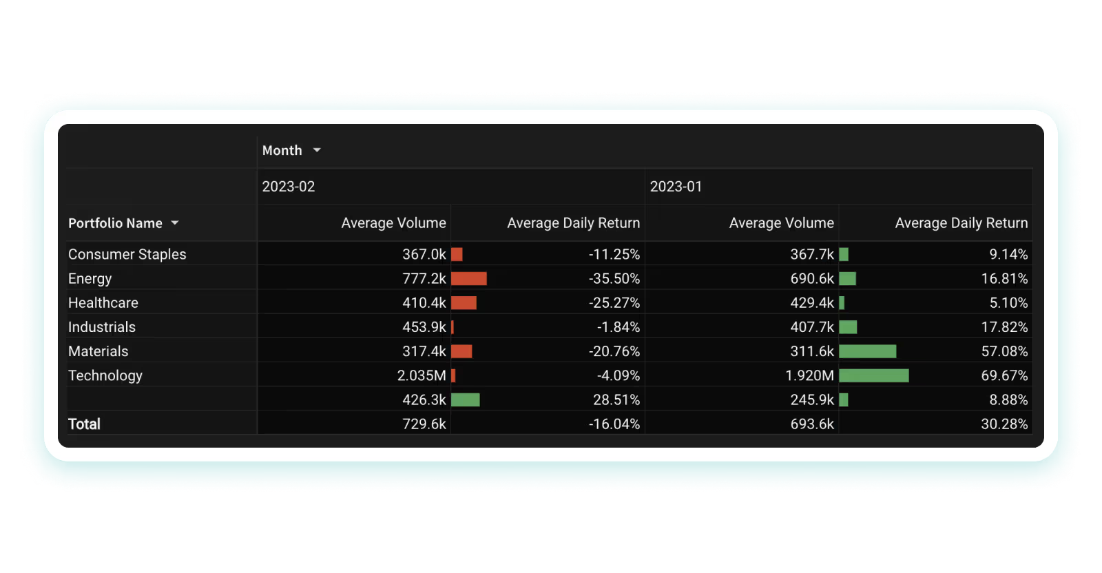
An example of a pivot table, where colors are used to show positive or negative progress on a company’s portfolio. The user can pivot the table to show multiple categories in different ways.
Heat Maps
A heat map is a type of chart that uses color to represent data values. It is often used to visualize data that is organized in a matrix or table format. The color of each cell in the matrix is determined by the value of the corresponding data point. Heat maps are best used when analyzing data that is organized in a two-dimensional grid or matrix.
For example, a heat map can be used to visualize a company's website traffic, where the rows represent different pages on the website, and the columns represent different periods of time.
When to use heat maps:
- When you need to visualize the density or intensity of variables
- When you want to display patterns or trends over time or space
When to avoid heat maps:
- When precise values are needed; heat maps are better at showing relative differences rather than precise values
- When working with small data sets
Tree Maps
A tree map is a type of chart that is used to visualize hierarchical data. It consists of a series of nested rectangles, where the size and color of each rectangle represent a different variable. Tree maps are best used when analyzing data that has a hierarchical structure.
For example, a tree map can be used to visualize the market share of different companies in an industry. The largest rectangle would represent the entire industry, with smaller rectangles representing the market share of each individual company.
When to use tree maps:
- When you want to visualize hierarchical data
- When you need to illustrate the proportion of different categories within a whole
When to avoid tree maps:
- When exact values are important
- When there are too many categories
Box-and-Whisker Plots
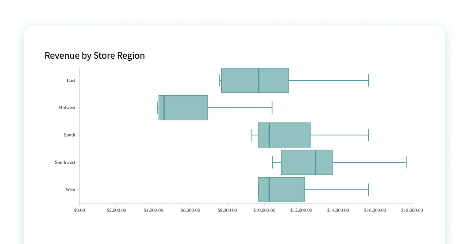
Box plots are useful for quickly summarizing the distribution of a dataset, particularly its central tendency and variability. For example, a box-and-whisker plot can be used to visualize the test scores of a group of students.
Colloquially recognized as a box-and-whisker plot, a box plot is a distinct form of chart that showcases the distribution of a collection of numerical data through its quartile divisions. Box plots serve as efficient tools for rapidly encapsulating the distribution of a dataset, specifically its central propensity and variability.
A box-and-whisker plot consists of a rectangle (the "box") and a pair of "whiskers" that extend from it. The box embodies the middle 50% of the data, with the lower boundary of the box signaling the first quartile (25th percentile) and the upper boundary of the box indicating the third quartile (75th percentile). The line situated within the box signifies the median value of the data. The whiskers project from the box to the minimum and maximum values of the data, or to a designated distance from the box referred to as the "fences." Any data points that reside outside the whiskers or fences are categorized as outliers and are plotted as individual points.
When to use box plot charts:
- When you want to display data spread and skewness
- When showcasing the distribution of data, including the range, quartiles, and potential outliers
- When comparing multiple groups or categories side-by-side; they allow for easy comparison of different distributions.
When to avoid box plot charts:
- If you need to show more detail, since box plots focus on a high-level summary
- When individual data points are important to the story you’re telling
- When your audience isn’t familiar with them, since they can sometimes be less intuitive than other types of visualizations
Histogram
A histogram is a type of chart that displays the distribution of a dataset. It consists of a series of vertical bars, where the height of each bar represents the number of observations in a particular range. Histograms are best used when analyzing continuous data. It’s used the most when you want to understand the frequency distribution of a numerical variable, like height, weight, or age. For example, a histogram can be used to visualize the distribution of heights in a population. Read more about building histograms in Sigma here.
When to Use a Histogram:
- When understanding the shape of a distribution; for example, whether it’s symmetric, skewed to the left or right, or bimodal
- When identifying outliers, like which data points are significantly different from the rest of the data
- When comparing distribution of a variable across different groups, such as males and females, or different age groups.
- To set boundaries for data ranges; for example, you might use a histogram to determine what constitutes a "normal" or "abnormal" value for a particular variable
When to Avoid a Histogram:
- When you need to look at multiple dimensions at the same time
- If your data isn’t all on the same scale
Sankey Charts
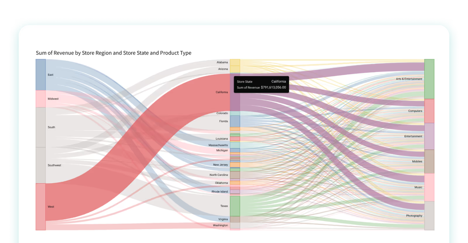
We end our guide with the controversial Sankey chart. A Sankey chart is a type of diagram that illustrates the movement or transfer of data, resources, or quantities through various stages of a system or process. Common applications of Sankey charts include visualizing complex sequences like energy usage, material distribution, or even a website's user journey. The structure of the chart includes nodes and links—with nodes representing the starting points, endpoints, or intermediate steps, and links depicting the transition of quantities or data between these nodes.
The thickness of the links in a Sankey chart directly corresponds to the volume of data or resources being moved, offering an intuitive comparison of the relative sizes of these transfers. They can be invaluable for recognizing inefficiencies, bottlenecks, or potential areas for enhancement in a system or process. These charts serve as a powerful tool for communicating complex information in a straightforward and comprehensible way. However, if there are too many nodes or links, Sankey charts can become cluttered and challenging to interpret, hence their use should be considerate and targeted.
When to use Sankey charts:
- When you want to show the data as part of a process
When to avoid Sankey charts:
- When it starts to feel too confusing, which can quickly happen when there are too many nodes or links
- When you need to see exact values, it might not be the most intuitive option.
Evaluating Data Visualization Tools
Data visualization tools have become increasingly popular in recent years, with a wide variety of options available to choose from. However, determining which tool best suits your needs can be challenging with so many options. When evaluating data visualization tools, there are several key questions to consider:
- What are your goals and needs?
It's crucial to clearly understand your goals and needs before selecting a data visualization tool. Are you looking to explore your data, communicate a specific message, or both? Understanding your objectives will help you choose the right tool for your project.
- What features do you require?
Different data visualization tools come with different features. Before selecting a tool, you should consider what features you need to achieve your goals. For example, do you require interactive capabilities or the ability to create custom visualizations?
- Where will your data come from?
The source of your data is another critical factor to consider when selecting a data visualization tool. Some tools are better suited for specific types of data, such as structured or unstructured data, while others may require specific file formats or data storage solutions.
- Where will you need to see your data?
Different data visualization tools may be more suitable for specific platforms or devices. For example, some tools may be optimized for mobile devices, while others are designed for desktop computers or specific web browsers. You may also be interested in embedding visualizations elsewhere, such as internal applications or external portals.
- Where would you like to publish your visualization?
Finally, consider where you would like to publish your visualization. Some tools may provide built-in publishing capabilities, while others may require you to export your visualization to a separate platform. Selecting a tool that supports your publishing needs is important to ensure your visualization reaches your intended audience.
By considering these key questions, you can evaluate different data visualization tools and select the one that best meets your needs.
Read a side-by-side comparison of Sigma against similar BI tools.
Take the Next Step & Start Analyzing With Data Visualization
Data visualization is a powerful tool for understanding and communicating complex data. While there are many data visualization tools on the market, Sigma offers an intuitive and familiar spreadsheet interface that allows users to easily explore, analyze, and collaborate on their data.
Explore Sigma’s capabilities and start transforming your data today via a free trial of Sigma.


