Why Your Customers Have Outgrown Read-Only Dashboards

When you first embedded analytics into your product, the goal was straightforward: give users a view of their data to inform decisions. For a while, that simple view into data worked.
But once users have been living in your product long enough, they develop sharper questions, and a lower tolerance for not being able to answer them on their own.
The evidence shows up as workarounds. Users start exporting data to build their own spreadsheets, filing support tickets for filters that seem like they should already exist, or asking for time horizons and breakdowns you didn't anticipate. They have a hypothesis about what's driving a trend and can't test it from what you've given them, so they go figure it out somewhere else.

Most embedded analytics layers follow a predictable progression as this pressure builds.
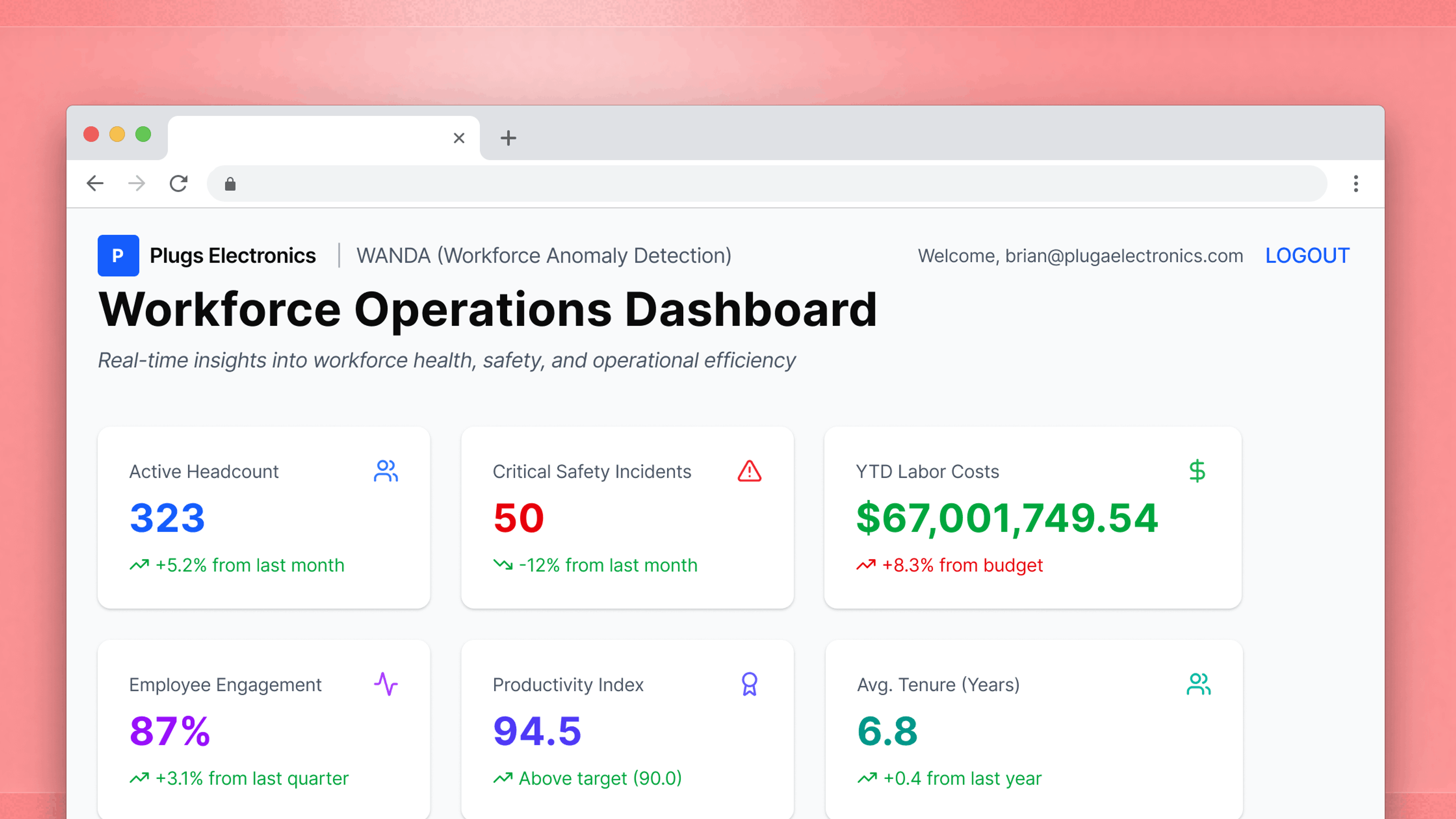
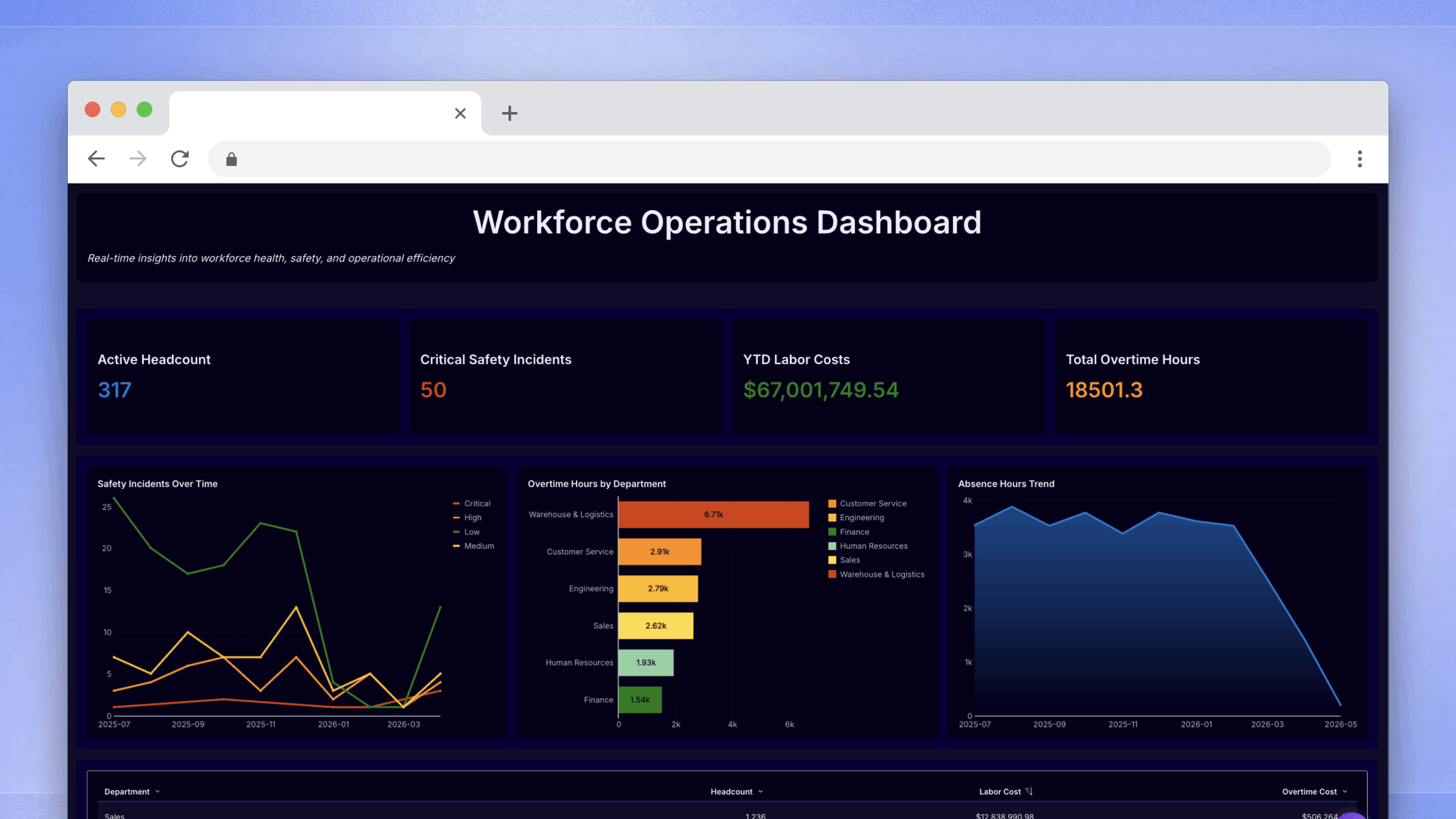
- Stage 1: Static dashboards
- This is the MVP of embedded analytics. Users can glean high-level insights, but they can’t go deeper into data on their own.
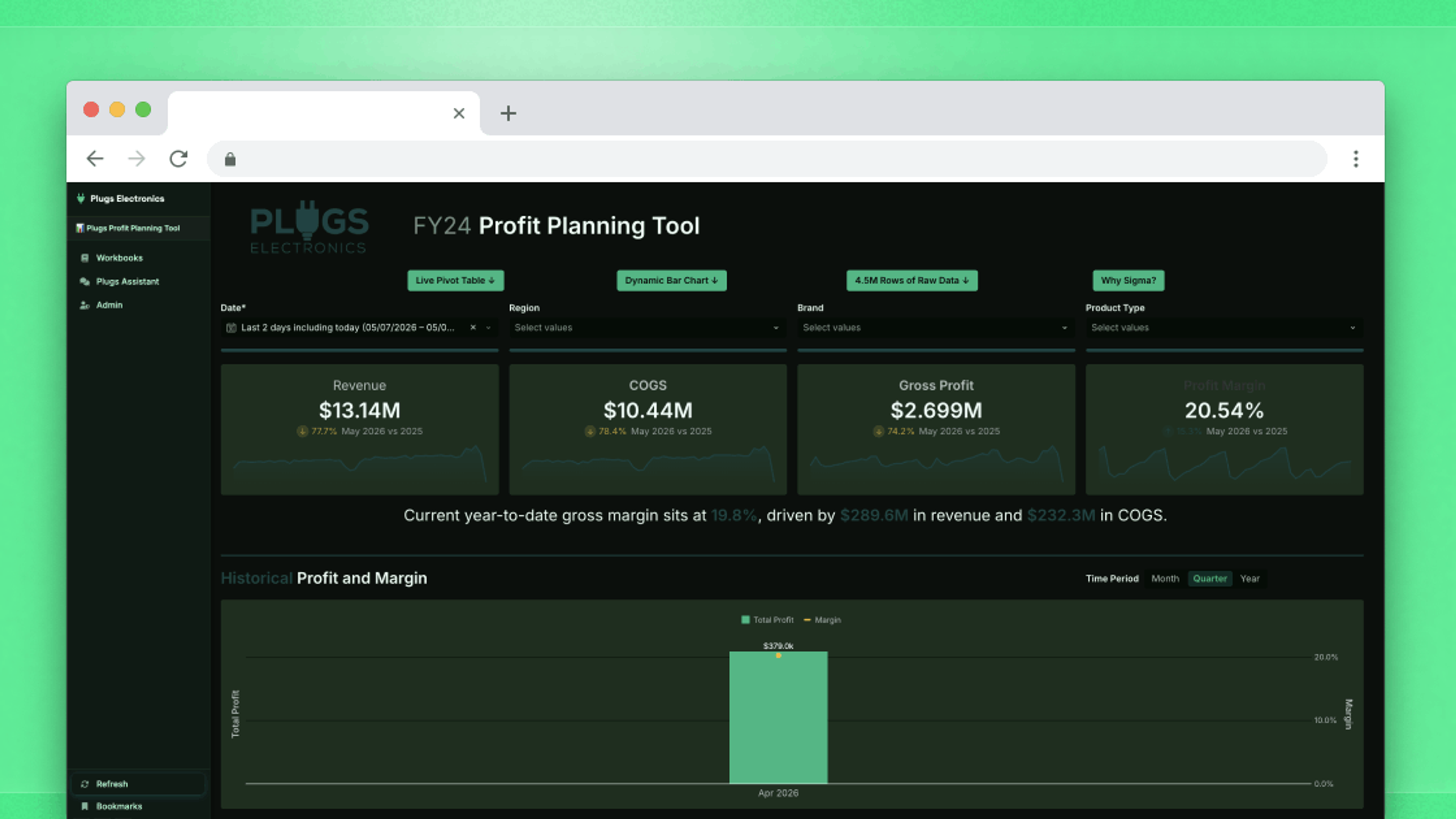
- Stage 2: Self-service analytics
- This is when embedded analytics starts to offer significant value to the end user. If they’re able to filter, sort, and drill down into data to find the exact insight they need, they’re more likely to engage with the product.
- Stage 3: Writeback and action triggers
- This is where a product with embedded analytics becomes truly irreplaceable. Users can add their own comments, modify data, or even trigger automated actions based on their data. The embedded solution goes from being something that gets a cursory glance to something that becomes a critical part of the user’s workflow.
- Stage 4: AI-assisted workflows
- This is where the product does interpretive work the user would otherwise have to do themselves. A conversational interface lets users ask questions about their data in plain language without needing to build a workbook from scratch, lowering the barrier to insight for the users who were never going to engage deeply with the earlier stages on their own.
Understanding where you sit on that curve, and what users actually need at the next stage, is the difference between an analytics investment that compounds and one that gets replaced.
Stage 1: Static dashboards

A static dashboard is a curated view: someone on your team decided what information matters, arranged it, and published it. The static dashboard works well early on because it's low-overhead for everyone. In other words, your team doesn't have to think deeply about user-level data access, and users don't need to understand the underlying data.
The ceiling arrives when users want answers the creator didn't anticipate. They want a different time period, a different breakdown, or the ability to test a hypothesis against their own data. What looks like a series of one-off requests is usually the same underlying need. Users want to bring their own judgment to the data, not just consume yours.
Stage 2: Self-service analytics

Self-service analytics gives users the ability to drill down into the data and set filters for what they actually care about. They can bookmark their own custom views to return to later. In some cases, they can even build their own workbooks with existing data models and validated business metrics. With a self-service embedded analytics experience, questions that required a support ticket get answered on demand. Users get faster answers, can validate their own thinking, and tend to trust what they find more when they can trace a number back to where it came from.
Your team still has work to do, it just moves up the stack. Instead of building dashboards, your team builds data models and a set of starter workbooks that meet end users where they're at. That's a higher-leverage investment: done well, it means every customer who logs in has a credible starting point they can build from, rather than a blank canvas that requires data expertise to use. The risk at this stage isn't that users can't access data. It's that the models underneath aren't structured well enough for non-technical users to navigate confidently. Two users can work from the same data, arrive at different numbers, and neither realizes it. The more fundamental limit is that the Stage 2 interaction is short-lived. A user can explore and filter to glean more insights, but that’s the most they can do. They can analyze the data, but they can’t easily take action on it.
Stage 3: Writeback and action triggers
At some point, users stop wanting to see the data and start wanting to do something about it.
Take a forecast that's clearly off: For a consumer of embedded analytics, correcting it means leaving the dashboard and filing a ticket or emailing a customer support rep, hoping that the change propagates before the decision window closes. Or an anomaly that's visible but can't be flagged in-context. Or an analysis that's done, but the approval it needs to trigger lives in a different system entirely.
It's part of a broader pattern. Microsoft's 2025 Work Trend Index, which surveyed 31,000 workers across 31 countries, found that more than half of employees (52%) describe their work as chaotic and fragmented — a condition driven largely by the overhead of coordinating across disconnected systems. Analytics workflows that require users to act outside the interface where they found the insight add directly to that load.
Stage 3 gives users the ability to enter or modify data within the analytics interface, with changes writing back to the underlying warehouse in real time. (For a detailed treatment of how this works and securing it in multi-tenant deployments, see our piece on what writeback is in embedded analytics.) The key distinction from Stage 2 is that these interactions have real consequences: they change the data, create a record, and can trigger effects downstream.
One common form this takes is in forecasting. A user sees actuals, enters projections alongside them, and a manager can review and approve that submission from the same workbook. No email chain, no external spreadsheet. Action triggers extend this further, letting you build structured workflows directly into the analytics surface: guided input flows, modals that walk users through submitting a record, navigation that takes someone from a summary to a detailed view. The workbook becomes something users move through with intent.
Where Stage 3 tends to break down is discoverability. Actions require thoughtful UI design to work well. If users don't understand what a button does or what clicking it will set in motion, they won't use it.
Stage 4: AI-assisted workflows

Each stage shifts what users are responsible for. In Stage 2, they can ask their own questions. In Stage 3, their answers stick and they can act on them. In Stage 4, the system helps them figure out what to ask—and this is where AI in embedded analytics can offer a competitive advantage to your product.
AI is most useful in analytics when it lowers the barrier to getting answers. In practice, this means a conversational interface that lets users ask questions about their data in plain language, without needing to know how to construct a query or build a workbook from scratch.
This only works if the governance layer underneath is trustworthy. AI on top of fragmented, unmodeled data produces fast wrong answers, which is worse than slow wrong answers because it looks credible. A well-governed data model is a prerequisite, not an implementation detail. When that foundation is in place, AI also reduces the discoverability problem that makes Stage 3 hard for some users. A conversational interface is familiar to people who have never touched a BI tool.
Where do you sit?
If you're trying to figure out which stage describes your current embedded analytics offering, the most reliable signals are in your users' behavior — what they're asking for, what they're working around, and what they've stopped bothering to do at all.
Stage 1: Your users ask for data exports or file tickets to get new views built. Every new question routes back to your team.
Stage 2: Users can explore and filter, but they're building in isolation. And when two people arrive at different numbers from the same data, confidence in the analytics layer erodes. You see it in support tickets asking why figures don't match, or in users who've quietly stopped trusting what they see.
At the Stage 2/3 threshold: Some form of writeback or data entry exists, but it happens outside your analytics interface, through a spreadsheet someone manually syncs or a separate form tool. Users context-switch every time they need to act on what they see.
At the Stage 3/4 threshold: You're trying to introduce AI into your analytics layer and users don't trust the outputs. In most cases, the issue is the data model, not the AI.
Why moving up is harder than it looks
Product teams can usually estimate the upfront cost of building the next stage well enough. The harder variable is ongoing maintenance: keeping pace with warehouse API changes, security requirements, and evolving user expectations. That cost falls on whoever owns the analytics infrastructure, and it accumulates in ways that are hard to see until it's already become expensive.
There's also a structural problem that's easy to underestimate. Writeback in particular requires an architecture designed to handle write access and multi-tenant data isolation, which is a different problem than read-only dashboards. Teams that try to build it in-house often underestimate that gap until they're already mid-project.
The product teams that move through this curve most effectively share a few characteristics. They treat the data model as the foundation from the start, knowing that every stage above Stage 1 depends on users navigating data they didn't design. They build governance in before they need it at scale, because access controls that work at Stage 1 often don't extend cleanly to Stage 3, where users are writing data. And they're clear-eyed about build versus buy: maintaining parity with a platform whose entire focus is analytics is a significant ongoing investment that most product teams aren't positioned to sustain alongside everything else they're building.
To explore the full landscape of what to consider when integrating customer-facing analytics into your product, Sigma's Ultimate Guide to Embedded Analytics is a good next read. You can also request a demo to learn more about Sigma’s approach to embedded analytics and AI.
Frequently asked questions
What is an analytics maturity curve?
An analytics maturity curve describes the progression from basic data viewing to more sophisticated interaction with data. In an embedded analytics context, this typically runs from static dashboards through self-service exploration, writeback and action triggers, and AI-assisted workflows. Each stage expands what users can do with their data and requires a different underlying architecture to support it well.
What are the signs that users have outgrown a static dashboard?
The clearest signals are behavioral: users export data to build their own spreadsheets, file support tickets to get views or filters that don't exist, or consistently ask for time horizons and breakdowns the dashboard doesn't support. These rarely surface as isolated requests. They appear as a pattern, the same underlying need showing up repeatedly through different channels.
What is the difference between self-service analytics and writeback?
Self-service analytics lets users explore and filter data without waiting for a new view to be built and shipped to them. Writeback lets users enter or modify data within the analytics interface, with changes written back to the underlying data warehouse. Self-service expands how users read data; writeback lets them contribute to it. Writeback interactions are also persistent. They change the data and can trigger downstream workflows.
When does self-service analytics create more problems than it solves?
Self-service works well when users have a strong starting point: good data models and well-designed starter workbooks they can extend. Without that foundation, users build analyses that look credible but aren't necessarily correct. When users are each building their own version of a metric with no way to cross-check, conflicting numbers accumulate and confidence in the analytics layer erodes across your customer base.
What does AI-assisted analytics actually require to work?
AI in an analytics context depends on the quality of the data and governance layer underneath it. Well-modeled, properly permissioned data lets AI direct user attention to what matters and lower the barrier to exploration. Fragmented or unmodeled data produces outputs that are fast but unreliable. And because they look credible, users may not realize they can't trust them.