5 Tips for Building Custom, Interactive Dashboards in Sigma

Data has replaced oil as the most valuable asset on earth. But extracting that value can be trickier than it seems. The business value of data is directly related to the quality, magnitude and impact of the decisions it generates. In other words, data is most valuable when it drives action.
But turning data points into impactful action is no easy feat. Executives across industries recognize the power data has to improve their decisions yet 85% percent of them struggle to analyze and interpret it. The solution? Dashboards.
Dashboards make data actionable by making it visual. Humans are visual creatures - more than 50% of our brains are dedicated to the processing of visual information. By representing KPIs, metrics, and critical data points as charts, graphs, gauges, and other visualizations, viewers can quickly understand the context around data points, draw insightful conclusions, and make better decisions.
But how do you ensure your dashboards drive action? Leveraging Sigma, you can craft dynamic, interactive, and customized dashboards that support data-driven decision-making at every level across the organization..
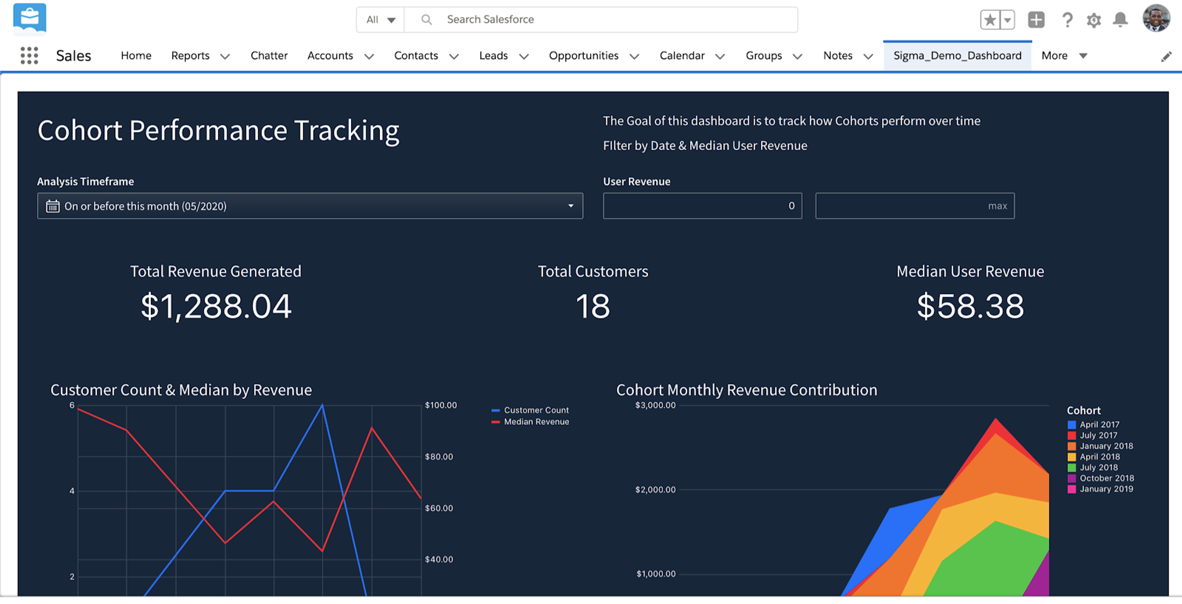
Identify what questions you are trying to answer
One of the most common dashboard mistakes is trying to cram too much into them. Great dashboards reduce complexity, increase clarity and communicate information at a glance. Overloading your dashboard with every chart, graph and table does the opposite of drive action - it creates “analysis paralysis.”
Start with a specific question or group of related questions to narrow your focus. Once you’ve determined the question or questions you want to answer with your dashboard, select only the data points that relate to that specific question to include in your dashboard.
Add clarity to your dashboard with text
Text boxesin Sigma allow you to add titles to your dashboard, captions to your images, and further explanation wherever it’s needed on your dashboard. Use text to help tell a story around your data and help your audience come to informed conclusions.
- Give your dashboard a clear and compelling title to arouse interest. For example, instead of titling your dashboard “Santa Clara County COVID-19 Data” you may try something like “The Impact of COVID-19 on Santa Clara County.”
- Rephrase the titles of your charts, graphs and tables into questions so people can get a better sense of what answer the data is providing. Instead of labeling a chart “Traffic Sources,” a better label would be “Where are site visitors coming from?”
Start with pre-built templates
Sigma has a growing library of templates of the most common dashboards to help get you started. These templates make it faster and easier to build new, complex analyses, and quickly get value from your data without having to create a new dashboard from scratch. From getting a better picture of your Snowflake data usage to integrating all of your digital marketing ad spend, Sigma has powerful templates that can help you quickly create the dashboard of your dreams.
Enable your viewers to dig deeper
Dashboards inevitably lead to more questions. Traditional, static dashboards make it difficult or impossible to ask any new questions or drill deeper into the data. Sigma’s dynamic and interactive dashboards empower viewers to be more than just passive consumers of data - with Sigma, they can explore data themselves to discover new insights in seconds.
Use Coordinated Drill-downs to enable data exploration
Drill-down charts in Sigma are visualizations that enable multiple levels of granularity within the bar charts, line charts, area charts, combo charts, scatter plot charts, pie charts and donut charts.
Coordinated drill-downs make dashboards interactive by allowing the viewer to filter data and impact multiple visualizations across a dashboard with a single click.

Help your viewers spot trends, patterns, and correlations
The best dashboards help viewers gain a 360-degree understanding of a problem. The design and functionality of your dashboard can either improve or weaken a viewer's ability to reach an informed conclusion.
One way you can help your viewer spot trends, patterns or correlations in the data is by using highlighting. Master-detail view is a familiar design pattern for digging deeper into individual topics while keeping tabs on their placement in the broader context. Highlighting lets you see a broad overview of your graphs, then click on individual segments in one chart to see related substrates in the others.

Customize your dashboard controls
Dashboard controls provide multiple ways for the viewer to manipulate data. For example, you may choose to show all options available at all times to make your viewer aware of every possible option, or the list may be so extensive that you may choose to only display a few options along with a search box.
There are several ways to create a control on your dashboard, but adding a control directly from a visualization is ideal because it automatically populates with relevant settings.
Two dashboard tips that can help your users make the data clearer and more usable to your viewers are removing the clear button and date binning.
- Remove the clear button - This removes the possibility of having an available empty state. When you have an empty state, Sigma calculates a parameter with a default value. While it may serve a purpose in some cases, this doesn’t always make sense. For example, if your dashboard allows the user to select a currency to display a monetary value in, it doesn’t make sense to have no value. Removing the clear button in this case would ensure a currency is selected at all times.
- Date binning - The DateTrunc field settings input in Sigma allows you and your dashboard’s viewers to filter one or more visualizations based on a continuous measure of time into a discrete period or bin (i.e. week, month, year, etc). Date bins are helpful when filtering several charts with dates truncated to different granularities. This is useful if you want to see something like how many orders were placed during a selected week, or how many parts were delivered in a specific month. With this enabled, viewers can interact with charts and graphs and see the data they highlight grouped in the ‘bin’ you’ve selected.
Leverage everyone’s expertise
Some of the most impactful data insights are surfaced by taking a community-driven approach to analytics and business intelligence. When everyone can lend their unique domain expertise, a more holistic solution to problems emerge. Sigma enables you to share your analysis and facilitate collaboration with colleagues across your organization.This is done in two main ways:
- Sharing - Worksheets, dashboards, folders and datasets can all be shared with others. Dashboards can be saved to a public folder so anyone can have access. Both dashboard owners and dashboard editors can share dashboards with other Sigma members. You can also share dashboard via scheduled reports.
- Embedding - Sigma dashboards and visualizations can be shared with users of 3rd party applications without requiring them to have Sigma accounts using application embedding. By putting Sigma dashboards directly into the tools leaders across the organization use most, it enables everyone to see data in context and within existing workflows without having to switch out of their applications. This gives everyone the data they need, when they need it, to make the best decisions.
Make your dashboard shine
When it comes to visualizing your data, aesthetics matter. Sigma's visual dashboard builder empowers everyone to create powerful dashboards using familiar spreadsheet formulas and website builder style templates (a la Squarespace). Dashboards created in Sigma are fully responsive and mobile friendly so viewers can access them on any device.
- Custom text - You can choose the size and color of your dashboard text. Text can be used to organize and label data visualizations on a dashboard, but can also assist in data storytelling. For example, the size and location of text on a dashboard can be used to organize the hierarchy of information so the viewer absorbs the data in a specific order or sequence.
- Colors - The most common and obvious use of colors are customizing dashboards to match company colors, fonts and images. Color theory can be used in data visualization to make our dashboards more effective by helping our brains better interpret information. For example, sequential levels of saturation in a single color can be used to show the varying levels of intensity, count, degrees, dollar amount or another gradual measure. Colors opposite on the color wheel can be used to draw contrast between two objects. A diverging color palette, like from red to blue, can be used to represent a variable along a spectrum (i.e. hot to cold).
Powerful, customized, and interactive dashboards are just a few clicks away
Using these techniques in Sigma’s intuitive, visual dashboard builder enables anyone to build a powerful, flexible dashboard in minutes. And thoughtful, well-designed dashboards empower organizations to take a community-driven approach to data analysis that generates the most impactful insights.
Best of all, any of the underlying data in the dashboard worksheet can be accessed in one click, making it easy to iterate, update and adjust your dashboard for whatever needs arise.
Ready to try Sigma’s dashboard builder for yourself?