Data Visualization Dashboards: What Are They & How Do You Make One?

Today, having the ability to monitor multiple key performance indicators (KPIs) and metrics is crucial to succeeding in business. No one has the time to analyze and interpret large amounts of data manually. By investing in robust data visualization software, your organization can streamline its data collection, analysis, and collaboration with dashboards that help users to quickly digest critical information and make smart business decisions in real time.
What is a Data Visualization Dashboard?
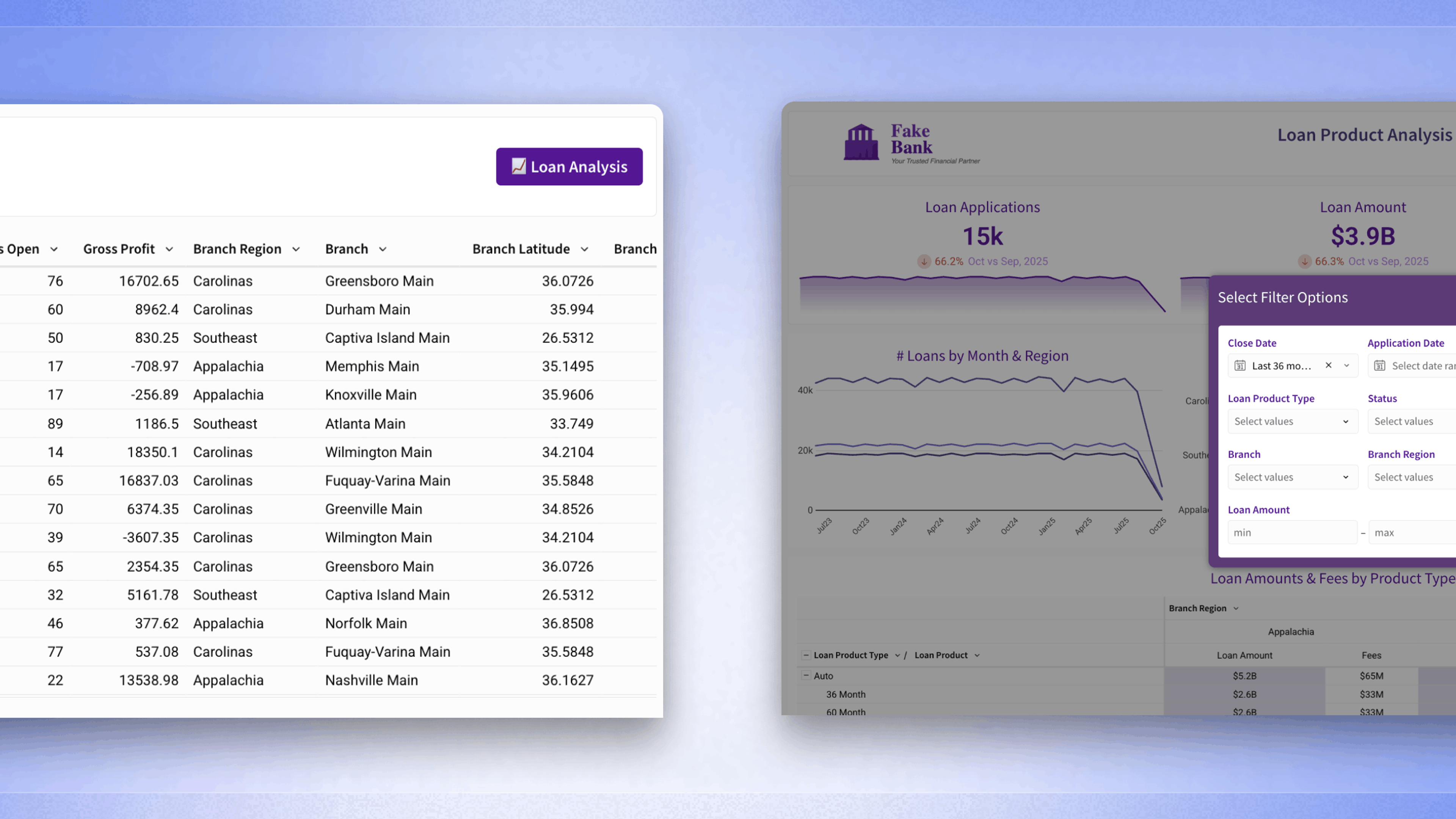
A dashboard is a data visualization tool that tracks, analyzes, and displays KPIs, metrics, and critical data points. Dashboards empower both technical and non-technical users to understand and leverage business intelligence to make more informed decisions. Users actively participate in the analytics process by compiling data and visualizing trends or occurrences, and uncovering an objective view of performance metrics that can be immediately understood.
Dashboards feature visualized data via charts, tables, and gauges. Viewers use these visualizations to monitor the health of the organization against established goals and industry benchmarks.

Visualize multiple KPIs at once
Most organizations utilize a variety of services to track KPIs and metrics, including marketing automation platforms, email marketing platforms, CRM tools, and many more. Monitoring and analyzing the data from each of these tools individually wastes precious time and resources.
The purpose of using a dashboard for data visualization is so that users receive a bird’s eye view of the data from each of these platforms in one centralized location, with the ability to quickly understand what it means for the business. The user can then drill down deeper into any aspect of the data, comparing it to established KPIs, which help us to understand what’s working and where there’s room for improvement.
Make data easier to understand
You don’t need to be a data scientist to use and understand a dashboard. The average user can quickly scan data visualization dashboards, obtaining a high-level view of key data points without painstakingly sorting through spreadsheets, emails, or documents for the answers to critical business questions.
Increase accessibility and collaboration
Dashboards make it easy for teams to collaborate whether everyone works in the office, virtually, or out in the field. Cloud-based dashboard tools update in real time and are accessible from any browsers. They help keep everyone on the same page and working toward the same goals.
Users can also create a link to their dashboards that can be shared with stakeholders inside and outside of the organization.
Create reports on the fly
In today’s fast-paced global business environment, it’s critical to ditch the old habit of generating reports at the end of the month, quarter, or year. By utilizing dashboards that update in real time, your organization can make swift changes before they have a chance to cause significant harm to the business.
Leadership doesn’t have to wait on management to provide them with reports; everyone in the organization can easily access a dashboard and use its insights for intelligent decision making.

The best data visualization dashboards are designed by first asking a critical business question. Let’s take a challenge such as tracking sales revenue within an organization. For example, an executive may want to know “How much revenue did the business generate this quarter? Was it more or less than the last quarter? And what regions performed the highest?”
From there, you would build out your dashboard with data visualizations that answer those questions and showcase the data in a way that is digestible and easy to understand. Here’s how you can get started:
Get started
Building dashboards with Sigma is easy. Sign up for afree trialand make your first one in minutes.
1. Extract your data
Import data into your dashboard from your data warehouse, via web services like Google Analytics, or by uploading old-fashioned Excel or CSV files. If you’re using a modern data visualization tool, take advantage of its integrations that allow you to extract data from 100s of other cloud platforms your company may use.
Once data is collected in your preferred analytics tool, you’ll want to take that data set and apply and begin to build visualizations to answer your questions.
2. Determine your KPIs
What metrics will you use your data visualization dashboard to track? Remember, your dashboard should provide an answer to a specific business question, so keep this in mind when determining the KPIs unique to your department, line of business, company, or industry.
When designing your dashboard, keep your audience top of mind. While an executive may want to see a high-level overview of performance across every marketing channel, a marketing manager is more interested in the day to day performance, but the ROI of your marketing investment may be an essential metric for the entire department to know.
Common Types of Dashboards
It’s critical to cultivate a data-driven culture in today’s competitive business landscape. That begins with making data available to team’s within an organization. Dashboards are a great place to start, they help raise deeper questions and encourage the natural curiosity of employees.
Here’s some examples of common dashboards and how they are used across business units.
MARKETING
Use dashboards to track the performance of your digital marketing programs—including social media engagement, SEO, web traffic, and email open rates—or better understand how your marketing funnel is performing by tracking leads generated across various channels.
SALES
Use a dashboard to understand the performance of individual salespeople, or track closed or lost deals, pipeline conversion rates, scheduled demos and more to help the sales team understand how they are performing and where they can best direct their efforts to hit company targets.
ENGINEERING
Software engineers rely on dashboards to track product development, usage, and performance. Dashboards make it easy to communicate important metrics and spot issues before they become large scale problems.
EXECUTIVE
Decision-makers typically use dashboards to track company goals, catch trends early, inform strategy, and understand whether business efforts are paying off.
Data visualization software provides a real-time overview of business processes, help to control the workflow of a company, and use dashboards to visualize multiple KPIs in one place.
Real-time data visualization dashboards help you to concentrate on important KPIs via interactive charts, graphs, and tables that represent the current state of your company and empower you to make data-driven decisions that provide a competitive edge.
Sigma is always adding new types of visualizations to our tool. To see which of these are currently supported, visit our help center.