Dashboard in a Day? Create Interactive Dashboards in Minutes

Visit our Interactive Dashboard to start exploring data in seconds.
The data being generated by SaaS solutions, social media, IoT, and mobile devices is invaluable for decision-making. But it can be challenging to get this data into a form that business teams can glean insights from. Today’s organizations are seeking ways to streamline the dashboard-building process, from using dashboard software tools to employing Dashboard in a Day training programs. This post shares a simple three-step process for creating effective and interactive dashboards and explains how to empower users to explore data for more in-depth insights.
What Are Interactive Dashboards?
An interactive dashboard is a data visualization tool that allows business teams to track, analyze, and display metrics of various sorts. Dashboards feature charts, tables, maps, and other visualizations to help viewers understand the story the data tells.
But not all dashboards are created equal. Static dashboards offer only surface-level detail, leaving users adrift when they want to ask follow-up questions or see alternative outcomes based on various criteria. Business teams are starting to demand more from their dashboards.
As organizations work to become more data-driven, people must be able to access the insights they need for daily decision-making. Their dashboards must allow them to find the answers to follow-up questions or conduct what-if analyses. A good interactive dashboard will empower data exploration, enabling both technical and non-technical users to leverage business intelligence to make better decisions. (More on this later.)
How to Efficiently Create An Interactive Dashboard in a Day
Dashboards shouldn’t take extensive amounts of time to build. With a well-designed analytics tool, creating an interactive dashboard in a day is simple. In fact, the process should only take a few minutes. And with the right tool, once you’ve built the dashboard, it will continuously update, automatically — so you can set it and forget it, so to speak.
But making sure your dashboard will deliver the insights it needs requires a bit of strategy. Here’s a three-step process for creating interactive dashboards more efficiently.
1. Ask four foundational questions
Before you start the process of building a reporting dashboard, you’ll want to answer four key questions. Getting clear on what you need from the dashboard before you begin will ensure you don’t get sidetracked with irrelevant information.
- Which questions are you trying to answer?
- What are you trying to measure?
- Which metrics matter?
- What will you do with the interactive analytics dashboard, and who needs access?
2. Determine how you’ll visualize the data
Once you’ve answered these four questions, you’ll need to determine how you’ll visualize the data. Your visualizations should be interactive and make it easy to see trends and digest insights. Using the most appropriate visualization will help you communicate the data’s story most efficiently.
- Charts and GraphsCharts and graphs have been around so long for a reason: they’re effective. These visualizations are best used for univariate data and descriptive analytics. Common types of charts and graphs include bar graphs, line graphs, area charts, and pie charts.
- DiagramsWhen your data is hierarchical or multidimensional, a diagram helps you demonstrate complex data relationships. For example, to get a holistic picture of your organization’s interactions with a customer, you might use a network diagram, block diagram, or tree diagram.
- Matrices and HeatmapsMatrices and heatmaps are also good options for multidimensional data visualization. With a heatmap, gradients show the strength of a correlation. With a pairwise scatterplot matrix, you can observe potential relationships or patterns. Black and white scatterplots can reveal two dimensions, while adding color will allow you to visualize three dimensions.
- Geographic MapsIf you want to display geographic data by location, a map is an excellent visualization technique. It’s important to note that you’ll want to limit your data points when working with geographic maps, or the visual will become cluttered.
3. Decide how you want to share your dashboard
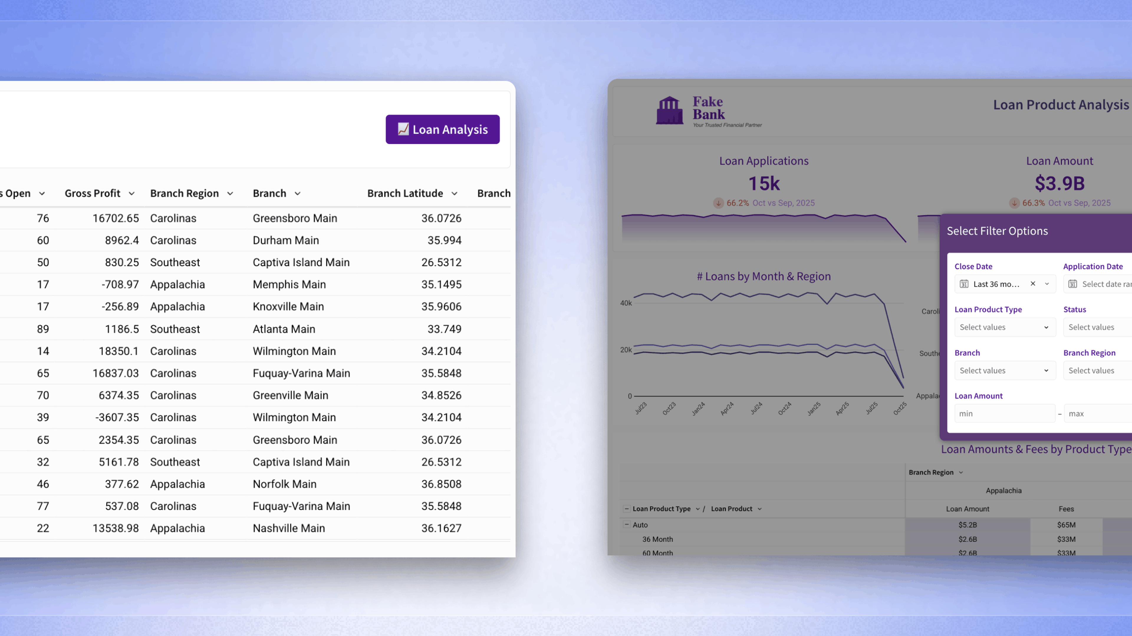
You’ll also want to think about how you’ll share the dashboard. Is simple sharing sufficient, or will you embed it into a webpage or third-party application? With Sigma, you can share or embed interactive dashboards in seconds.
Going Beyond the Dashboard
Dashboards are an important starting point in the data exploration process. But they’re just that — a starting point. As mentioned earlier, business teams must be able to explore the data and derive sufficient insights as soon as possible, if not on the same day.
Point-and-click dashboards limit users to a predefined set of business metrics. The result is surface-level reporting on historical data. Without involving the already overwhelmed BI team, there’s no ability to ask follow-up questions or see likely outcomes based on various scenarios. It’s easy to see why between 60% and 73% of all company data goes unused when traditional dashboards are the norm.
Today’s business teams need the ability to dig directly into data — often at the most granular level — to make decisions on-demand. Modern self-service analytics moves beyond the static dashboard and towards interactive dashboards that reveal real-time, highly relevant insights on the same day a question, request, or hypothesis Is submitted. The dashboard is being redefined as a BI and cloud data exploration tool that empowers even non-technical users to independently find answers to their pressing questions — without waiting on data teams.
Using Sigma Deep Dive to Power Data Exploration
When a team discovers an interesting trend in a dashboard, they usually want to know more. What’s driving the trend? What will happen to the trend if a variable changes? This is where chart drill-downs are essential. Drill-downs are interactive and allow you to explore data slices easily. Team members can click on a visualization and see hierarchies of data based on what they selected.
In Sigma, each visualization is tied to a worksheet. If you have follow-up questions, you can query the data directly to help you better understand what’s going on. Business teams can truly do their own analyses, exploring the underlying data in just a few clicks. With Sigma’s spreadsheet-like UI, team members can slice, dice, filter, and calculate data using the same format, functions, and formulas as traditional spreadsheets — empowering users to drill down to record-level detail without writing SQL or proprietary code.
Using Sigma’s intuitive dashboard builder allows anyone to build a powerful, flexible, and interactive dashboard in minutes, if not a day. And any of the underlying data in the dashboard worksheet can be accessed in a single click, making it easy to iterate and update your dashboard for whatever needs arise.