8 Best Practices for Dashboard Design with Excellent Examples
Table of Contents
.avif)
Data visualization is pivotal for finding trends and patterns in your data. Humans process visual information very quickly, and by chunking data into meaningful categories and displaying it visually, we are able to identify what stands out, find patterns that warrant additional investigation, and ultimately determine what actions we need to take.
Data visualization is both a science and an art. Many of the best practices are fundamental to good design, based on decades of research, and basically are non-negotiable (that’s the science). Other aspects are subjective and really depend upon your audience and purpose (that’s the art). When data visualizations are relevant, aesthetically appealing, easy to understand, and include relevant context and drill-downs, data becomes approachable and meaningful for people with all levels of data literacy.
In this blog, I will cover eight key data visualization best practices that you can apply to create reports and dashboards like a pro.
#1: Understand your audience
Before you begin any data visualization, ask your stakeholders some questions. Who are they? What level of data literacy do they have? What kinds of decisions do they need to make? How will your visualization help them with those decisions? How and when will they be using these visualizations?
The answers to these questions will help determine things like the metrics and chart types you include, if the layout is optimized for desktop, tablet, or phone, and the level of interactivity you provide. An executive who has 2 minutes to figure out how the company is performing this quarter compared to last quarter will need a much more curated, less interactive view than an analyst whose job it is to do root cause analysis.
Ideally, you have conversations with your audience before, during, and after you create visualizations to ensure your end product meets their needs and you aren’t making any false assumptions. I recommend writing down your audience personas to stay grounded in what you know about your stakeholders throughout the design process. It doesn’t have to be complicated; check out the example below.
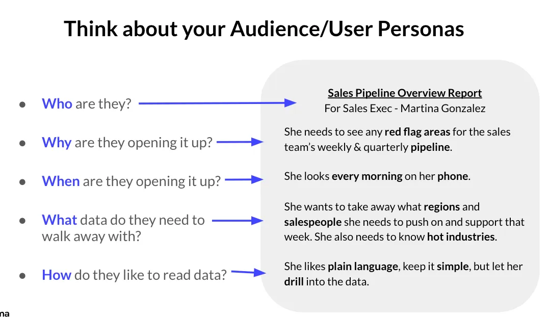
Image credit: Kaela Dickens
Keep in mind that it’s impossible to anticipate every question your stakeholders will have in advance. With Sigma, users can drill anywhere, view and explore underlying data, and bring their own data with CSV upload and input tables. This enables stakeholders to get the answers they need without the intensive prior planning required when using other BI solutions. However, it is still important to understand your audience’s needs and level of data literacy in order to build appropriate starting points for them.
#2: Choose the right chart for your message
Once you are ready to start visualizing, take it one visualization at a time and make sure each stands on its own as an effective way to communicate the data. A key part of this is choosing the right chart for your message. There are a lot of different visualizations to choose from and you don’t want to pick something just because it looks fun and artsy. Rather, choose the chart that most cleanly and clearly communicates the data. Keep in mind that humans are really good at distinguishing differences in length (think bar chart) and finding visual patterns in the data (think line chart or scatter plot) but not as good at distinguishing differences in area or angle (think pie and bubble charts). This shouldn’t be a surprise; is it easier for you to determine the length of a rectangular table or the area of a slice of pie?
There’s a plethora of resources out there to help you choose the right chart type. I recommend this one from Visual Vocabulary or the book I wrote with Kathy Rowell and Lindsay Betzendahl. But, if you find yourself using a lot of KPIs, bar charts, line charts, and tables with conditional formatting, you’re probably in good shape, as those are great chart types for the vast majority of situations.
- KPI Charts: Use a KPI chart to show big, high-priority metrics and how they’ve changed over time, specifically period over period.
- Bar Charts: Use a bar chart when you need to display how a metric varies across categories. Bar charts are great because they are easy and intuitive for people to understand and highly versatile. They can be adapted to compare multiple metrics across multiple categories and add reference lines for context.
- Line Charts: Use line charts to communicate how a metric has changed over time. Line charts are also very intuitive and easy for people to understand.
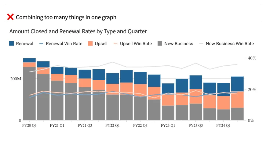
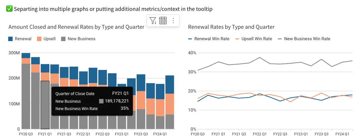
Keep in mind that trying to do too much with a single chart can be confusing. If you are combining different metrics with different scales on a single chart, it’s typically better to break them into different charts or provide the secondary metric in the tooltip or a table next to the chart; see the example below.
#3: Include meaningful context
Data is more meaningful and easier to understand when it includes relevant context. It’s helpful to know how we are performing today, but it’s even better to know how this compares to something like a target, how we performed during the same period last year, or the average across all units.
For example, suppose you were only to consider the revenue by product family, as shown in the chart below. In that case, you may conclude that party and celebration products are not performing well.

However, if you add the additional context of the prior year’s performance, we can see Party and Celebration has seen the greatest year-over-year growth of any product family by far.
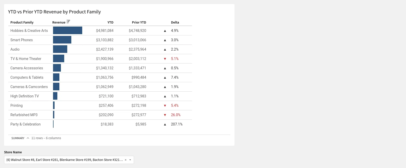
This added context changes the insights we take away from the visualization and, ultimately, the conclusions we draw and the next steps we take. Adding relevant and meaningful context to your visualizations wherever you can is one of the best ways to make them more meaningful and increase their impact.
#4: Take advantage of preattentive attributes.
At any point in time, humans have countless amounts of information coming in from their surroundings. We are hardwired to filter out most of it and just pay attention to what matters in a given moment. You are reading this sentence right now, but if a fire truck were to drive by outside your window with its flashing lights and siren, it would undoubtedly draw your attention away.
Preattentive attributes are visual elements our brain notices before we are even cognizant of them. They are illustrated in the visualization from MedeAnalytics below. The ones most relevant for data visualization are length, size, position, color hue, and color intensity.
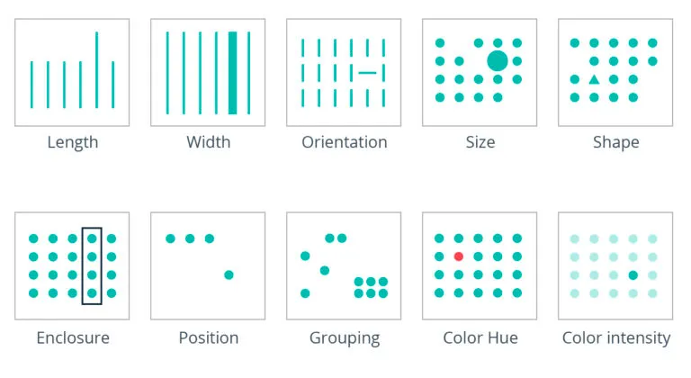
Preattentive attributes are powerful for saying, “Hey, look here!” and calling attention to important data points needing user attention. However, not all are created equal. For instance, color is more apparent than shape.
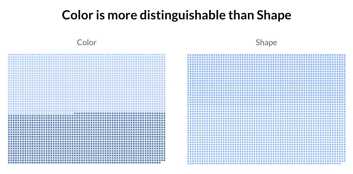
Image credit: Stacey Roberson
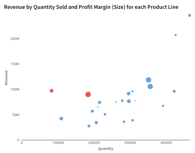
Also, keep in mind that more is not always better; preattentive attributes can lose their impact when multiple types are used in tandem to emphasize different things. Consider the scatter plot below: 3 different preattentive attributes are used:
- Position to plot revenue by quantity
- Size according to profit margin
- Color intensity to distinguish product lines with an average price below $200
The result is that none of the points stand out. Your brain doesn’t know if it should pay attention to the red dots (low average price), the large dots (higher profit margin), or the outliers in the top- right. This is because the preattentive attributes are competing with one another.
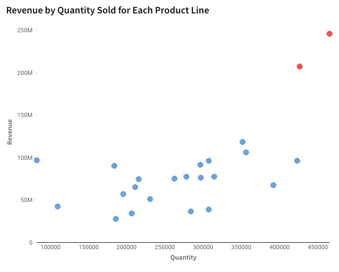
Conversely, if we simplify and use preattentive attributes to highlight the one thing we want the user to focus on, now position and color are working together to draw our eye to the two outliers in the top-right.
Also, notice how I used the preattentive attribute of color in section 3 above to draw your attention to the product families with decreasing year-over-year revenue.
#5: Use color to convey meaning
Color is not arbitrary, and my recommendation for color is similar to choosing the right chart type for your message. Don’t add color just to make your visualizations look fun and artsy; use it to impart meaning. Remember, color is a preattentive attribute and one of the most important tools for emphasizing the data points that need our user’s attention.
Here are some helpful tips for using color:
- Use it sparingly and keep things simple; when you highlight everything, you highlight nothing.
- If color means something on your dashboard (e.g., success, risk, or a specific metric or category of data), keep it consistent across your workbook.
- Avoid the redundant use of color.
Examples of the redundant use of color are shown below. In the first bar chart, each color represents a different county, which is unnecessary since each bar is already directly labeled with the county it represents. In the second bar chart, each bar is colored according to the population size. This is also unnecessary because the length of the bar represents the population size. In the 3rd bar chart, color is used to highlight the counties that have shrunk since the prior year, which is an example of meaningful and non-redundant color use.

Also, it is important to know a little color theory before using color for your data visualizations. Hue is the part of the rainbow a color sits on, and saturation is the intensity of a color.
- Want a different feel? Change the hue.
- Want something less intense? Add gray.
- Want something brighter? Add white.
- Want something with more weight? Add black.
If we don't use our knowledge here, it's easy to end up with a lot of colors with equal weight, all asking for the same attention instead of using color to point out something different or important. Think about what insight a person should get from the visualization, then make it easy for them to get that insight.
When using color to represent different categories of data on visualizations such as line charts or stacked bar charts, try not to use more than a handful of colors. Interpreting a chart with a color legend requires users to store information about what each color represents in their short-term memory. And it is really difficult to do so for more than a few categories at a time. So, if the field you want to color on has several categories, try grouping some of them together. What’s great about Sigma is that you could even allow your end user to group the categories in a way that’s meaningful to them.
#6: Minimize noise and non-data ink
Edward Tufte introduced the concept of data-ink in his book, The Visual Display of Quantitative Information, in 1983. He defined data-ink as the “non-erasable core of the graphic” and recommended minimizing non-data-ink and redundant data-ink, thus increasing the data-ink ratio.
Examples of data-ink include - this is the ink you want to keep:
- The bars of a bar chart
- The lines of a line chart
- The dots on a scatter plot
Examples of non-data ink - this is the ink you want to minimize, within reason:
- Chart titles
- Data labels
- Legends
- Borders
- Gridlines
- Axes
- Axes labels
- Background shading
- Overly-precise numbers
Of course, in many cases, you cannot remove these elements altogether because they provide vital information and context to the visualization. However, you can minimize their weight by lightening up the font color, avoiding big, bold fonts, and rounding value labels to meaningful units. And you can remove redundancies. For instance, if you directly label the bars on a bar chart with their values, you don’t need an axis with grid lines, and vice-versa. Below is an example of a chart with lots of non-data ink on the left and an optimized data-ink ratio on the right.
Regardless of the chart type you have, remember that part of the reason we visualize data is to chunk hundreds to billions of data points into a manageable number of groups. If your visualization has too many groups of data, it gets messy and hard to interpret. Also, if you’re associating each group with a color, users have to do a lot of work to match each category to its color and then store that in their short-term memory.
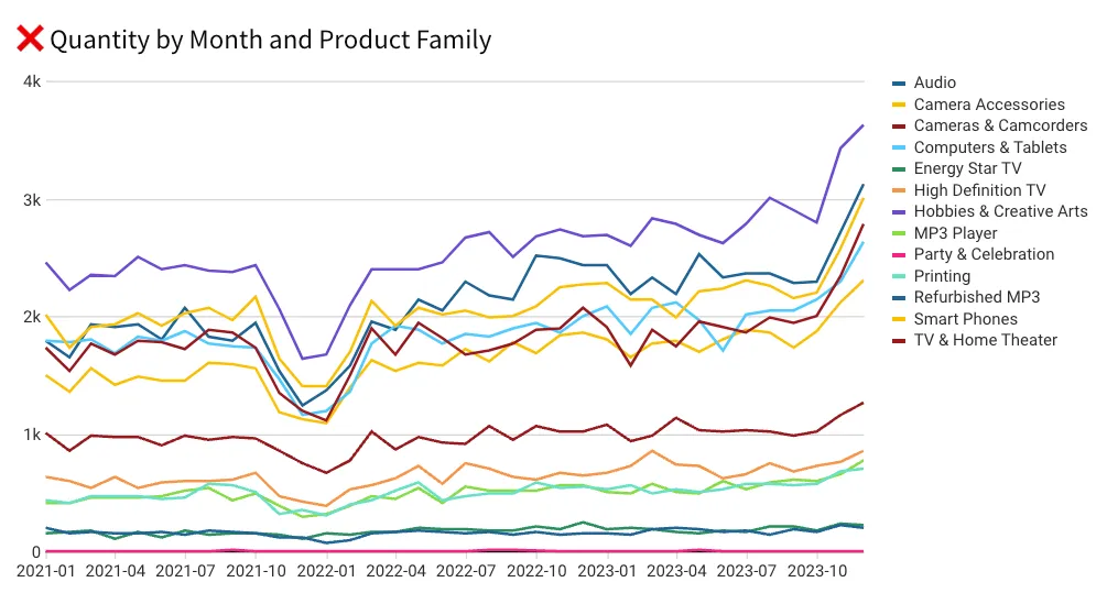
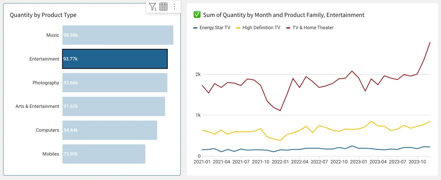
It gets messy and hard to ask someone to find a meaningful pattern when there are more than seven categories of data. If you have a dimension with more than seven different values that you want to put on color, I recommend grouping some of the values together into fewer categories or creating a drill or filtering sequence to narrow the number shown at any given time.
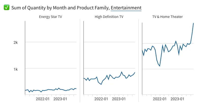
Also, remember that small multiples are a great way to directly label the data instead of asking your user to rely on a legend.
#7: Arrange elements in a meaningful way
People tend to read top-to-bottom, right to left. Keep this in mind when arranging your dashboard: the most important real estate is in the top-left corner of the page. Try to tell a story with your data, with important summaries at the top, and additional pertinent details as the user scrolls down.
#8: Provide access to next-level insights and underlying data
Humans are not capable of finding patterns in a 500-million-row table, or even a 500-row table, for that matter. This is why we visualize data to begin with. However, once we identify something of interest from a visualization, we will need to drill down to get those 2nd, 3rd, and 4th-level insights to figure out what’s driving the numbers. Eventually, we will want to see the underlying details for the subset of data relevant to what we learned in order to find the root cause. So, just as we needed the aggregated visualization to make sense of the granular data, we also ended up needing access to the granular data to make sense of the aggregated visualization.
A business intelligence tool like Sigma allows end users to drill into any field and view underlying data out of the box. This means people can get the additional context and details to fully understand the data and answer new questions without needing to anticipate all the questions they may want to ask in advance. Not only does this drastically reduce requirements gathering, development time, and iterations, but it also leads to a truly actionable dashboard.
Bringing it all together: Creating impactful and engaging dashboards
Mastering the art and science of data visualization through thoughtful dashboard design is essential for effectively communicating data insights. By understanding your audience, selecting the right chart types, incorporating meaningful context, utilizing preattentive attributes, and using color strategically, you can make your visualizations more impactful and accessible. Minimizing noise, arranging elements purposefully, and providing access to detailed data further enhance the clarity and functionality of your dashboards.
Following these best practices will help you create dashboards that look professional, drive better decision-making, and deepen understanding. Implement these strategies to transform your data into actionable insights, ensuring your visualizations are informative, engaging, and intuitive.


