Sales Dashboard Examples

Sales dashboards serve as centralized hubs that consolidate and present essential sales data from different sources; for example, customer relationship management systems, marketing platforms, and financial records. They offer a comprehensive view of sales performance across different dimensions, including revenue, customer acquisition, conversion rates, pipeline status, and more. By leveraging interactive charts, graphs, and customizable visualizations, sales dashboards transform raw data into meaningful insights, highlighting patterns, outliers, and correlations that would otherwise be difficult to discern.
With the ability to drill down into granular details or zoom out for a broader perspective, sales dashboards allow users to explore data from different angles and uncover actionable insights that can drive revenue growth and strategic decision making.
By transforming complex data into visual representations, sales dashboards empower businesses to optimize their sales processes, drive revenue growth, and stay ahead in a competitive market.
What Is a Sales Dashboard?
A sales dashboard typically displays key performance indicators (KPIs) that are relevant to sales operations, such as total sales, revenue, average deal size, win/loss ratio, conversion rates, sales team performance, and pipeline status. These KPIs help users understand sales trends, areas of improvement, and track performance against targets.
A sales dashboard consolidates sales data, presents it in an easily digestible format, and provides insights into sales performance, enabling organizations to monitor, analyze, and optimize their sales operations. At the same time, a properly designed sales dashboard should not limit the user from exploring as deep as they want, to the lowest level of granularity they are interested in, regardless of the scale of the data.
Why Are Sales Dashboards Important?
By harnessing the power of analytics and business intelligence, sales dashboards offer the following benefits:
- Data-Driven Decision Making: Sales dashboards provide real-time access to crucial sales data and insights, allowing businesses to make informed decisions based on accurate and up-to-date information. It's a quick way to visually display your progress, by having a clear view of sales performance, trends, and metrics. Organizations can identify patterns, spot opportunities, and take proactive measures to drive revenue growth.
- Performance Monitoring and Accountability: Sales dashboards enable organizations to monitor and track key performance indicators (KPIs) related to sales, informing sales leaders about issues or action items that require immediate attention. With transparent visibility into sales metrics, it becomes easier to reward high performers, provide targeted coaching or training, and address areas that require improvement.
- Identifying Trends and Patterns: Sales dashboards provide visual representations of sales data, making it easier to identify trends, patterns, and correlations that may not be apparent when examining raw data. By spotting these trends, organizations can adjust their sales strategies, target specific customer segments, and capitalize on emerging opportunities.
- Enhanced Sales Efficiency: Sales dashboards enable organizations to optimize their sales processes and improve efficiency. By monitoring metrics such as conversion rates, sales cycle length, and pipeline status, businesses can identify bottlenecks, streamline workflows, and make data-driven decisions to improve overall sales performance. This leads to better resource allocation, increased productivity, and reduced sales cycle times, which ultimately leads to more revenue for the business.
Examples of Sales Dashboards
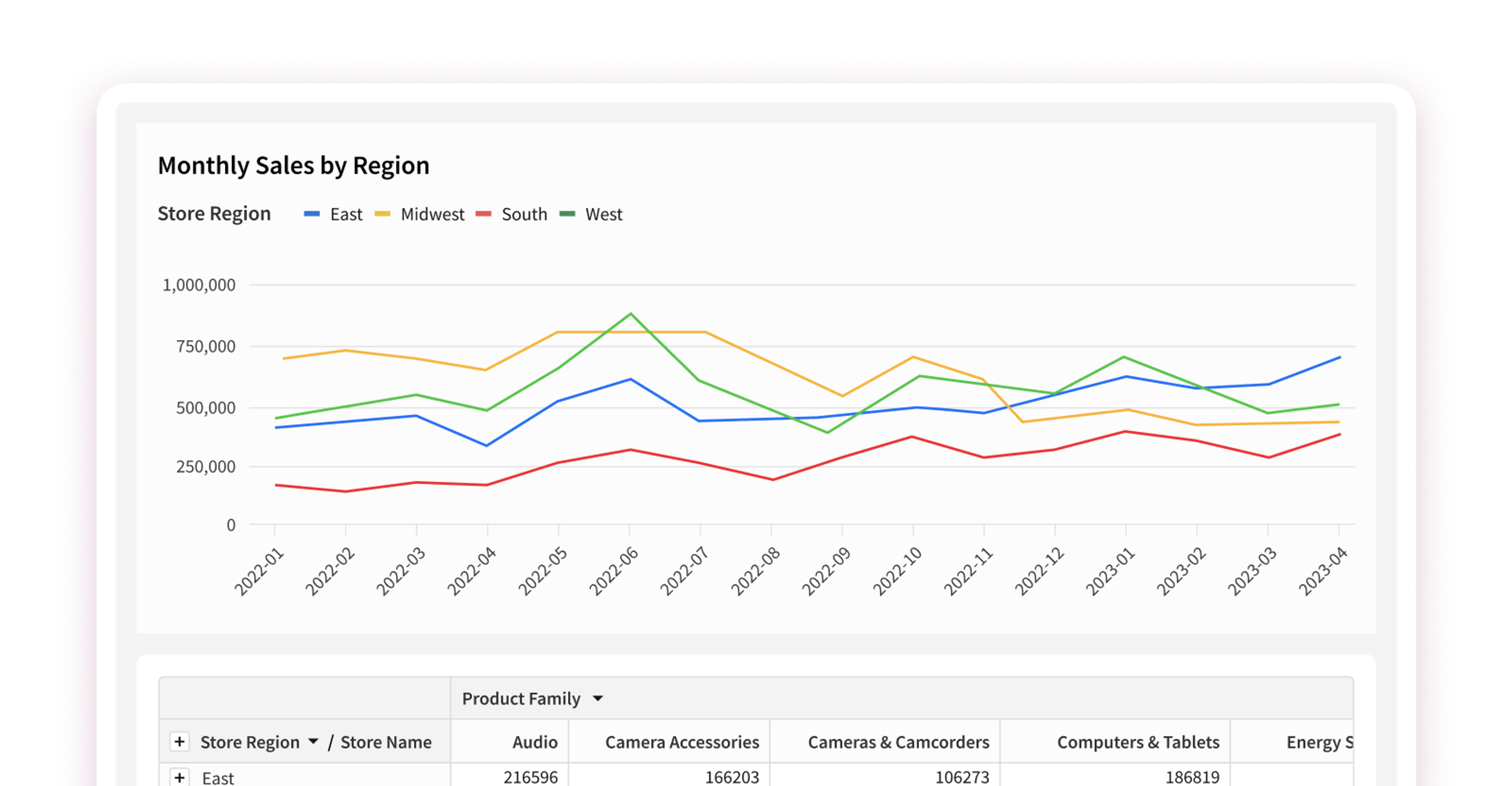
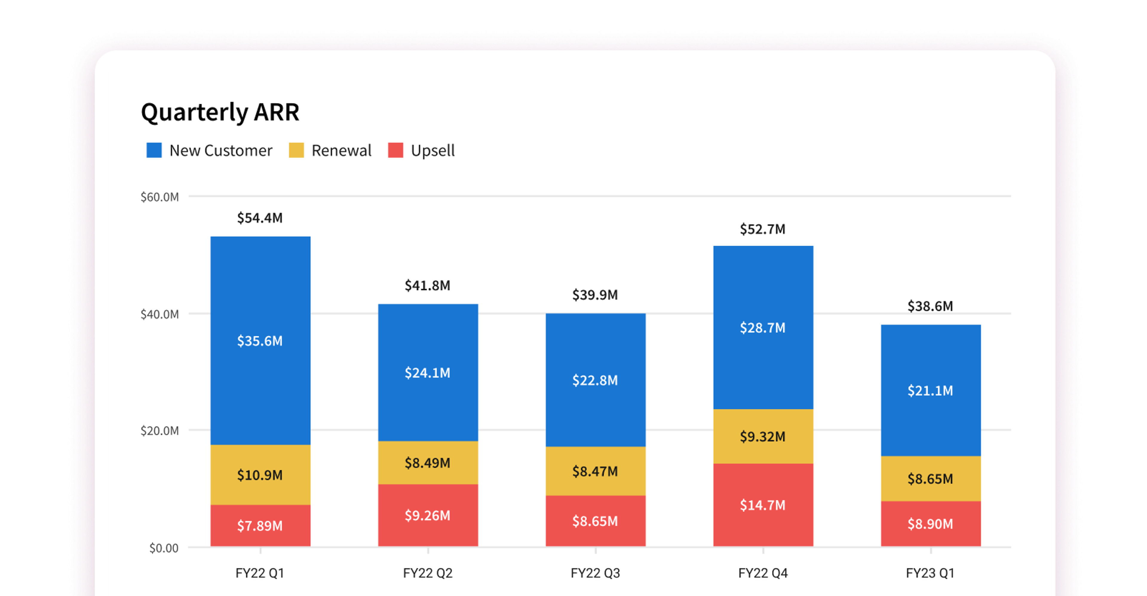
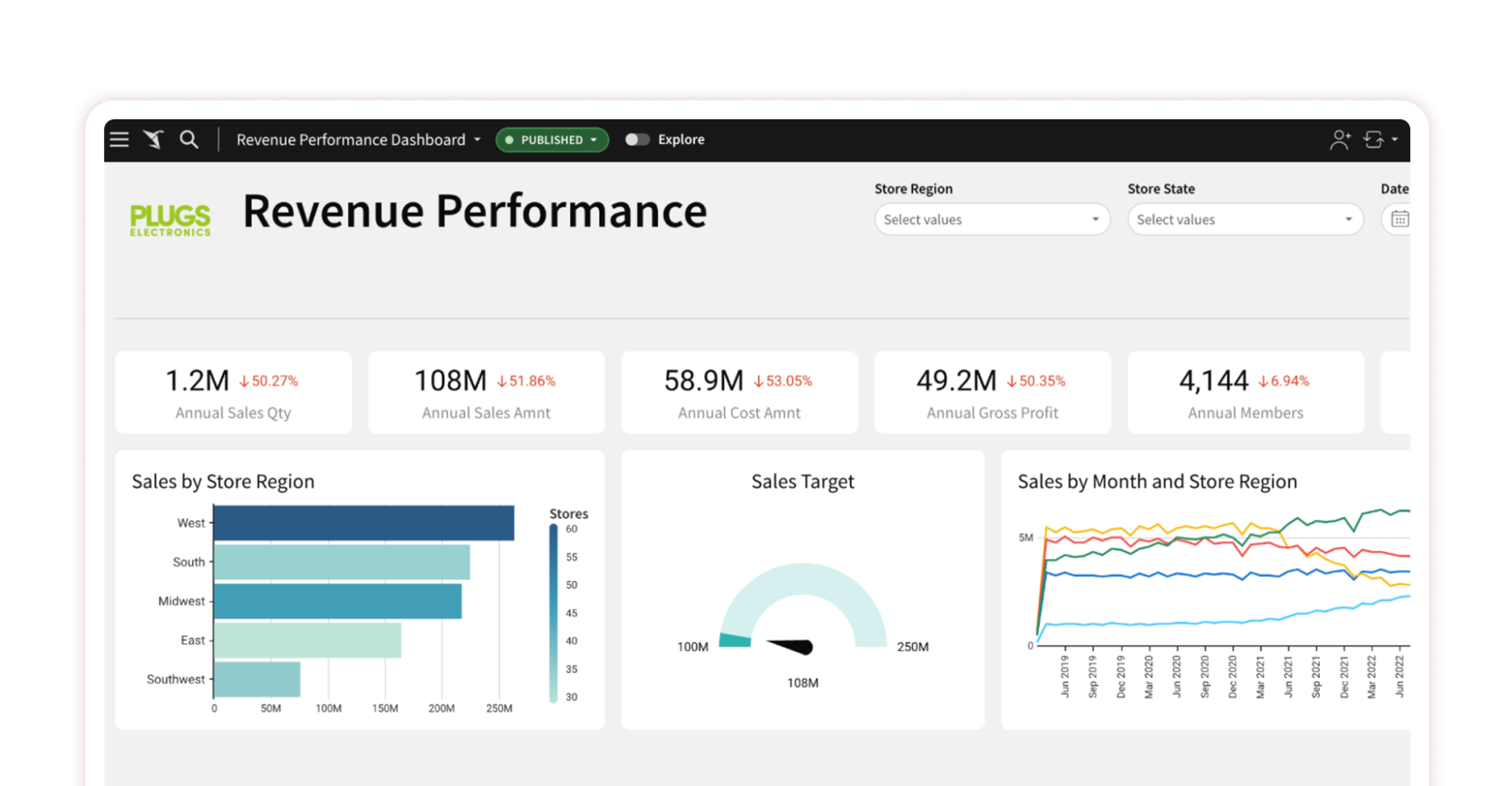
Revenue Performance Sales Dashboard:
This sales dashboard example provides an overview of key revenue-related metrics, such as quarterly and annual sales performance against targets, new customer growth, as well as cost metrics. It helps organizations track their overall revenue performance and identify areas for growth or improvement. Users are able to interact with the sales dashboard by applying various filters and drilling down to explore as deeply as they want, without regard for the scale of the data.
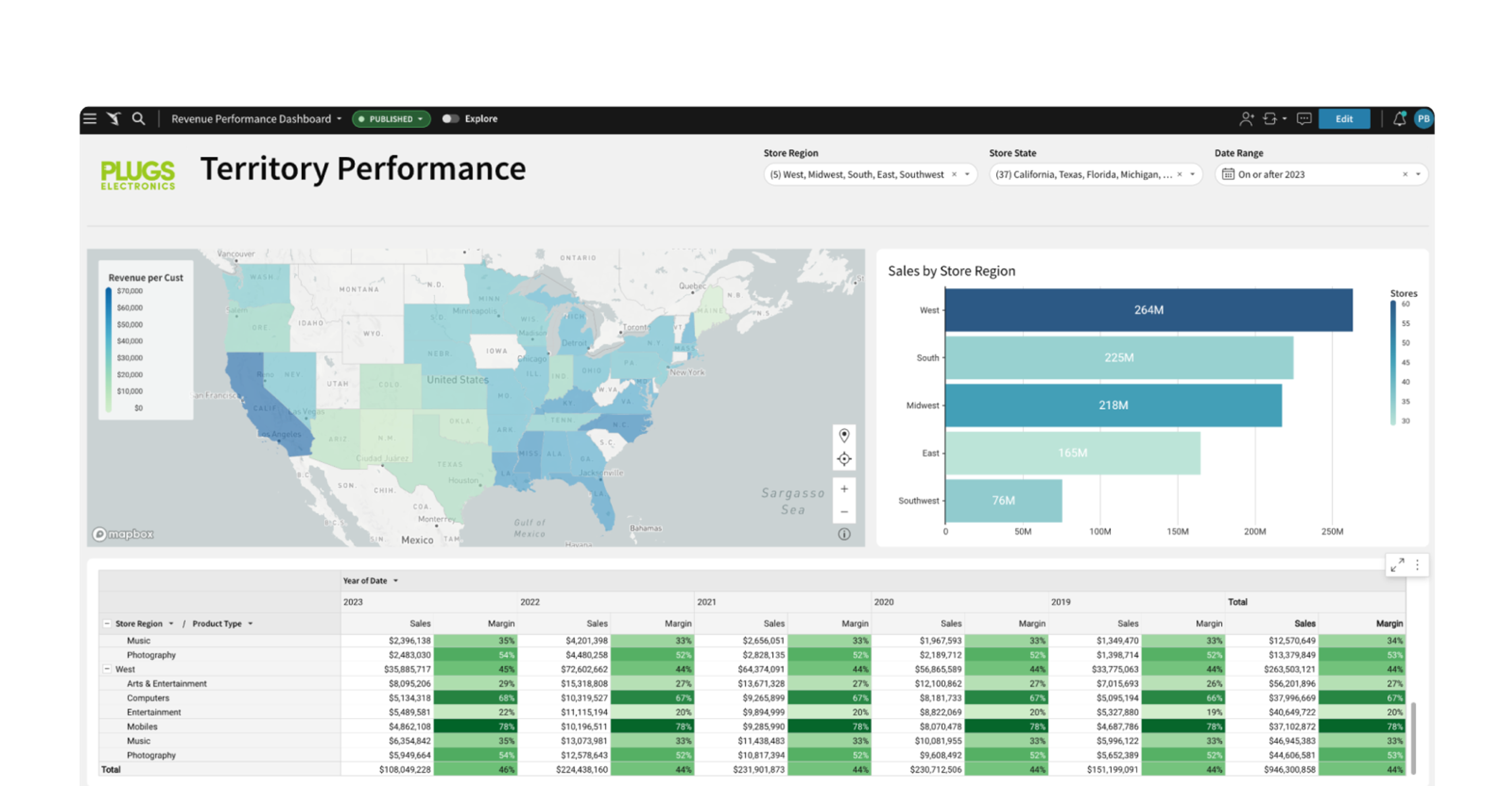
Sales Territory Performance Dashboard:
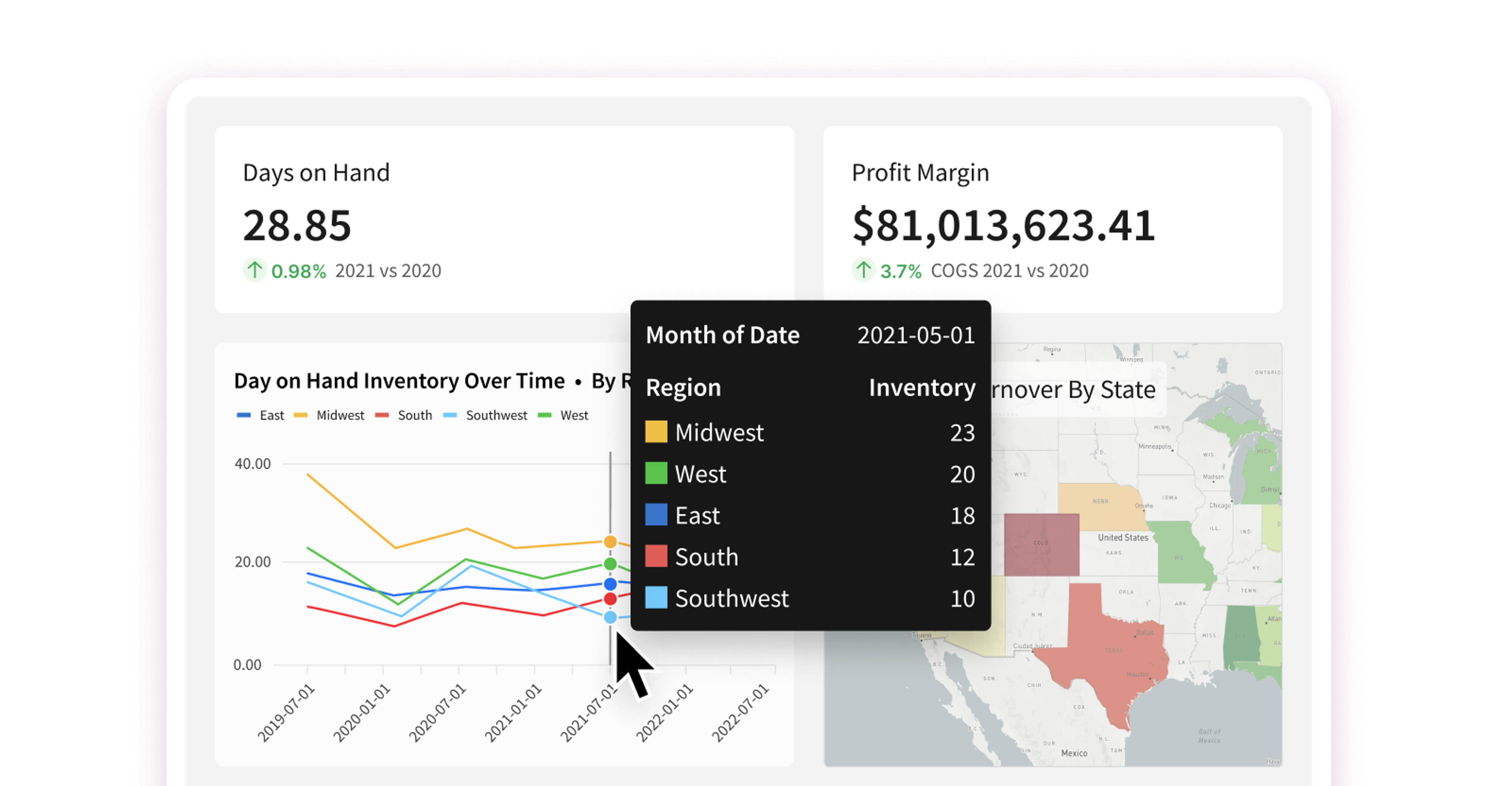
Sales teams often divide up their areas of focus by territories, which usually correlate to a specific geographic location. This sales dashboard example provides a geographic view of sales performance, using maps, charts, and tables along with colors to draw the user’s eyes to outliers. It helps organizations understand the performance of different sales regions, identify high-potential areas, and allocate resources effectively. For example, we can quickly see that the Southwest store region has significantly fewer stores than other regions. At the same time, we see that revenue per customer is highest in a few key states.
Sales Forecast Planning Dashboard:
Sales managers often struggle with ever-changing market conditions that impact revenue projections. Static sales dashboards usually provide information about “what has already happened” and “what sales teams are saying will happen”. In this next sales dashboard example, we show how the sales manager can be given the ability to run “what if” modeling directly, by entering their own data value alongside reported sales data. This is often called scenario modeling.
In the example below, an Input Table allows the user to review the current and next year's forecast for their territory, but also allows them to experiment with the impact of a potential overachievement or shortfall. This "what-if-analysis" helps make critical decisions easier. Corporate governance is maintained since the source data does not change, but the user still can see the potential impact of their projections on each territory.
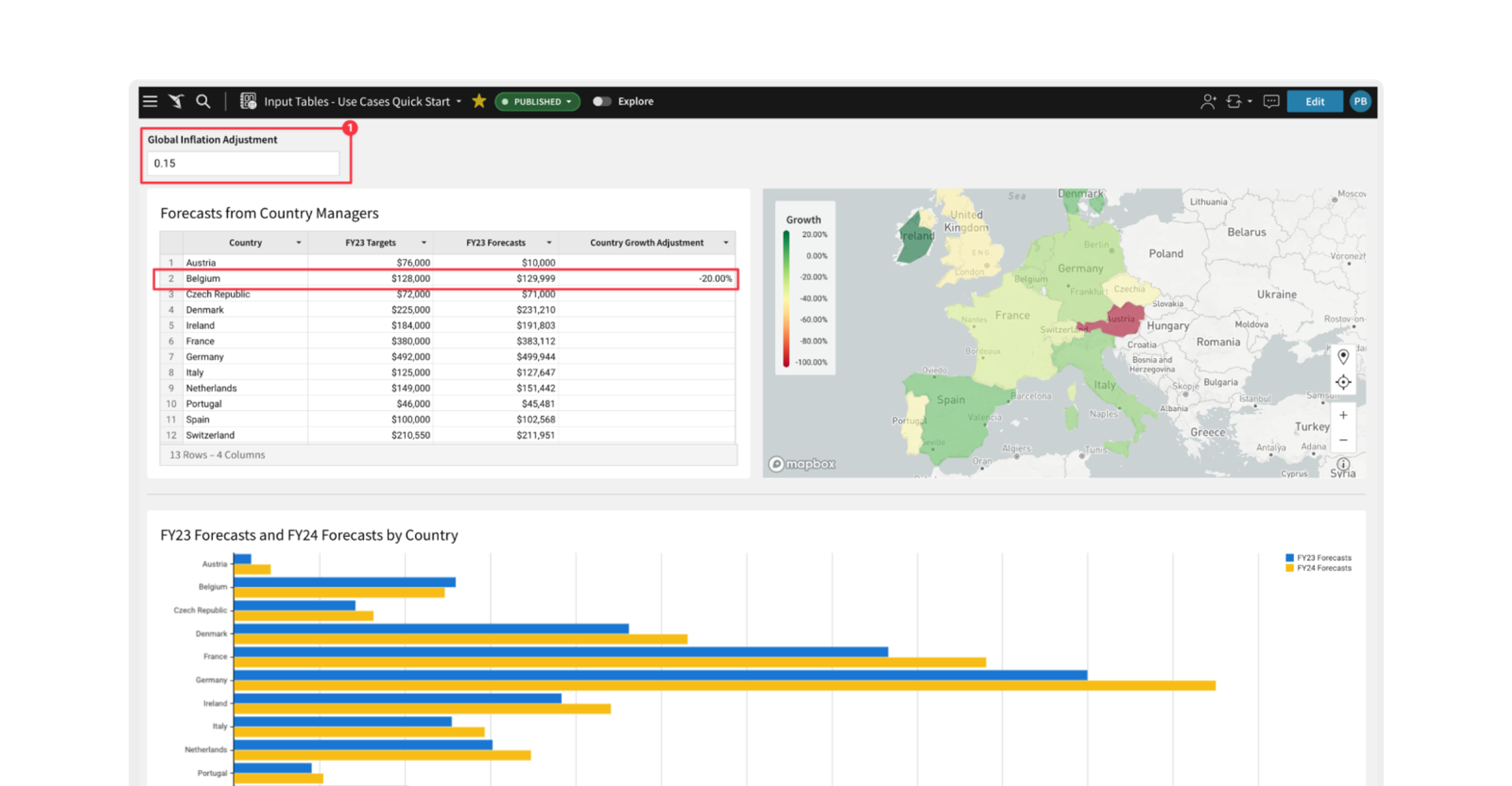
To learn more about this advanced functionality and how customers are using it today, click here.
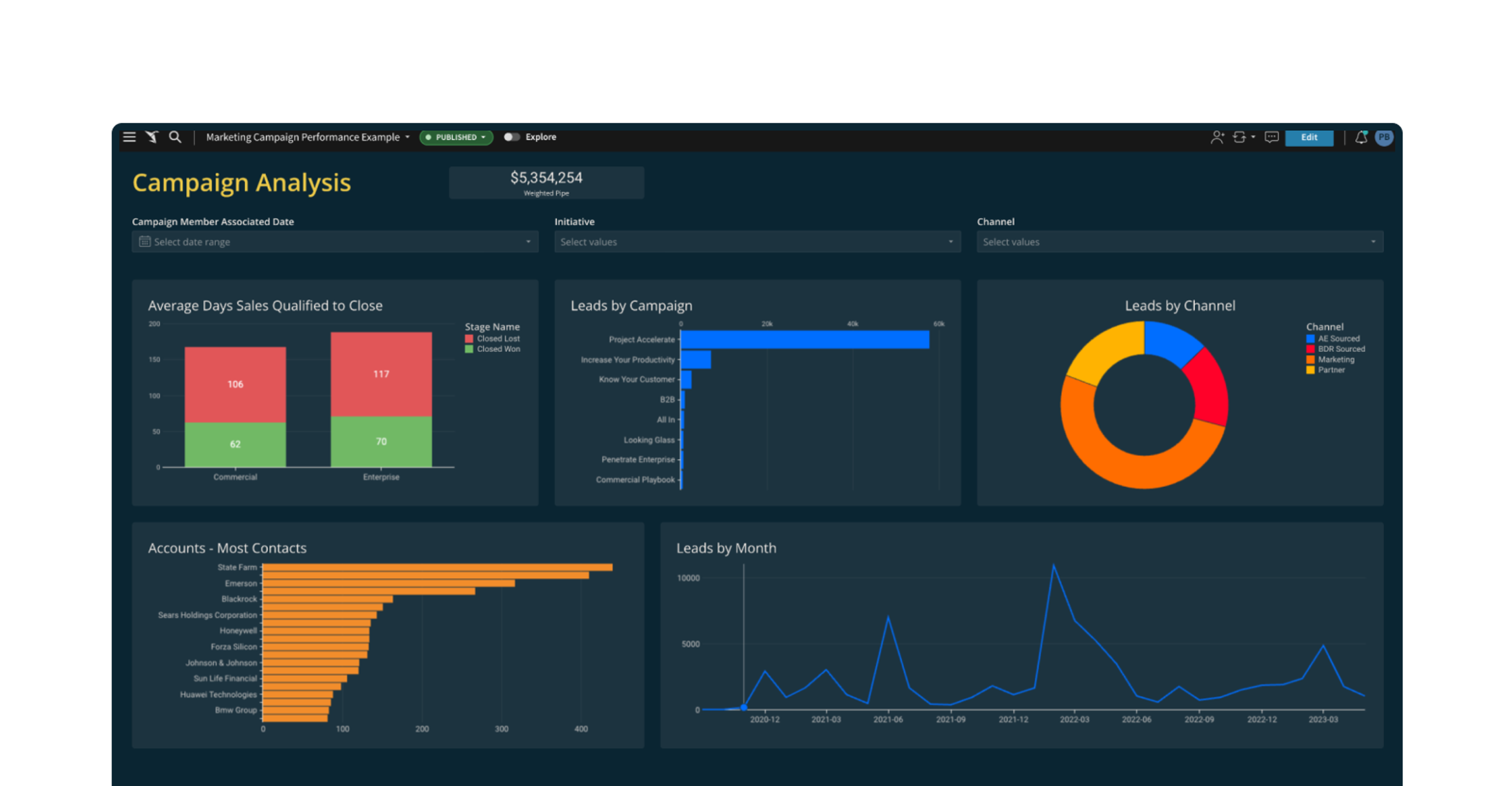
Marketing Campaign Analysis Dashboard:
This sales dashboard example focuses on customer lead-related metrics, such as sales qualification to close, lead counts, lead sources, account contacts, and leads by month. It helps organizations gain insights into how well their lead generation campaigns are doing, which ones have the greatest impact, and in which area of their business, such as commercial vs. enterprise in this example.
These are just a few examples of how sales dashboards can be customized to fit the specific needs and goals of an organization. The key is to focus on the relevant sales metrics and visualizations that provide actionable insights and support decision-making processes for your business.
How to Create a Sales Dashboard
When starting a new sales dashboard project, you should consider these general steps:
1) Define Objectives and Requirements:
Clearly define the objectives of your sales dashboard project. Identify the specific metrics, KPIs, and insights you want to track and visualize. Consider the requirements of your stakeholders, such as sales managers, executives, and sales representatives. Determine the data sources you need to integrate into the dashboard.
2) Gather and Prepare Data:
Collect the necessary data from your sales systems, CRM platforms, marketing tools, or other relevant sources. Ensure the data is clean, accurate, and properly structured for analysis. If required, perform data cleansing, transformation, and integration tasks to create a unified dataset that can be easily used in Sigma or other tools.
3) Select a Vendor:
Get acquainted with the business intelligence and analytics platform and its features. Understand how to connect to data sources, create calculations, build visualizations, and design interactive dashboards. Explore the available functionalities and capabilities to determine the best approach for your sales dashboard project.
PRO TIP: Contact the vendor's support desk and see what the response time is. You don’t want to find out later that you can’t get the support you need when questions or problems arise.
4) Run a Proof of Value:
Make certain that the product does what it advertises, can work at the scale of your data, and your end-user community is involved in the process. By engaging the business users early, you ensure that they will more readily accept and use the selected vendor once in production.
5) Integrate and Refine Data Visualizations:
Connect your prepared data to the dashboard, either by importing or connecting directly to the data source. Ensure that the data is correctly mapped to the relevant visualizations and that the dashboard is responsive to real-time updates, at scale. Then, fine-tune the visualizations, colors, and labels to ensure clarity and readability.
6) Test and Validate:
Thoroughly test the dashboard to ensure it accurately represents the desired sales metrics and insights. Validate the accuracy of calculations, data mappings, and any interactive elements. Solicit feedback from stakeholders and make necessary refinements or adjustments based on their input.
7) Deploy and Share:
Once the sales dashboard is finalized and validated, deploy it to the intended users. The selected tools should have a security model that matches your organization's needs while being flexible enough to allow your users to have roles that support their needs too. Consider creating user roles and permissions to control access and ensure data security. A good solution will require minimal end-user training on how to interact with and interpret the dashboard effectively.
8) Monitor and Iterate:
Continuously monitor the usage and effectiveness of the sales dashboard. The selected vendor should have built-in metrics for usage reporting.
Regularly update and iterate on the dashboard based on evolving business needs and changing requirements.
Start Building Your Sales Dashboards With Sigma
Sigma’s unique approach to analytics makes it easy for business users to create a variety of sales dashboards while adhering to your organization's security and governance models. Sigma’s fundamental value proposition aligns with the value proposition discussed earlier along with several others:
- Spreadsheet-like interface means users are comfortable, need less training, and user adoption is high.
- Connects instantly to your cloud data warehouse.
- Is performant, even at massive data scale.
- Eliminates the need to export data; users can collaborate directly in a shared browser session.
- Nothing to install, works in any browser.
There are many other things that customers love about Sigma, but feel free to try it for yourself and see with a free trial or a live demo.