Why Data Analysts Aren’t Just Report Writers

Data analysts are suffering under the burden of report writing
I spent most of my last five years knee-deep in building and maintaining BI reports. I’m a big picture person, but tell me to take lines of data and make them into a pretty picture and I’ll hunker down for hours, days, and even weeks to paint the exact picture you want and need.
But even after launching my dashboard into production, the work continued. My beautifully curated report would answer a lot of my users’ questions, but they would still come up with new questions, endless calls for enhancements, and urgent requests for exports of the data.
This cycle reveals a key problem with traditional BI—analysts are suffering under the burden of report writing and maintenance, rather than getting to strategically improve the business.
Ideally a dashboard would be the end-all-be-all. But when you’re dealing with the complexity of real life, real business, and real customers, you quickly reach a scale of sliced-and-diced metrics that is impossible to satisfy with a one-size-fits-all report.
Fortunately, there’s a better way to put the right information in your users’ hands. By pairing best-in-class data visualization with row-level data access in Sigma, people can get what they need and the data analysts can be relieved of the neverending burden of report writing.
Read more about what sets Sigma apart from Tableau.
Eliminating the Cycle of Questions
There are ways to eliminate the endless cycle of questions and climb out from under neverending report writing.. Here’s how.
Build the 80% so people can customize their 20%.
Most great dashboards answer about 80% of the questions users will have. As an analyst, you’ve labored over those questions, poured blood sweat and tears into finding the perfect visualizations, tweaked and checked all of the filters, created customized parameters and navigation, and made the fonts and colors just right. No matter how good of a designer you are, that 80% is as good as it gets, and then beyond that comes the agonizing bottleneck of customizations and exports.
But in Sigma, your users get to go beyond your dashboard and follow their curiosity by turning on Explore mode, drilling down, viewing underlying data, or saving their own version with their own adapted charts. As long as you create a great foundational 80%, users can fill in their own personal 20% with very little overhead.
The business isn’t able to get their answers because they’re locked behind your dashboard functionality.
How can you capitalize on this as a Sigma Creator? Make a great foundational report as a jumping off point for your users. This means going through your usual discovery process, developing iterative design, focusing on aesthetics and usability, but also thinking about the customizations your users will want. You can:
- Set up drill down paths
- Clean up the underlying data so the columns are easy for anyone to drag and drop into charts and tables
- Create column definitions and governed Metrics for general consumption
- Provision your users accordingly so they can View or Explore your dashboard
- Train your users to fearlessly bring their Excel skills into Sigma for a secure, performant, beautiful ad-hoc analysis experience.
If you’ve done the 80%, the 20% not only becomes possible, but also streamlined and seamless. Say goodbye to emails asking for exports or URGENT asks for a dashboard enhancement - your foundational dashboard will set your users up for more success in slicing your visualizations and data however they need.
Read a thoughtful catalog of the Sigma Visual Library.

Sigma is investing tons of time this year into making our visuals best-in-class. I’m all for self-service analytics, but when I see some of the stuff that (very smart) business users put up on Powerpoint slides, I shudder. Many users are more concerned with getting their perfect numbers into a Powerpoint and forget to make sure that the visuals enhance the data communication, rather than muddle it. Let’s make the visual part so easy that users don’t have to think about it—it just looks great from the start.
Sigma sets your team for success with:
- Centrally-governed color templates that all your users can access
- Custom branding settings for your organization, so you can ensure your users are following brand guidelines and visual best practices
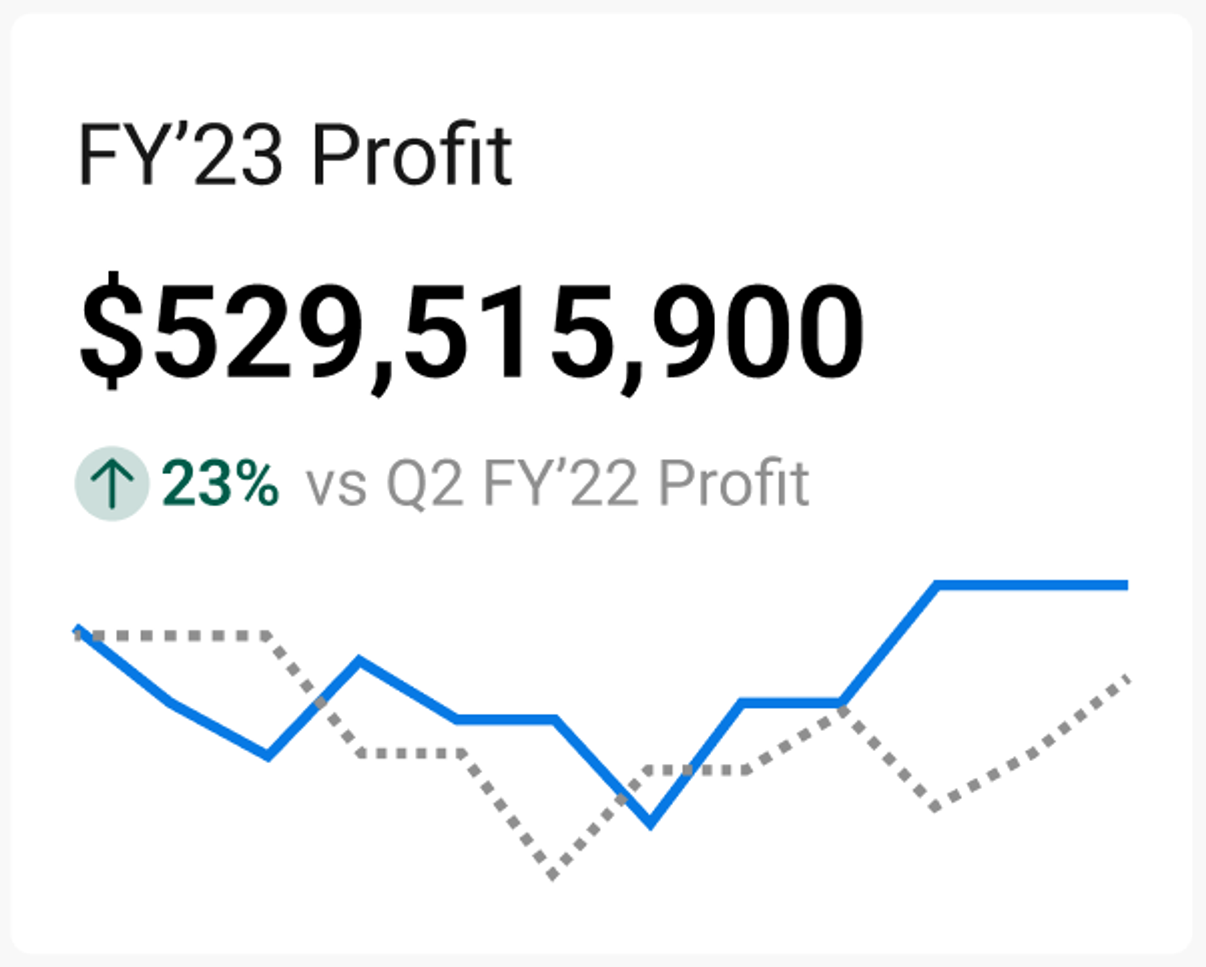
- Gorgeous visualizations, including our new KPI chart, which seamlessly incorporates traditional KPIs with period-over-period comparisons, automated trendlines, and clean-cut labeling
- Our super easy-to-use interface, so users don’t have to make their own charts from scratch, but they can adapt yours instead
Sigma makes the visualization part easy so that your business teams can focus on the numbers. When the visualizations look good, the BI team looks good, no matter who made them.
Read more about Sigma’s data visualizations.

I know from experience that enhancement requests not only take up time for data analysts, but also they block business users from getting what they need. It’s easy to get bogged down in negotiating which enhancements are actually worth it, which ones are too custom, and then spending all kinds of time planning them into a sprint. Meanwhile, the business isn’t able to get their answers because they’re locked behind your dashboard functionality.
Using Sigma as your BI tool dramatically frees up your time as a developer so you can focus on the strategic parts of your job instead of fulfilling enhancement requests. Just imagine—instead of tweaking your dashboards you could be…
- Exploring new data sources for leveraging
- Conducting new strategic analyses for a neglected arm of your business
- Cleaning up your data pipelines
- R&D… seriously
- Figuring out how to monetize your awesome analytics with customers
- Running an internal user group to equip your power users and inspire new users
- Actually taking those15 minute walk-breaks.
In short, Sigma provides a better way for data analysts to leverage data viz to solve the cycle of questions. The end of report writing is not as far off as you may think.