How to Build an Accounts Payable Dashboard

Your finance team has all the data points it needs to manage payables: invoices, due dates, balances, vendor history, and approval status. That data sits scattered across the ERP, the accounts payable (AP) automation platform, and spreadsheets that get emailed around. Nobody sees the full picture until month-end, and by then, discounts have expired, exceptions have compounded, and a vendor has already called about a late payment.
An accounts payable dashboard ends that blind spot, but only when it focuses on the decisions the AP team makes every day.
Key takeaways
- Build an AP dashboard around AP decisions. The signals worth surfacing are usually the ones that change what the team does in the next hour, such as aging buckets, days payable outstanding, and upcoming cash outflow.
- An AP dashboard is more likely to be used frequently when it runs on live warehouse data. A day-old view can send the AP team back to phone calls and ad hoc exports.
- AP data is sensitive, and segregation of duties matters. The dashboards that hold up under audit tend to inherit row-level security and access controls from the warehouse at query time.
What is an accounts payable dashboard?
An accounts payable dashboard is a single interactive view that pulls open invoices, due dates, balances, and payment statuses from your accounting systems. It keeps them up to date, so the AP team can see the state of payables at any moment instead of waiting for a month-end summary.
An accounts payable dashboard can also bring together current operational signals and historical performance context in one place. When an invoice is stuck in approval, it shows up immediately. When a vendor’s balance crosses a threshold, it’s visible before anyone has to ask.
Accounts payable dashboard vs. accounts payable report
An accounts payable report and an accounts payable dashboard cover similar ground but solve different problems across financial processes, operations, and documentation.
- An accounts payable report usually captures a point-in-time snapshot: AP aging at period end, vendor payment history, and liability summaries for the close. An accounts payable dashboard reflects current activity: invoices moving through approval, due dates approaching, and exceptions accumulating over time.
- Reports are usually read-only, while dashboards let users filter by vendor, drill from an aging bucket into the underlying invoices, and sort by amount or days overdue.
- Reports are helpful for audit documentation, or compliance board reporting. Dashboards help the team catch operational issues while there’s still time to act, before discount windows close or exceptions continue to build.
The practical takeaway is that most AP teams need both an accounts payable dashboard and accounts payable reports. Reports are artifacts of record for the close, the audit, and the board pack. The dashboard is the artifact the team works from in between those reporting cycles.
6 things to include in an accounts payable dashboard
The strongest AP dashboards are intentionally narrow to isolate the handful of signals that actually change what the team does that day: which invoices to escalate, which payments to release, and which vendors to call.
1. Aging buckets
Aging buckets show what’s overdue before it turns into a late fee or a strained vendor relationship. Organize payables by overdue period: current, 30 days, 60 days, and 90 days or more. The bucket for invoices overdue by 90 days or more gets the most attention, but the 30-day bucket is where intervention often has the most impact.
2. Days payable outstanding (DPO)
DPO shows how well you’re balancing cash on hand against what you owe. The DPO formula = (Accounts Payable / Cost of Goods Sold) x Number of Days. Targets vary by industry and company size. Too high and you’re putting pressure on vendor relationships. Too low and you’re giving up cash you could be holding.
3. Upcoming cash outflow
Upcoming cash outflow shows what’s due and when, so finance can plan payments. Group invoices by payment date for the next seven, 14, and 30 days. This view lets treasury time payment run against actual cash flow patterns rather than arbitrary schedules, and it surfaces early payment discount windows before they close.
4. Invoice status and approval stage
Invoice status and approval stage surface where processing stalls. Track invoices by status: received, in approval, approved, paid, and on hold. Approval routing is part of AP workflow automation, so the approval stage view helps show where extra days can accumulate.
5. Exceptions and discrepancies
Exceptions and discrepancies flag duplicate invoices and matching issues before they cause problems. Duplicate invoices or payment errors can lead to avoidable costs when the team doesn’t closely monitor exceptions. An exception view grouped by vendor, invoice type, or approver turns a hidden cost center into a targeted process fix.
6. Vendor and spend concentration
Vendor and spend concentration flag risk and negotiation strength. Show where spend and outstanding balances are concentrated, along with adherence to payment terms. A high concentration among a small number of vendors can increase risk, while a highly fragmented vendor base can add inefficiency. Both are more actionable when visible.
How to build an accounts payable dashboard step by step
A useful AP dashboard is as much a data project as a design project. Most of the work happens upstream: deciding which systems to pull from, which metrics map to real decisions, and which roles need which view.
1. Consolidate every accounts payable data source
Invoice data often spans the ERP, an AP automation platform, and spreadsheets, filling in the rest. In many environments, the ERP remains the system of record while connected AP data adds workflow detail.
Connect the ERP first, then layer in AP automation data, vendor master data, and procurement data for three-way matching metrics. If your organization runs a cloud data warehouse like Databricks, Snowflake, BigQuery, or Amazon Redshift, that warehouse is the natural consolidation point.
66% of AP teams still manually key invoices into their ERP. Without a centralized view that pulls that activity together, AP managers can lose visibility into where invoices are stuck, which deadlines are approaching, and where exceptions cluster.
2. Connect to a live data source
Connect the dashboard to a live data source so the numbers stay up to date without manual refreshes. A dashboard should provide the most recent data every time it loads, so the AP manager can see which invoices are currently stuck in approval. Current data usually separates daily-use dashboards from dashboards people ignore.
3. Choose metrics that map to AP decisions
Choose the metrics that map to the decisions AP makes. Start with the six categories above and align each to a specific “if this, then that” response. If DPO is rising, adjust payment timing. If exceptions spike for a specific vendor, escalate to procurement. If discount capture drops, accelerate the next payment run. A metric without a decision attached to it is decoration.
4. Lay out the dashboard around the team’s most-asked questions
Lay out the dashboard around the questions the team asks most. Different roles ask different questions. The CFO needs working capital and DPO trends. The AP manager needs aging and bottleneck detail. The controller needs exception and audit views. Build role-differentiated views from a single underlying dataset rather than one monolithic screen that serves no one well.
5. Add filters and drill-downs
Add filters and drill-downs so people can answer their own follow-ups. Every summary number should sit one click away from the detail behind it. Add filters for date range, vendor, payment status, entity, and invoice type. Structure aging drill-downs so the user can move from the bucket for invoices overdue by 90 days or more to the specific vendors and invoices driving it. That structure reduces follow-up emails such as “Can you pull the details on this number?”
6. Set access rules and governance
Set access rules and governance for important financial controls. Create separate roles for invoice processors and payment approvers to maintain segregation of duties in financial data access. Give the CFO a summary view and the AP analyst a transactional view from the same dataset. Use role-based access to control visibility at each level. Broad access can create audit risk. Overly restrictive access can slow work down and push teams toward workarounds.
Best practices for an accounts payable dashboard that drives action
Implementing best practices will make it easier for your AP team to trust the dashboard and use it for payment runs and exception reviews, rather than reverting to email threads and ad hoc exports.
- Pair every metric with a threshold and an owner. A number on a tile doesn’t do much by itself until the team knows what triggers escalation and who handles the next step. Surface the threshold next to the metric so the alert lives in the view rather than in someone’s head.
- Document resolutions alongside exceptions. When the team clears an exception or overrides an approval, capture the reasoning in the dashboard via writeback or notes. That documentation turns the dashboard into the team’s institutional memory, rather than forcing the team to dig through email threads to find the rationale.
- Re-audit views against the work each quarter. Walk through a recent payment run, exception review, and close, and ask whether the dashboard actually answered the team’s questions. Cut views nobody opened, and build views around the questions that pushed people back to spreadsheets.
- Revisit access on a fixed cadence. Roles drift, people move, and access creep quietly breaks down segregation of duties. Re-map roles to views every quarter, even when nothing visible has changed.
The best practices are not one-time decisions. Vendors change, approval chains shift, and the metrics that mattered last quarter may not be the ones that matter next quarter. Treat the dashboard as a living artifact that the AP team revises as the work itself changes.
How Sigma helps you build an accounts payable dashboard
Most finance teams struggle to build the accounts payable dashboard when they have to stitch together CSV exports or wait weeks for the data team to write SQL. Sigma is the runtime layer to build and scale analytics, apps, and agents on live data in your cloud warehouse. It sits between the warehouse and the AI tools acting on it, so the artifacts teams produce inherit existing governance.
Sigma makes it easy for finance teams to build AP dashboards directly on live warehouse data in a spreadsheet interface they already know. Finance gains the speed and flexibility to build what it needs. IT keeps visibility and governance over the data layer.
Query live warehouse data so the dashboard reflects the latest payables
Formulas, filters, and pivots in Sigma compile to SQL that executes inside the connected cloud data warehouse, with no in-memory engine, no data extraction, and no snapshotting.
Sigma’s query engine is designed to optimize performance as data is requested by the user interface. Extensive engineering time has been spent to determine a balanced solution that provides the best user experience, performance, and the least cost impact when used with a data warehouse.
When the dashboard queries the warehouse directly, the Query Engine ensures the best possible performance regardless of the scale of the data.
Build and change the dashboard in a familiar spreadsheet interface
Sigma provides the familiar spreadsheet formulas, pivot tables, and cell references that finance teams use in Excel, then compiles them to SQL running on billions of rows in the warehouse. The AP manager who builds the aging view on Monday can adjust the drill-down structure on Tuesday without filing a ticket.
Write updates like approvals, notes, and corrections back to the warehouse from inside the dashboard
With Input Tables, the AP team can edit data directly in the dashboard and write those changes back to the warehouse through governed operations. Sigma captures every change in an audit trail covering the original record, the new record, who changed it, and when. Additional information can be added in the dashboard to become part of the governed warehouse record that the close team will reference later. For example, an approval note can be useful when looking at reports later.
Inherit governance and row-level security from the warehouse so the right people see the right numbers
Sigma is warehouse-native, so it inherits row-level security and column masking from the warehouse rather than maintaining a parallel permissions system. The segregation-of-duties controls that the data team has already built carry through automatically, so the AP analyst sees transactional detail and the CFO sees the summary view, both governed by the same policies.
Extend the dashboard with AI agents
Sigma lets you embed an AI agent directly inside the workbook, running on the same live warehouse data the dashboard queries. The agent can be configured with domain-specific instructions — AP terminology, your approval thresholds, your vendor hierarchy — so it understands the context behind the numbers, not just the numbers themselves.
From there, the team can interact with it in plain language, asking questions directly against live data without knowing SQL or needing to build a new view. And because the agent runs inside Sigma’s runtime layer, it can also be configured to watch, surface, and act — scoped to whatever the workflow needs.
Because everything runs through Sigma, the agent inherits the same row-level security and governance controls as the rest of the workbook. Whatever the data team has already enforced carries through automatically.
Build your accounts payable dashboard with Sigma
You now know what belongs on an accounts payable dashboard and how to build one. The remaining question is the tool — and the wrong answer is one that moves the data before it builds the dashboard.
Build and iterate on the dashboard faster with AI-assisted authoring
Finance teams shouldn’t need to know SQL syntax or formula libraries to build the dashboard they need. Sigma’s AI-assisted authoring lets you describe what you want in plain language — “show aging by vendor for invoices over 60 days” — and generates the chart, table, or formula directly. When the structure needs to change, the same interface handles the revision.
AI formula suggestions work alongside the spreadsheet interface, so the AP manager building an aging view doesn’t have to look up date-difference syntax or aggregate logic. The result is a shorter path from “we need to see this” to a working view — and a shorter path from a quarter’s worth of new questions to an updated dashboard.
The same AI assistance that helps build the dashboard also helps scope it. Describing what the dashboard needs to do — which metrics, which roles, which drill-down paths — produces a structured plan that Sigma can build directly from. The more precisely that plan is written, the less revision the build requires. A well-defined plan might look like this:
Accounts Payable Dashboard Build Plan

Data Requirements:
Source Table: Snowflake > accounts_payable
Required columns:
  - order_id/invoice_id (Integer/Text) - Unique identifier
  - customer_id (Integer/Text) - Customer identifier
  - order_status/payment_status (Text) - Status field
  - total_amount/invoice_amount (Number) - Monetary value
  - order_date/invoice_date (Date/DateTime) - Transaction date

Build Phases:

Phase 1: Data Source Setup
  - Create hidden "Data Sources" page
  - Connect Snowflake warehouse table
  - Create level table element named "ORDERS"

Phase 2: Dashboard Structure
  - Create visible "Accounts Payable Dashboard" page
  - Create sidebar panel (6-column grid)
  - Create header panel (24-column grid)

Phase 3: Sidebar Navigation (6 columns)
  - Logo Image: Rows 1-4, full width
  - + Actions Button: Rows 5-6, full width (#0059EB)
  - Divider: Row 7
  - Dashboard Text: Rows 8-9

Phase 4: Header Panel (24 columns)
  - Title Text: "Accounts Payable Dashboard" at columns 1-8
  - Search Control: Columns 18-23 (optional)

Phase 5: Global Filters (Page body, rows 1-3)
  - Date Range Control: Columns 1-6, targets order_date
  - Payment Status Control: Columns 7-12, targets order_status

Phase 6: Bills to Pay Container (Rows 4-11, 24-col grid)
Layout:
  - Title "Bills to pay": Columns 1-9, rows 1-2
  - Pay Button: Columns 21-24, rows 1-2
Four KPIs (rows 3-8, 6 columns each):
  - Overdue (cols 1-6)
      - Value: Sum of amount
      - Comparison: Count, label "INVOICES"
      - Filter: [order_date] < Today()
  - Last 7 Days (cols 7-12)
      - Value: Sum of amount
      - Comparison: Count, label "INVOICES"
      - Filter: [order_date] >= DateAdd("day", -7, GrandTotal(Max([order_date])))
  - Over 7 Days Ago (cols 13-18)
      - Value: Sum of amount
      - Comparison: Count, label "INVOICES"
      - Filter: [order_date] < DateAdd("day", -7, GrandTotal(Max([order_date])))
  - Total to Pay (cols 19-24)
      - Value: Sum of amount
      - Comparison: Count, label "INVOICES"
      - No filter

Phase 7: Open Invoices Container (Rows 12-62, 12-col grid)
Layout:
  - Title "Open invoices": Columns 1-6, rows 1-2
  - Create Invoice Button: Columns 9-12, rows 1-2
Four KPIs (rows 3-9, 3 columns each):
  - Overdue (cols 1-3) - Same filter as above
  - Due in 7 days (cols 4-6) - Same filter as "Last 7 Days"
  - Due in 7+ days (cols 7-9) - Same filter as "Over 7 Days Ago"
  - Total owed (cols 10-12) - No filter

Key Formulas:

For Historical Data:
Overdue: [order_date] < Today()
Last 7 Days: [order_date] >= DateAdd("day", -7, GrandTotal(Max([order_date])))
Over 7 Days Ago: [order_date] < DateAdd("day", -7, GrandTotal(Max([order_date])))

For Real-Time Data:
Overdue: [order_date] < Today()
Next 7 Days: [order_date] BETWEEN Today() AND DateAdd("day", 7, Today())
7+ Days Out: [order_date] > DateAdd("day", 7, Today())

Styling:
  - Theme: Highlight #0059EB, Surface #757575
  - Containers: White background, rounded corners, padding enabled
  - Fonts: Source Sans Pro (text), Roboto (data)
  - KPIs: Currency format, absolute comparison, neutral direction
  - Buttons: Medium size, rounded shape

Implementation Checklist:
✓ Connect Snowflake table
✓ Create data source page
✓ Build dashboard page structure
✓ Add sidebar navigation
✓ Create filter controls
✓ Build Bills to Pay container with 4 KPIs
✓ Build Open Invoices container with 4 KPIs
✓ Apply layout and styling
✓ Test filters and data display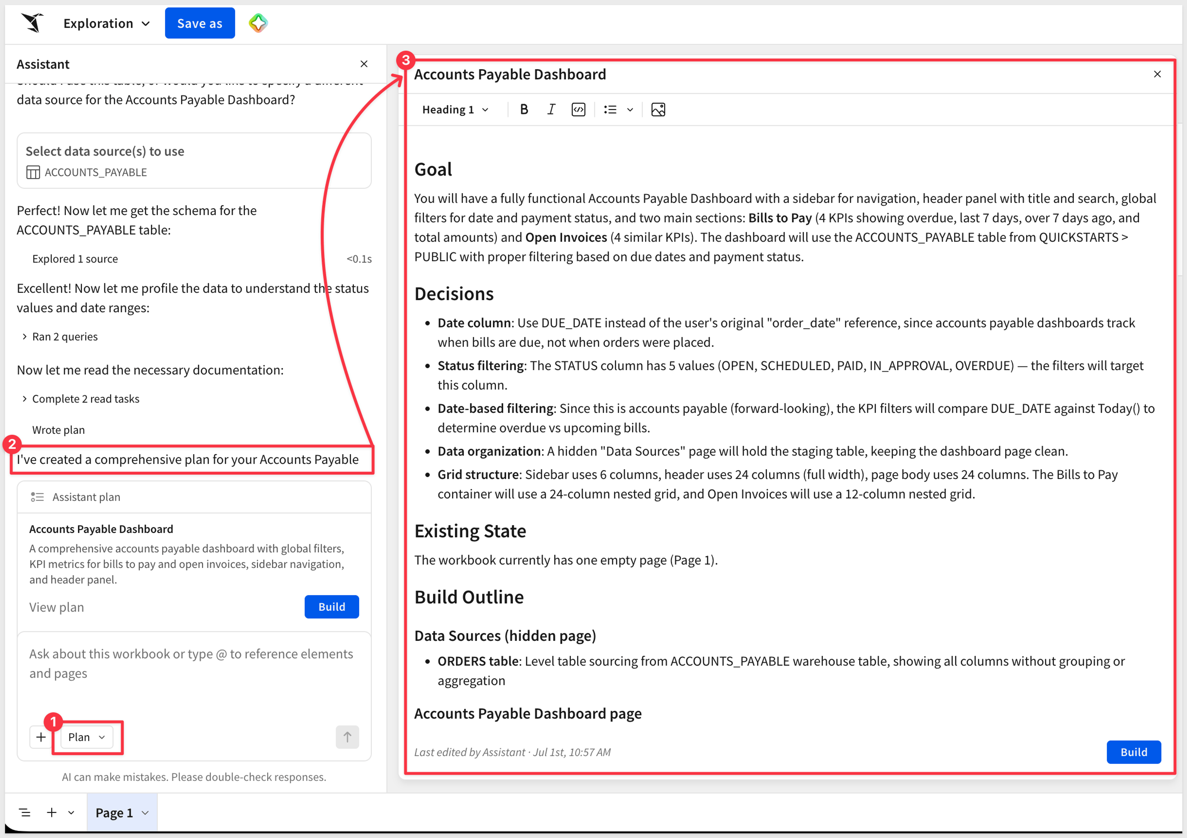
Set the AI to “Plan” and it will read the instructions and create a comprehensive build plan that we can adjust before anything is built:
Once the plan is approved, clicking “Build” hands the work to Sigma. What comes back isn’t a locked template — it’s a fully editable workbook the AP team can adjust, extend, and reshape without filing a request.
That’s the difference from a typical SaaS AP tool. Off-the-shelf applications cover roughly 80% of what most teams need. The other 20% — the approval routing that matches your vendor hierarchy, the exception view that maps to your close process, the aging buckets that reflect your actual payment terms — is where companies differ from each other. Sigma builds the foundation and leaves that 20% open, so the dashboard reflects how your team actually works rather than how the software vendor assumed it would.
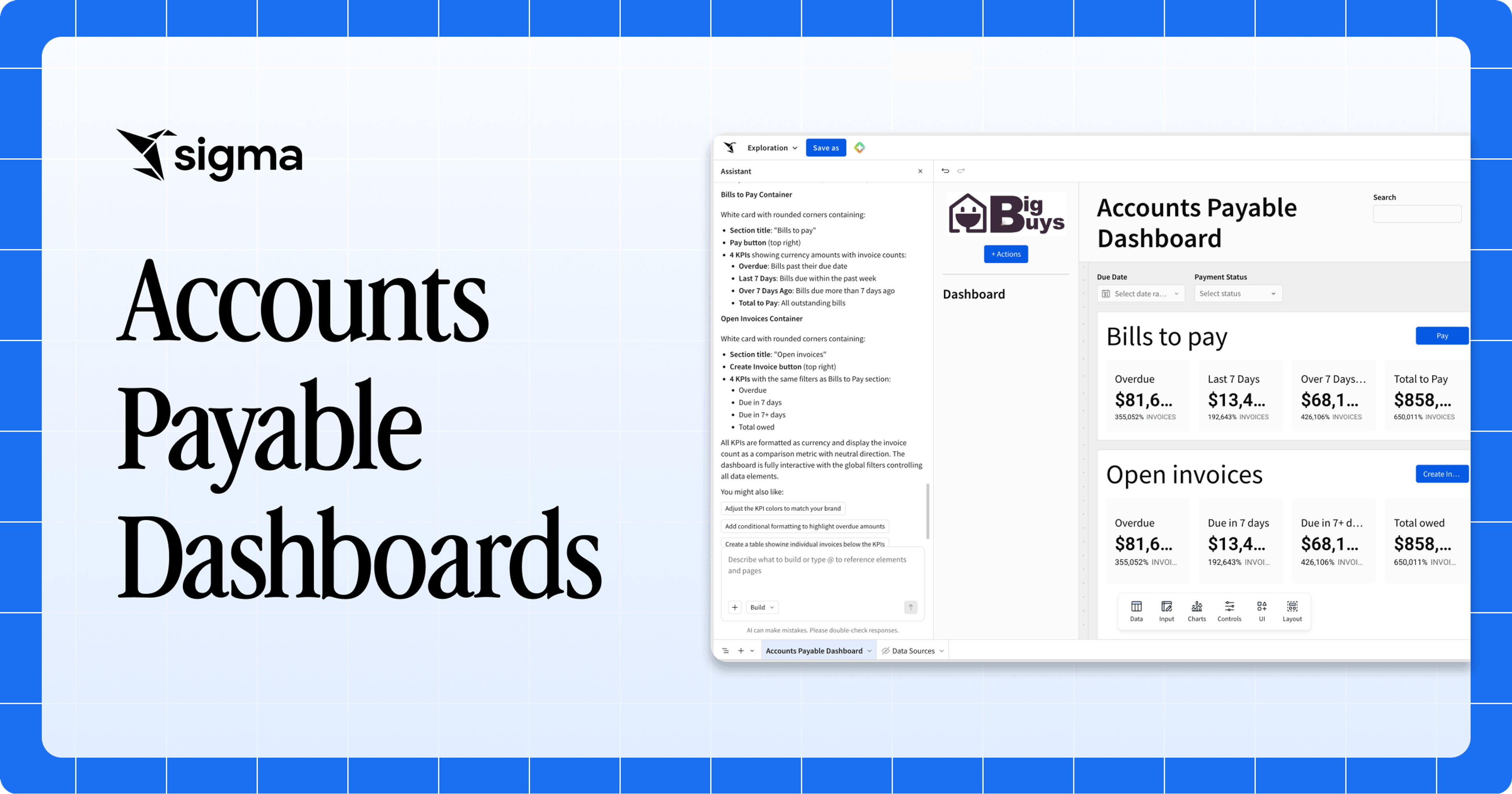
In just a few minutes, our dashboard is ready for us to review and fine tune:
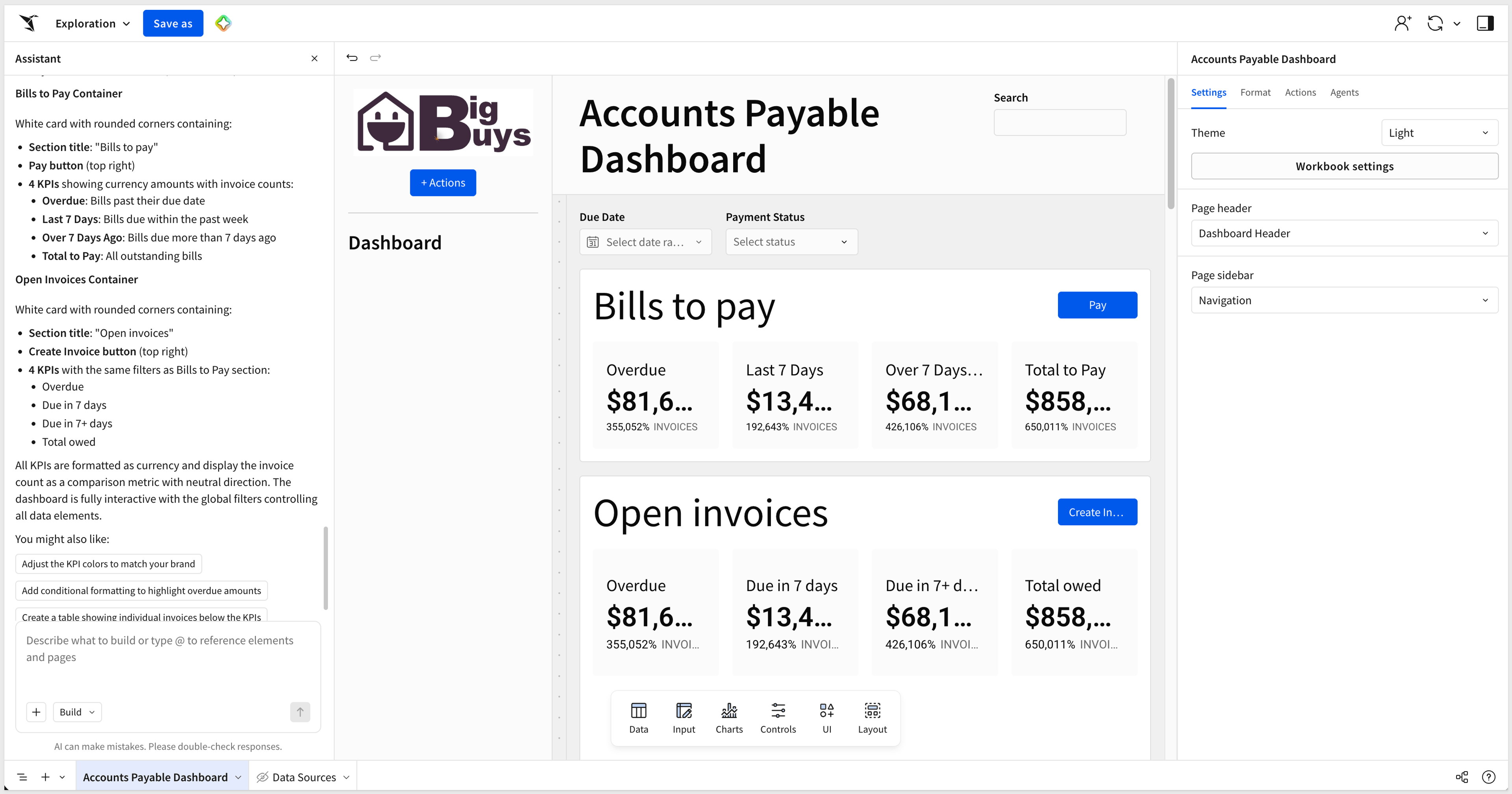
The first version of the dashboard gives the AP team a live view of what’s owed and when: outstanding bills bucketed by age, open invoices by due date, and running payment totals that update directly from the warehouse. That’s enough to run a payment cycle without pulling a report.
The next version adds what the first quarter of use surfaces — approval bottlenecks, vendor patterns, exception views the team kept asking for in email. The version after that absorbs changes in the close process, the vendor base, or the approval chain. Because Sigma stays connected to the warehouse, none of those revisions require a ticket — they require opening a tab.
Next steps
Try Sigma free or get a demo to start building your accounts payable dashboard.
- Get a demo
- Sigma Public (free version)
- Sigma trial account
- QuickStart: Learn the Fundamentals (no sign-up required)
- QuickStart: Build AI Apps in Sigma (no sign-up required)