When In Doubt: KPI, Bar Chart, Table
Table of Contents

Let me be blunt. Most teams care more about visuals than they need to.
I see it with executives and with data builders. We chase clever charts when the job is to help someone decide and move. The truth is not complicated. Most of the value comes from three things: a KPI, a bar chart, and a table.
Why This Works
Our brains are excellent at recognizing patterns and outliers, which means good visuals make scanning and comprehension easy. They answer one straightforward question, like what is going well or what needs attention, and they provide supporting detail in a table with the underlying data so the visual is not overloaded. Any chart type can become too complex when the intended audience spends too long trying to understand what is happening, or when there is no clear outcome guidance where there should be.
And do not get me wrong, there is a time and a place for exploratory visualizations with looser structures that let the end user explore connections that might not be obvious or straightforward. Or for more aesthetic visuals that paint a beautiful picture in a presentation or static report. But those are usually the smaller set of use cases that data teams are creating. The vast majority of visualizations should be placed in a context that indicates some kind of action, meaning they need to prioritize comprehension.
The 80% Solution
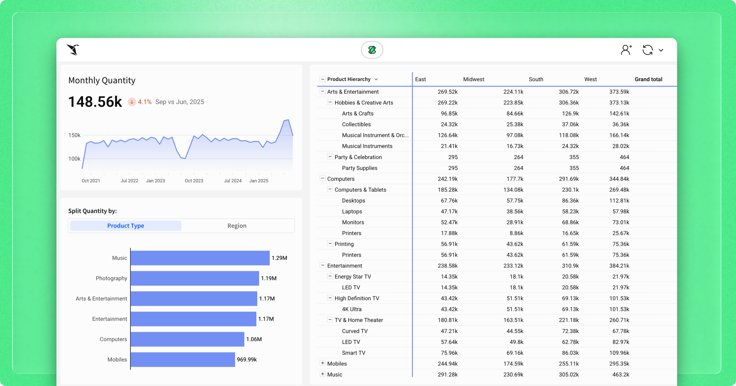
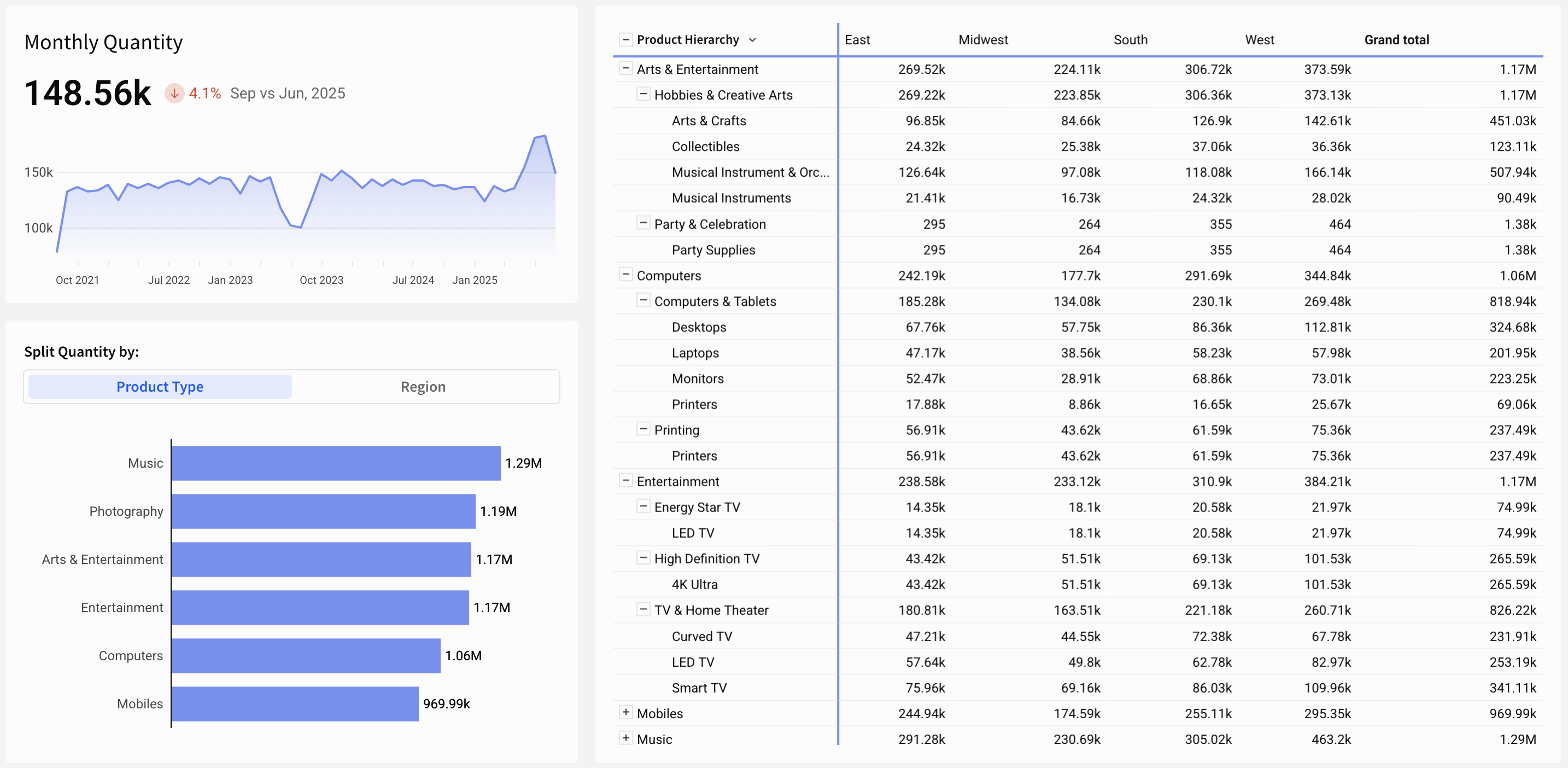
To keep visuals glanceable without losing the detail people need to act, design in these three layers:
- High-Level KPI
- Start with a clear summary and comparison of the important metrics. Help the user identify the current state and how to react. Is it two million or two hundred million? Is the number higher or lower than last week? Are we over or under target?
- Medium-Level Grouped View
- Clarify the drivers of the KPI by adding one layer of detail to spot outliers or trends. Add value with a dynamic selection for this layer.
- Low-Level Granular Data
- Always provide the underlying data in a table or pivot table so users can drill down, sort, filter, and understand the why behind the higher-level visuals.
This "KPI, Bar Chart, Table" approach will meet approximately 80% of analytical needs. It prioritizes clarity, accuracy, and ease of consumption.

Add Value and Move On
These three layers are fundamental and simple, and they’re effective. They’re easy to build, so teams can ship value quickly and then iterate or move to the next task. They’re easy to understand, which empowers end users to investigate and ask better follow-up questions.
There’s power in the fundamentals. The next time you start an analysis or get asked for a complex visualization, ask, “Is this the right tool for this scenario?” When in doubt: KPI, bar chart, table.


