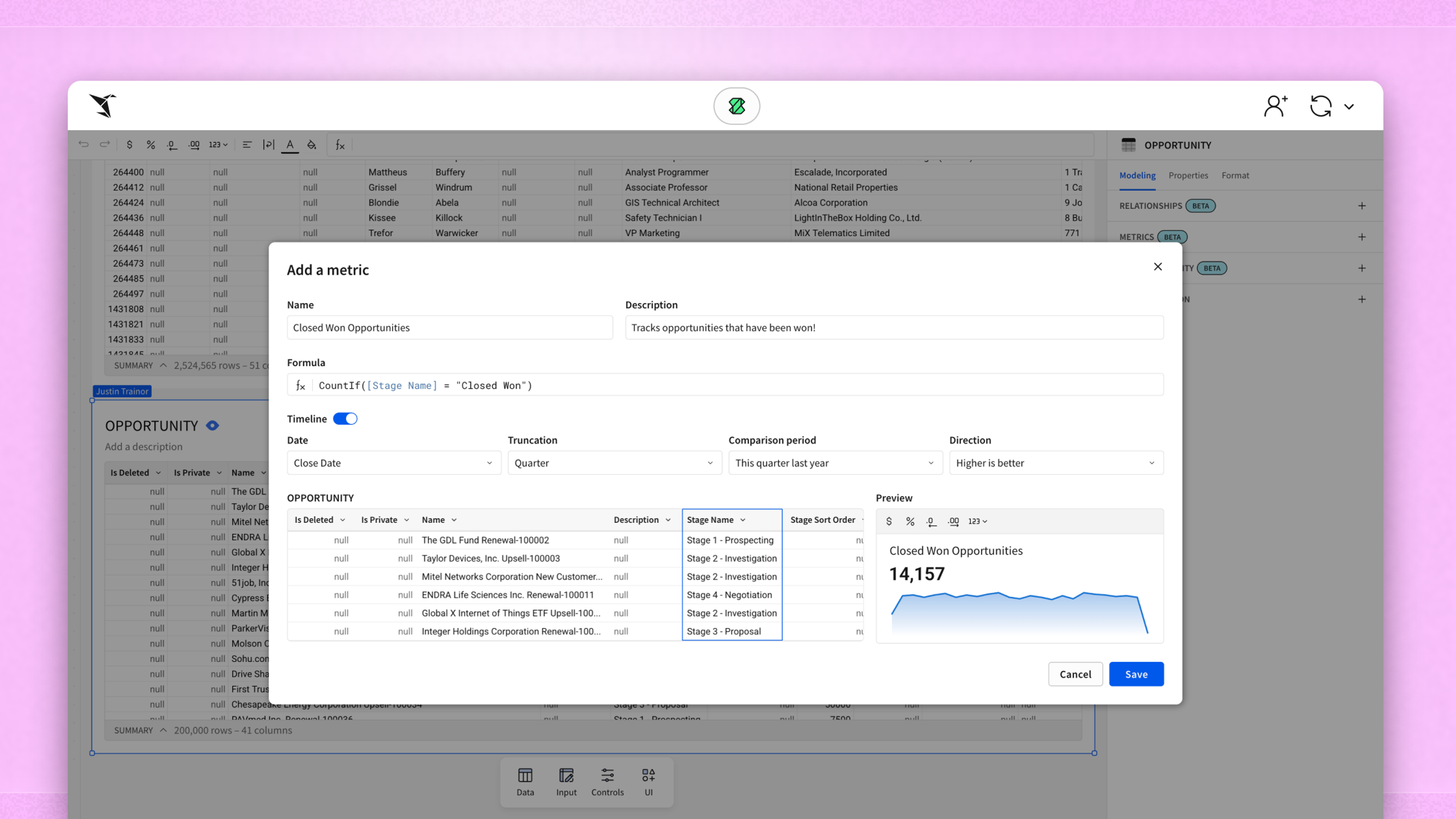
Your Spreadsheet Can’t Do This: Unlocking The Value Of Geospatial Data

As a data leader, you recognize that spreadsheets are invaluable for analyzing and generating business insights. Spreadsheets allow your data team to crunch numbers and spot trends in traditional datasets, but they weren’t built with a critical asset in mind - geospatial data. While spreadsheets are great for working with quantitative data, they do not excel (no pun intended) at revealing powerful insights stored within geospatial data.
What is geospatial data in terms of Business Intelligence (BI)?
Geospatial data encompasses any information tied to a specific location, including coordinates, addresses, regional demographics, satellite imagery, and mobile data. This data offers unique insights into how your customers, operations, and markets interact across geographic spaces, revealing patterns that traditional analysis simply can't capture.
The challenge is that geospatial data is complex, combining multiple data types (vector, raster, attribute, and temporal) from various sources. Consequently, it is often too sophisticated for spreadsheet analysis and requires specialized visualization tools to reveal its true business value. Investing in geospatial data is worthwhile. Spatial analysis transforms hidden geographic relationships into actionable business intelligence. Instead of wondering what happened, you'll understand where it happened and why location matters to your bottom line.
When should you move beyond spreadsheets to geospatial analysis?
Geospatial analysis should be used whenever location context is essential to understanding the full story of your data. In general, if where an activity occurs matters as much or more than the activity itself, then geospatial analysis and visualization will provide insights that traditional analytics miss.
Maps transform raw location data into intuitive visual stories, making complex spatial relationships clear to technical and non-technical stakeholders. The real power emerges when you combine geospatial insights with your existing business metrics. Here's how location-aware analysis creates competitive advantages across key business functions.
- Site selection & planning: That mediocre-looking store location in your spreadsheet might be a goldmine when mapped against foot traffic and competitor proximity.
- Logistics & supply chain: When mapped, real-time warehouse data becomes actionable. Identifying bottlenecks and downstream impacts becomes instantaneous instead of relying upon hours of scrolling through tabular data.
- Customer analytics: Your transaction data might show 10,000 customers, but a heat map can quickly reveal the three geographic clusters driving 60% of your revenue.
- Asset management: GPS coordinates in spreadsheets capture the position of assets at static intervals. Visualizing these assets using geospatial analysis allows you to track asset movement in real-time. Additionally, visualizing this movement and using mapped routes with geographic boundaries can immediately highlight when assets deviate from expected paths.
- Risk management: Static facility addresses in tabular data can become dynamic intelligence when combined with external sources, such as weather data. These visualizations can help your organization when managing its real estate portfolio and planning for crisis responses.
- Sales territory optimization: Transaction data gains a new dimension when visualized geographically, revealing performance patterns across local, regional, and national territories.
Geospatial mapping organizes data, reveals spatial relationships, and transforms hidden patterns into strategic opportunities.
Why is mapping geospatial data so powerful?
Our brains process visual patterns exponentially faster than rows of numbers. Maps transform complex location data into immediate insights that would take extensive analysis to uncover in spreadsheets.
To demonstrate this concept, let's consider a simple example. In our example, a retail chain is tracking 25 of its store locations in a spreadsheet.


- Store clustering could point to potential market oversaturation.
- High distribution of locations primarily centered along a single highway corridor could suggest missed geographic opportunities.
- The proximity of store locations could be analyzed to identify route optimization.
These visual insights become conversation starters that unite previously siloed teams. Your real estate team can immediately validate footprint concentration concerns, while the operations team can see store locations and communicate about any distribution inefficiencies. This insight comes from a single map that took seconds to interpret.
Now consider the data implications when scaled to reality vs. the limited sample provided in this scenario. Most organizations collect geospatial data from multiple sources daily, creating thousands to millions of data points. In spreadsheets, these data points bury potential insights.
On maps, they become immediately actionable intelligence. Even basic geospatial visualizations, such as simple coordinate plotting, reveal spatial patterns, clusters, and outliers without requiring complex calculations. More sophisticated mapping techniques can provide even deeper insights. The fundamental power of geospatial analysis lies in transforming an overwhelming volume of data into clear visual narratives. These narratives, in turn, can be used to drive strategic decisions.
5 types of geospatial visualizations and when to use them
Choosing the proper geospatial visualization is like selecting the right analytical tool. The visualizations should match the complexity of your data and the needs of your audience. Here are five core visualization types that transform location data into strategic insights:
Point maps
Point Maps plot individual locations using simple dots or symbols. They are perfect for revealing distribution patterns, like mapping store locations against competitors or visualizing insurance claims to identify risk hotspots. These maps are for static data with moderate density across defined boundaries.

Cluster Maps scale symbol sizes to represent quantitative values at each location. A logistics company might use a cluster map to spot capacity imbalances by mapping distribution centers with symbol sizes representing throughput volumes. The visualizations are Ideal for comparing relative performance across geographic areas without overlapping data points.

Flow Maps use lines and arrows to visualize movement between locations, with line thickness indicating the volume or frequency of movement. Supply chain managers track product movement between facilities, while marketing teams map customer journey patterns. These visuals are essential when your analysis focuses on connections between origin and destination points.

Choropleth Maps are considered the workhorses of geospatial analysis. They use color intensity across geographic boundaries to display aggregate metrics. Telecommunications companies often use these maps to visualize customer satisfaction by service region, instantly identifying areas needing attention. These maps effectively illustrate how single variables change across geography or over time.

Heat maps reveal density and concentration using color gradients to highlight activity hotspots. Marketing teams identify high-value customer concentrations, while operations teams visualize service request density for resource planning. These maps are best suited for visualizing location data when concentration patterns matter more than individual data points.

Visualizations are a powerful tool for gaining insights from geospatial data, but knowing when to use each type of map is crucial.
Advanced visualizations can be created by combining elements from the visuals above, but visual complexity shouldn't compromise clarity. Smart analysts often utilize multiple visualization types to provide comprehensive location intelligence, moving beyond the limitations of spreadsheets.
What are some common challenges with geospatial data visualization?
Geospatial analysis delivers powerful insights, but these common pitfalls can undermine your results. Here's what data leaders should watch out for:
Dirty or incomplete location data
Clean your location data first. Inconsistent addresses, such as "123 Main St." versus "123 Main Street," create artificial patterns that skew analysis. The upfront investment in standardizing location data pays dividends in reliable insights. Remember that garbage in leads to garbage out.
Choosing the wrong type of map for the question you’re answering
Match the visualization type to your business question. Using choropleth maps for point data or heat maps for flow analysis creates confusion instead of clarity. Start by defining what you want to learn, then select the appropriate visualization.
Performance issues with large datasets
Utilize data aggregation or dynamic loading techniques that reveal details as users zoom in, helping to manage performance with large datasets. Millions of data points crash browsers and create sluggish user experiences.
Overcomplicating the visualization with too many data layers
Avoid information overload. Cramming multiple data layers onto one map creates visual chaos. Start simple and add complexity gradually as users require more detailed information. Your goal is clarity, not comprehensive data display.
Privacy or compliance concerns with personally identifiable location data
Protect sensitive location information. Geospatial data can inadvertently expose private information about individuals or facilities. Aggregate data appropriately and implement drill-down restrictions that align with your organization's data governance policies.
Start with clean data and build visualizations that answer specific business questions. Technical complexity should enhance understanding, not impress audiences.
Getting better at visualizing geospatial data effectively
Visualizing geospatial data transforms spreadsheet rows into insight-rich maps that drive better decisions. Companies leveraging location intelligence report 25% operational efficiency gains, 10x faster issue resolution, and entirely new revenue streams from spatial analysis. Modern cloud platforms democratize these sophisticated insights across organizations, not just technical teams.
When building geospatial BI tools, remember these essentials:
- Start with business questions, not cool maps. "Where should our next store go?" delivers infinitely more value than "Let's make a pretty customer map."
- Invest in data quality upfront. Standardize addresses, validate coordinates, and regularly audit datasets. Poor location data can sabotage even the most thorough analysis long before it begins.
- Design for your audience. Executive dashboards need different details from operational maps. Create visuals that answer big-picture questions while enabling users to drill down for more detailed information. Always include clear legends, scales, and labels.
- Combine data sources strategically. Geospatial data gains power when merged with other datasets, such as demographics, competitor locations, or traffic patterns. Resist the urge to combine every data set at your disposal and only add data sets that directly support answering your business questions.
- Test across devices and users. Your desktop masterpiece might be useless on mobile devices or confusing to non-technical stakeholders. Design for actual use, not just aesthetics.
Utilizing geospatial visualizations during decision-making provides your business with a competitive advantage. Organizations that utilize geospatial data and visualizations can identify patterns, opportunities, and risks that remain invisible to their spreadsheet-bound competitors.
Your spreadsheets captured the data. Now let’s use maps to unlock its true strategic potential.
Geospatial data FAQs
What's the difference between geospatial data and geographic data?
They're nearly identical! Geographic data refers to basic location information, while geospatial data is geographic data structured for analysis and mapping using specialized tools.
How accurate does location data need to be for analysis?
Match accuracy to your business needs. Utility planning requires meter-level precision, customer clustering works with block-level accuracy, and regional trend analysis functions fine with lower precision. Don't overspend on accuracy you won't use.
What are the best sources of location data for business use?
Start with your internal geospatial data, including customer addresses and facility locations. Supplement these private data sources with public sources like census data and OpenStreetMap. Commercial providers offer demographics and business listings. GPS sensors provide real-time intelligence. Combine internal and external sources for comprehensive coverage.
How does geospatial analysis help with marketing strategy?
Geospatial analysis provides the critical answer to the question of where to focus. Use geofencing for targeted ads, identify customer clusters for expansion, optimize store locations with demographic analysis, and measure campaign effectiveness by region. Location intelligence enables precision targeting over broad-brush marketing.