Heatmaps 101: Numbers To Insight In One Glance

Picture yourself facing a massive spreadsheet with thousands of cells, rows upon rows of numbers stretching beyond your screen's boundaries, your eyes glazing over as you struggle to extract meaningful information from this numerical labyrinth. The quarterly sales figures are all there, the customer engagement metrics are complete, but the story they tell remains frustratingly elusive behind this wall of numbers. This scenario plays out daily across organizations worldwide, where data overload isn't just a minor inconvenience; it's a business challenge that slows decision-making, obscures opportunities, and wastes valuable analytical resources.
Our brains, remarkable as they are, simply weren't designed to process large numerical datasets efficiently, leading to missed insights and decisions based on incomplete understanding. What if, instead, you could reshape those impenetrable columns of numbers into an intuitive visual landscape where patterns emerge instantly and important relationships between variables become immediately apparent through something as simple as color? This is where heatmaps enter the picture as a fundamental solution to one of the most persistent challenges in modern business intelligence (BI).
What is a heatmap?
A heatmap is a data visualization technique that uses color to represent values in a matrix. Simply put, it converts numerical data into a visual format, where different colors or color intensities represent distinct values. The name "heatmap" originates from the way it displays "hot spots" (high values) and "cold spots" (low values) in your data.
Think of it as looking at data through a thermal camera, where warmer colors (reds, oranges) typically indicate higher values and cooler colors (blues, greens) represent lower values. This color-coding creates an immediate visual pattern that your brain can process much faster than rows of numbers.
The value of seeing data in color
Heatmaps stand out among data visualization techniques for several compelling reasons:
- Instant pattern recognition: Our brains process visual information 60,000 times faster than text. Heatmaps leverage this by translating abstract numbers into colors that reveal patterns immediately.
- Accessible insights: They democratize data analysis by making complex information accessible to non-technical stakeholders, no statistical expertise required.
- Density of information: A single heatmap can effectively display thousands of data points in a compact, comprehensible format.
- Intuitive interpretation: The color gradient provides a natural way to understand relative values: darker or brighter usually means "more."
How heatmaps turn data into visual stories
Heatmaps take data visualization a step further by fundamentally changing how we process information. The psychological and cognitive benefits are significant:
Pre-attentive processing
Color variations in heatmaps tap into our brain's ability to notice visual differences before conscious attention, making patterns immediately apparent.
Reduced cognitive load
By encoding values as colors, heatmaps reduce the mental effort required to analyze data, thereby freeing up cognitive resources for more in-depth analysis. Research in cognitive psychology suggests that humans can process visual patterns faster than text, allowing analysts to identify outliers and trends that may remain hidden in spreadsheets even after hours of scrutiny.
Enhanced communication
When presenting to stakeholders, a well-designed heatmap can effectively convey complex relationships that would require multiple pages of explanation in text form.
Memory retention
Visual information is more likely to be remembered than text or numbers alone, making heatmap insights more "sticky" in organizational memory. This is due to the "picture superiority effect," a well-documented psychological phenomenon where images are recalled with approximately 65% accuracy after three days, compared to just 10% for text-based information, making heatmaps particularly valuable for long-term strategic planning and cross-team alignment.
Interpreting heatmaps in a business context
When analyzing heatmaps for business insights, approach them with strategic questions in mind. First, clarify what's being measured and what "hot" or "cold" areas signify in your specific context. For example, depending on your goal, a red zone might indicate success (high sales) or problems (high defect rates). Look for unexpected patterns that reveal hidden opportunities or issues, such as underperforming regions in sales heatmaps or bottlenecks in customer journey maps.
The most valuable information emerges when you connect these visual patterns to your key business objectives, asking not just "what does this show?" but "how does this impact our KPIs and what actions should we take as a result?" Of course, the information you can extract will largely depend on the type of heatmap you're working with.
Types of heatmaps and when to use them
Heatmaps come in various forms, each suited to different analytical needs. Here are the major categories:
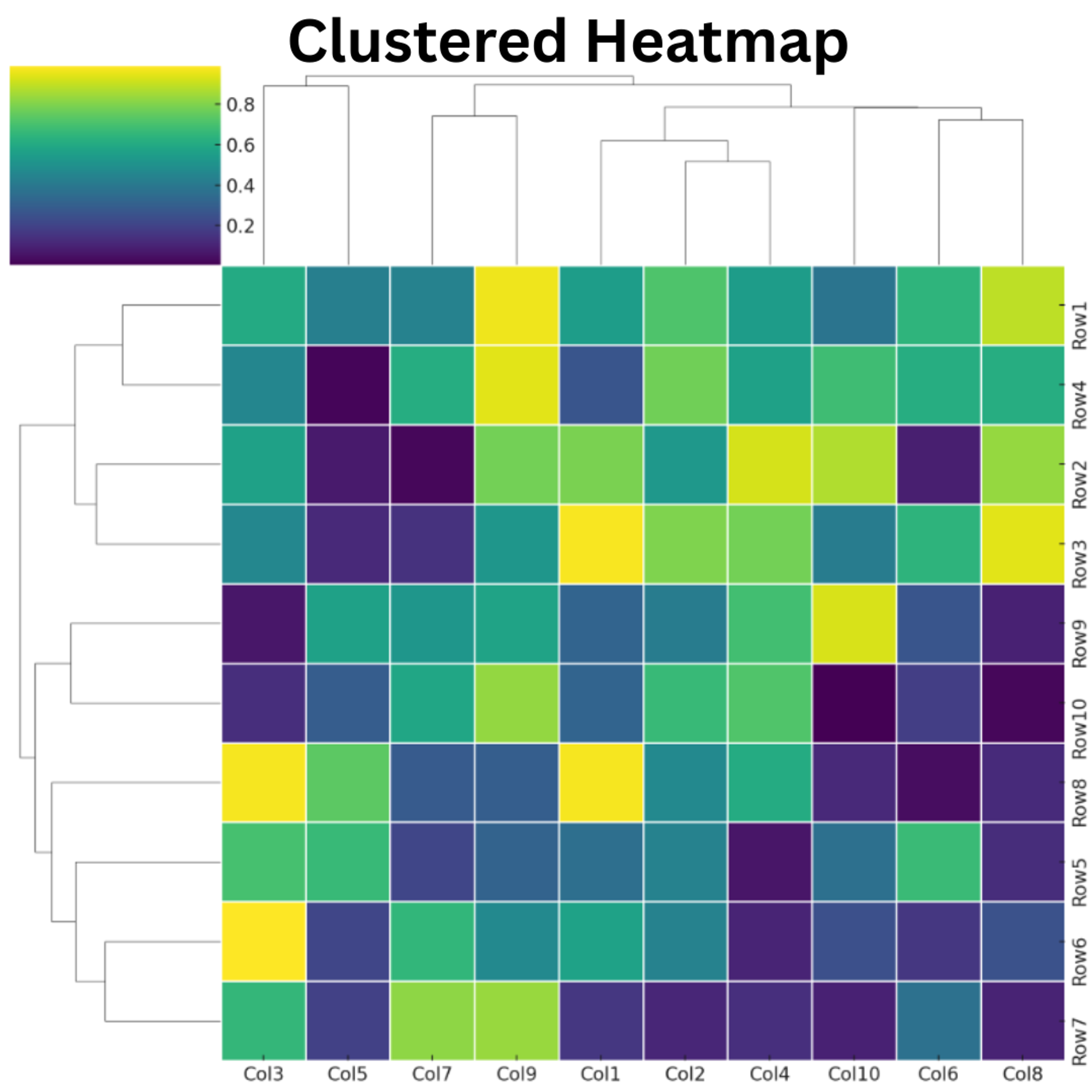
Grid heatmaps (matrix heatmaps)
These are the most versatile and common heatmaps, displaying data in a 2D grid with color-coded cells. Grid heatmaps excel at revealing relationships between two variables simultaneously, with rows typically representing one dimension, such as time periods or products, and columns representing another, like locations or customer segments. The color intensity communicates the magnitude of the measured value at each intersection. Let’s look at a few grid heatmap subtypes.
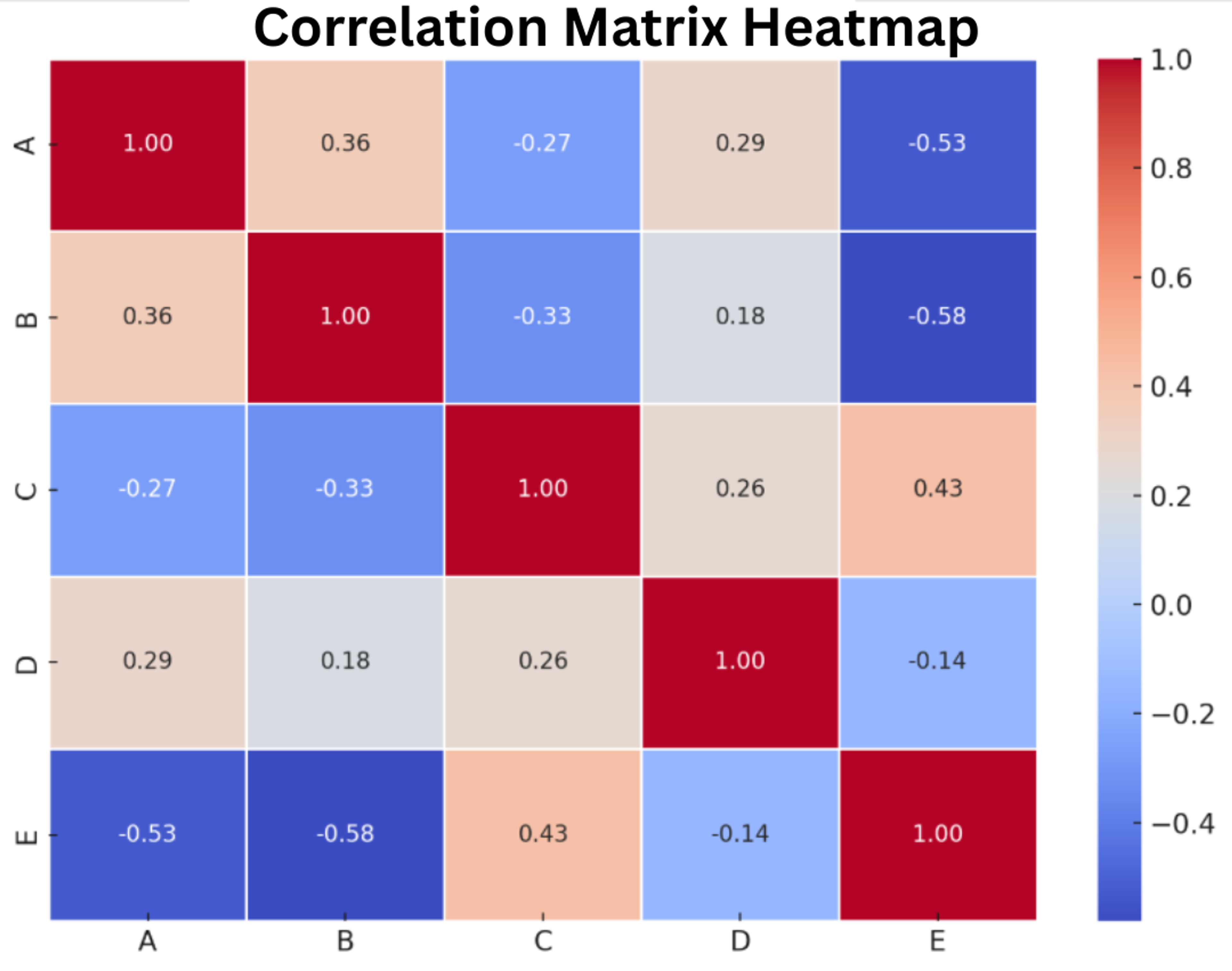
Correlation matrices
Perfect for visualizing relationships between variables. Used extensively in statistics, finance, and data science to spot correlations that might indicate causal relationships or opportunities for dimension reduction.
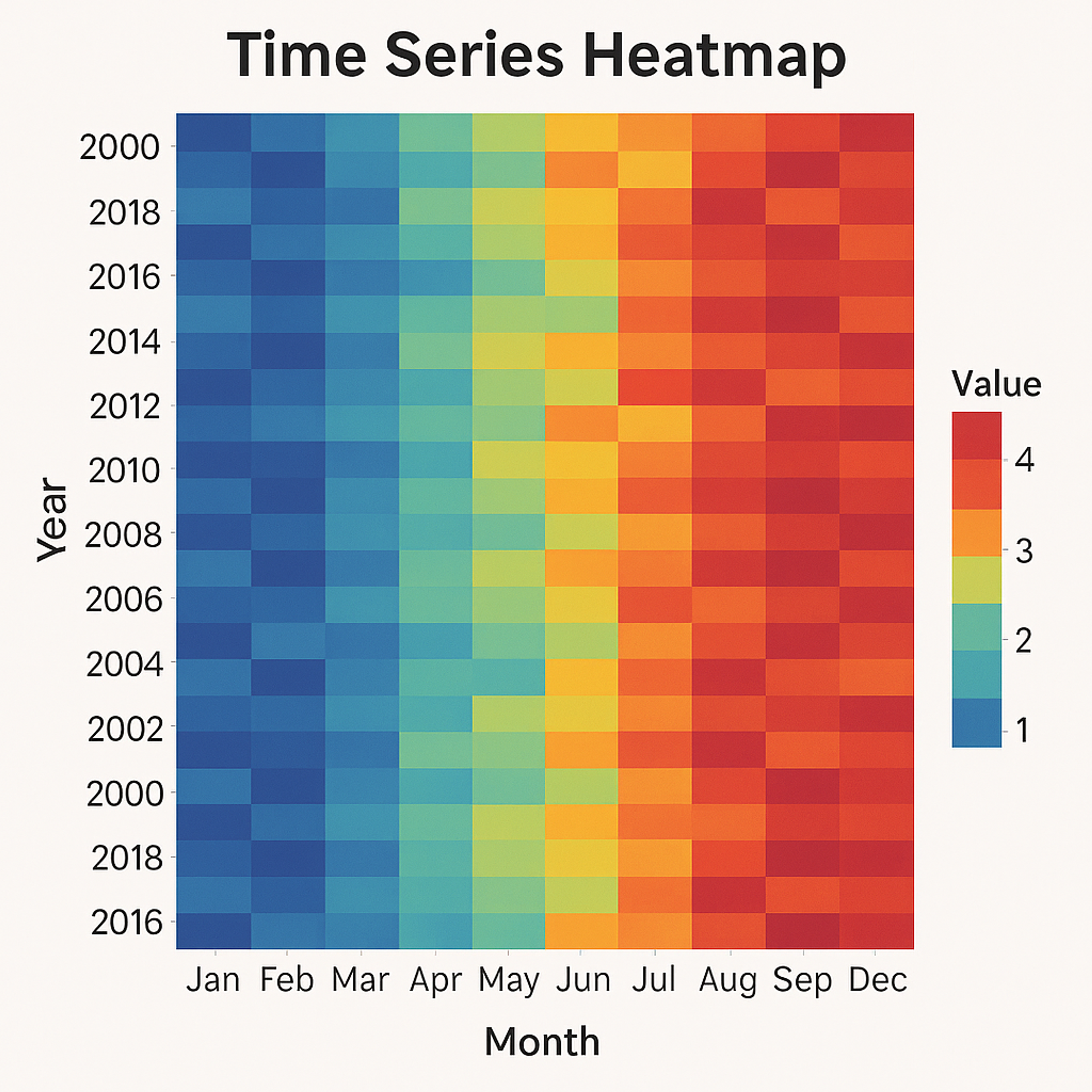
Ideal for spotting patterns over time. These are powerful for analyzing seasonal trends, usage patterns, or performance metrics across different time periods.
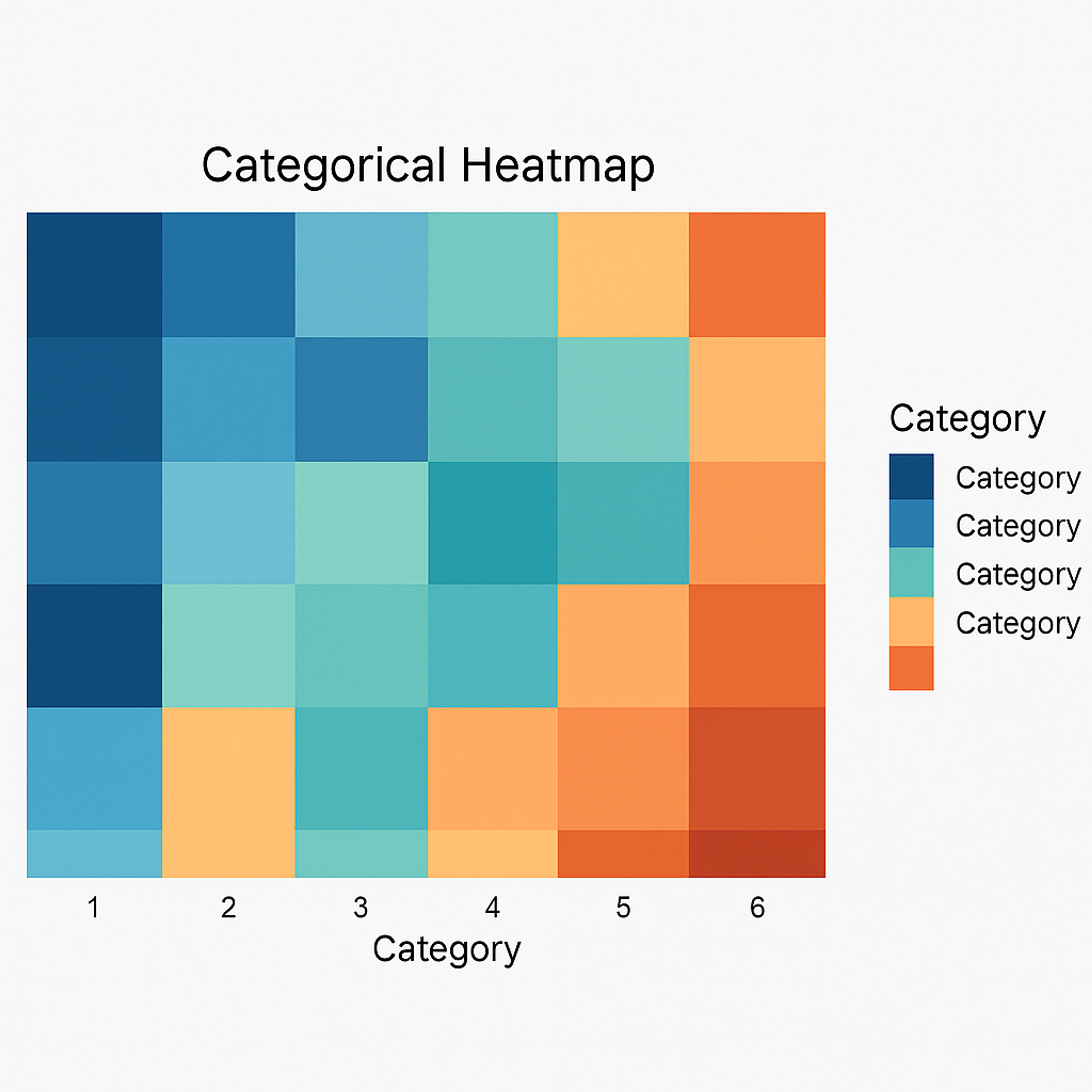
Best for showing relationships between categorical variables, like product performance across different customer segments or regional sales by product category.
Enhanced with hierarchical clustering to group similar rows and columns. These are particularly valuable in genomics, customer segmentation, and other fields requiring pattern identification across multiple variables.
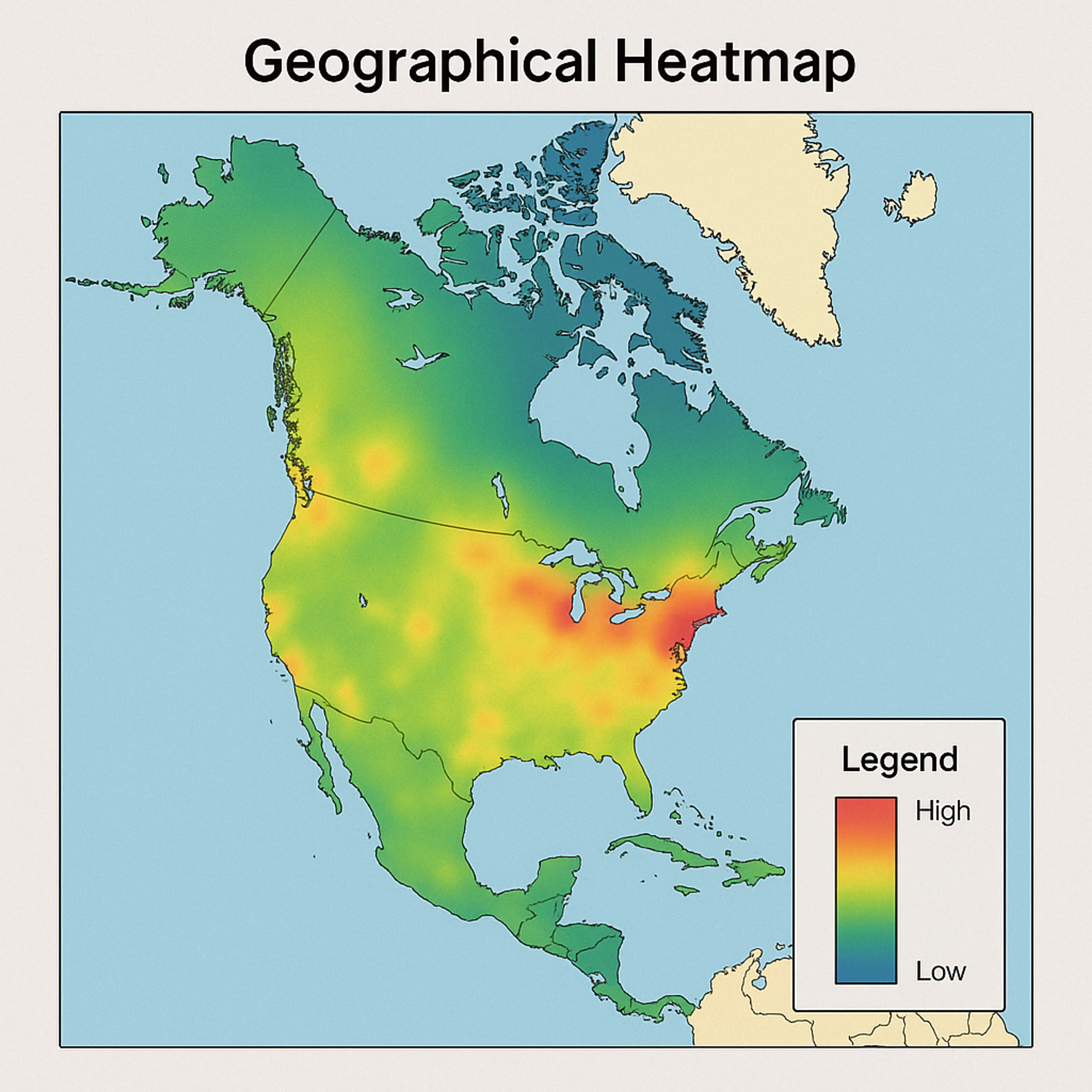
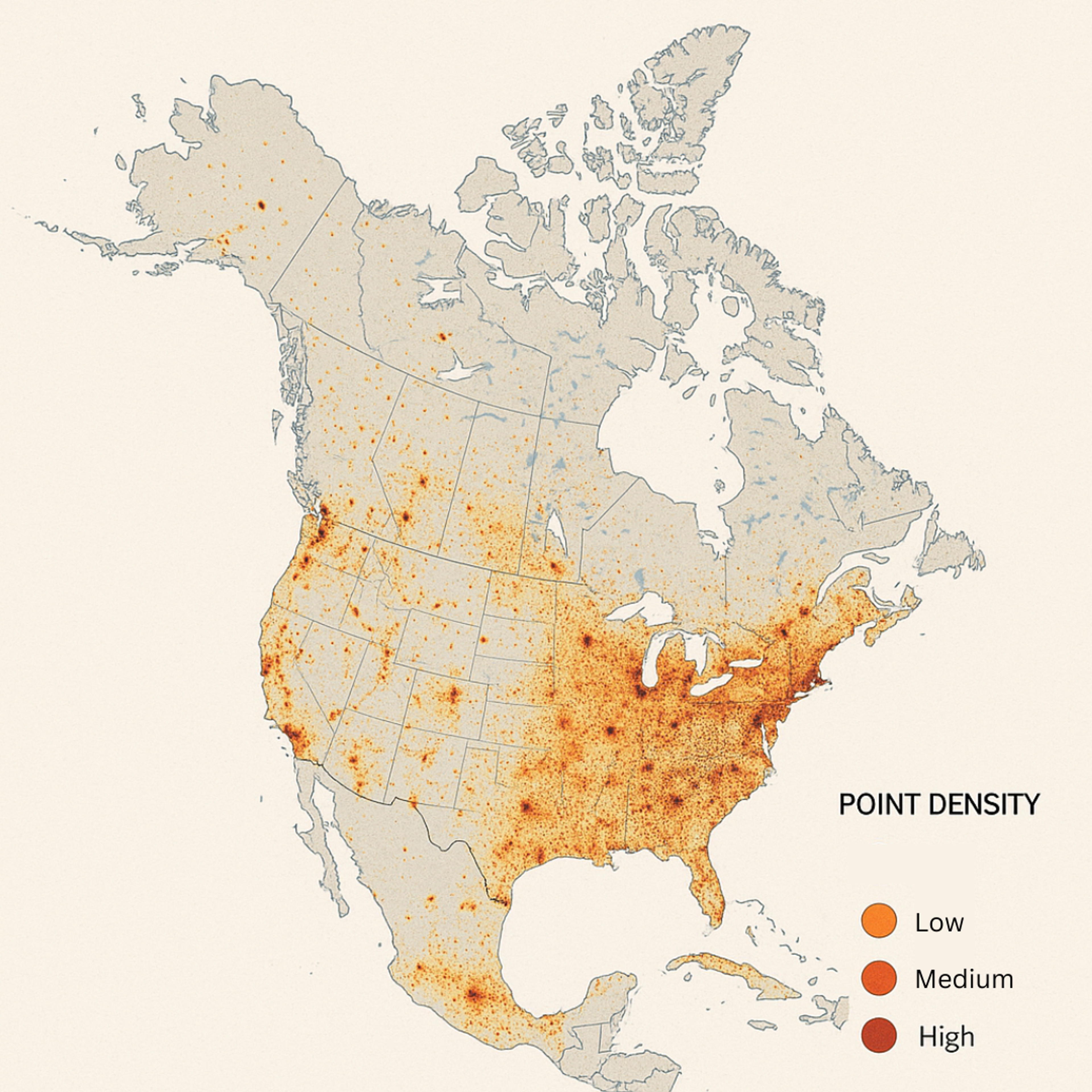
These overlay color-coded data onto geographical or spatial layouts. Unlike abstract grid heatmaps, spatial heatmaps maintain geographic accuracy, allowing decision-makers to identify location-specific patterns and regional variations that would be lost in tabular data.
They're particularly powerful when combined with Geographic Information Systems (GIS) data, which can incorporate factors such as population density, income levels, or competitor locations for multidimensional spatial analysis.
Subtypes include:
- Geographical heatmaps: Map data to geographic regions to visualize regional variations. These are invaluable for sales territory analysis, public health monitoring, or demographic studies.
For BI professionals, website heatmaps represent a critical extension of traditional analytics, bringing the same visual power of BI heatmaps to digital customer experience analysis. While most BI platforms focus on internal operations and structured data, website heatmaps apply similar principles to the customer-facing digital environment, an important touchpoint deserving the same analytical rigor as any other business process.
Examining several subtypes, we have click maps that display where users interact most frequently, scroll maps that reveal content visibility thresholds, mouse tracking maps that indicate user attention patterns, and engagement heatmaps that combine multiple interaction metrics for comprehensive behavioral analysis.
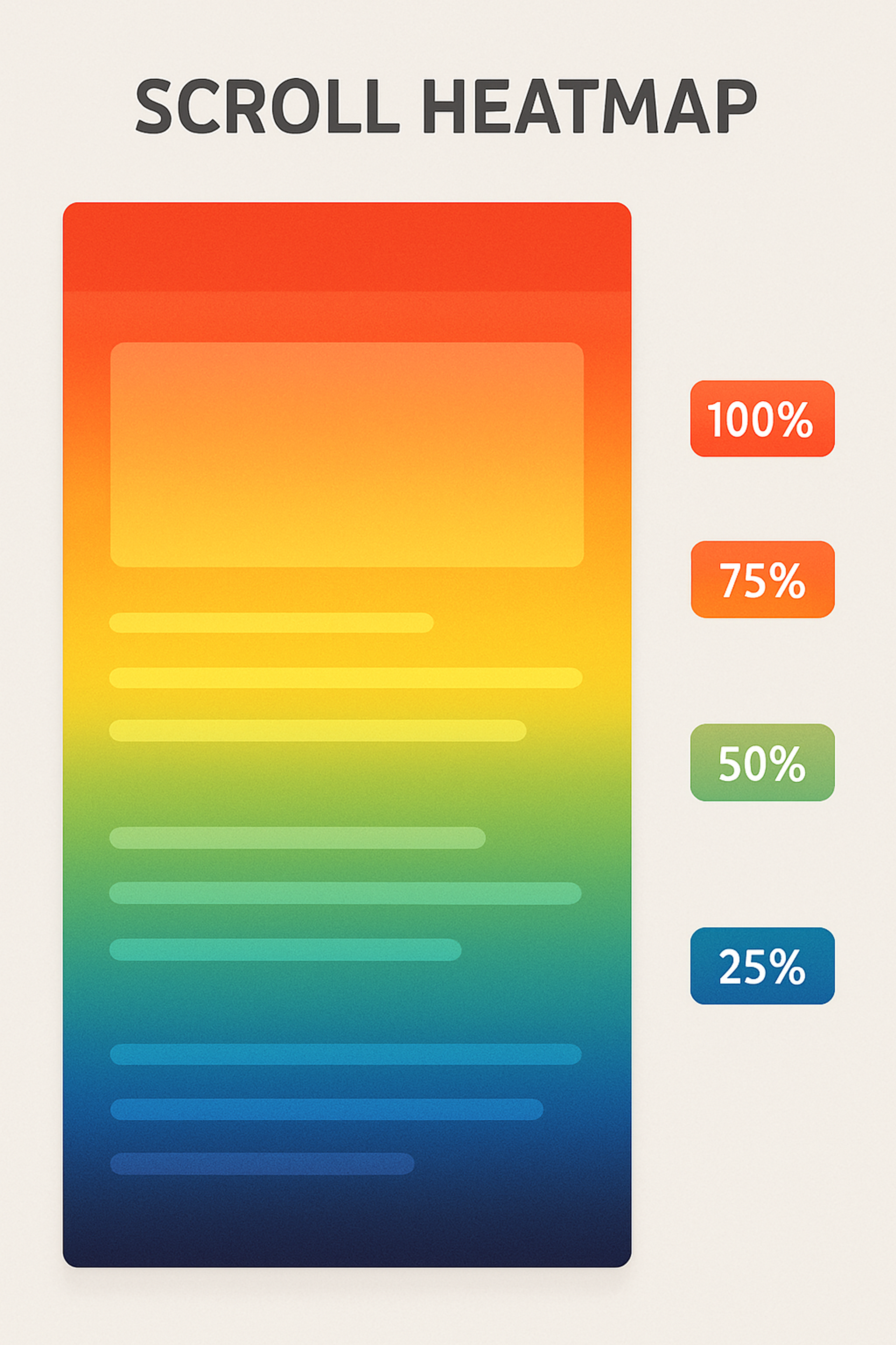
Similarly, a B2B software company leveraged scroll maps to identify that key product features were positioned where most visitors had abandoned the page, leading to a redesign significantly decreasing bounce rates.
In another case, a financial services firm combined mouse tracking with engagement heatmaps to identify prospective customers who spent considerable time hovering over pricing information without converting, prompting them to develop clearer value propositions that improved lead generation. Each use case demonstrates how website heatmaps transform abstract user behaviors into concrete, actionable business insights that directly impact revenue.
Best practices for designing clear, actionable heatmaps
Creating effective heatmaps requires careful consideration of several design elements:
- Thoughtful color selection: Choose color schemes that are:
- Intuitive (e.g., red for high values, blue for low)
- Accessible (colorblind-friendly options)
- Appropriate to your data (sequential, diverging, or categorical)
- Clear labeling: Include descriptive titles, axis labels, and legends that explain what the colors represent.
- Appropriate granularity: A useful heatmap strikes a balance in detail: too much individual data creates overwhelming visual noise, obscuring patterns, while too much aggregation can hide nuances. The ideal level depends on the data and questions, requiring experimentation to reveal insights clearly for the intended audience and display size.
- Consistent scaling: Use consistent color scales within related visualizations to enable accurate comparisons.
- Contextual information: Include reference points or annotations that help interpret the visualization.
By thoughtfully applying these principles, you can create heatmaps that are not only visually appealing but also highly effective in communicating complex data and driving informed decision-making.
Common pitfalls to avoid
Even well-intentioned heatmaps can mislead if they're not designed carefully:
- Over-colorization: Using too many color gradients can confuse viewers and obscure patterns. Stick to a manageable number of colors that clearly differentiate values.
- Poor scaling: Without careful attention to how values map to colors, important patterns can be hidden or exaggerated. Consider whether linear, logarithmic, or custom scales best represent your data.
- Mislabeling: Inadequate or confusing labels can lead to misinterpretation. Always clearly indicate what variables are being compared and what the colors represent.
- Correlation vs. causation: Remember that patterns in heatmaps show relationships, not necessarily causes. Avoid drawing unsupported conclusions from surface-level visual patterns without deeper analysis.
Tools and techniques for creating heatmaps
Modern data visualization tools have made heatmap creation accessible to users with varying technical skills:
BI platforms
- Tableau: Offers heatmap capabilities with drag-and-drop interfaces, customizable color palettes, and interactive filtering.
- Power BI: Provides built-in heatmap visuals with customization options and strong integration with the Microsoft ecosystem.
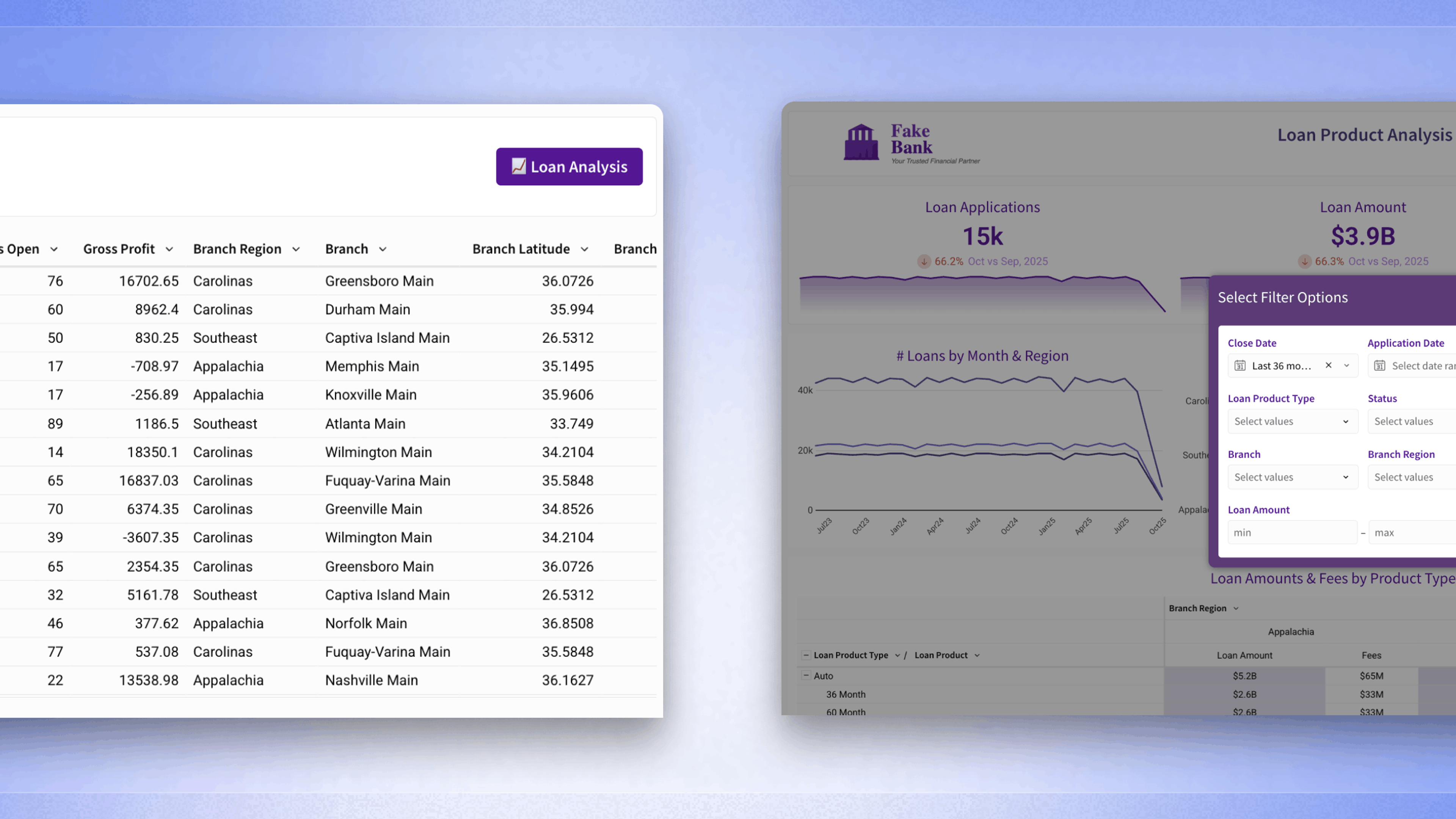
- Sigma: Excels at creating heatmaps directly from cloud data warehouses with its spreadsheet-like interface that combines the familiarity of Excel with the power of modern BI. Sigma's unique collaborative features allow teams to work together on heatmap analysis in real-time, and its cloud-native architecture delivers exceptional performance when visualizing large datasets.
- Looker: Offers flexible heatmap visualizations for business analytics, complemented by strong governance capabilities.
Programming libraries
- Python: Matplotlib, Seaborn, and Plotly provide powerful heatmap functions
- R: ggplot2 and heatmaply offer sophisticated heatmap creation
- JavaScript: D3.js and Highcharts enable interactive web-based heatmaps
Specialized tools
Beyond general heatmap capabilities found in various software, specialized tools exist to cater to specific needs. For website analysis, platforms such as Hotjar and Crazy Egg provide detailed insights into user behavior.
Geographic Information Systems (GIS) software, such as ArcGIS and QGIS, provide robust tools for visualizing spatial data as heatmaps. Furthermore, statistical software packages like SPSS and SAS often include heatmap functionalities for exploring correlations and distributions within datasets.
Choosing the right heatmap tool
When selecting a heatmap tool, focus on these key considerations:
Technical comfort level
Strike a balance between your need for customization and your coding skills. BI platforms like Sigma offer power without programming, while libraries like D3.js provide ultimate flexibility but require coding expertise.
Data volume
For large datasets, cloud-native solutions like Sigma perform better than desktop tools that might lag with millions of data points.
Specific use case
Match the tool to your purpose. Website analysis typically needs specialized tools like Hotjar, while data analysts comparing multiple variables might prefer Tableau or Python libraries.
Collaboration needs
Think about how you'll share your heatmaps. Will teammates need to interact with them, or will static images in reports suffice? Select a tool that aligns with your team's collaboration style and reporting requirements.
Integration requirements
Choose a heatmap tool that seamlessly connects with your existing data sources, eliminating the hassle of manual imports and data silos. This direct access to your information saves valuable time and allows you to leverage your current data investments for immediate and insightful visualizations.
Remember that the best tool is the one that helps you quickly translate your specific data into actionable insights with minimal friction.
Heatmaps: Seeing data, inspiring action
Heatmaps serve as bridges between information and action. By turning raw numbers into intuitive visual patterns, they enable everyone, from analysts to executives, to immediately grasp complex relationships that might otherwise remain hidden in spreadsheets. This democratization of data creates a common visual language that unites technical and non-technical stakeholders, accelerating decision-making and driving strategic responses.
The most effective organizations don't just select the right heatmap tools based on their specific needs, whether that's Sigma for collaborative, cloud-native analysis, specialized software like Hotjar for website interactions, or programming libraries for maximum customization. They also apply thoughtful design principles to ensure their visualizations tell clear stories that inspire action rather than creating more confusion.
Looking to enhance your heatmap visualizations and maximize their impact? Explore our comprehensive guide, where you'll discover powerful methods to turn your visualizations into even more compelling visual narratives that spur meaningful business outcomes.