Maintaining a Well-Oiled Machine: Reducing Dashboard Friction with Legend Controls
At Sigma, I think of our product like a Swiss Army knife—versatile, packed with functionality, and always within reach. Among its most powerful tools are dashboards, the final layer between data and a decision-maker, where visual clarity can mean the difference between a clear conclusion and total confusion.
As an engineer on the Visualization team, one of my priorities is to make it easy to build dashboards that bring users closer to data-driven decisions. However, even the best dashboards can break down when small details, such as color inconsistencies or clunky legends, get in the way. Here’s how we spotted that friction, listened to our users, and built something that made dashboards a whole lot smoother.
Identifying the squeaky wheel
During the process of building dashboards, both internal users and customers identified recurring pain points. One of the biggest offenders was the representation of colors on charts. The same data category would often be auto-assigned different colors in different charts. While Sigma did offer a way to manually change those colors, it meant digging through a deeply nested menu to update each chart individually. It was tedious, and it introduced room for error.
One of my priorities is to make it easy to build dashboards that bring users closer to data-driven decisions.
Another common struggle was how legends behaved. You could use a legend to focus or filter data, but only within a single chart. As soon as you clicked away, the interaction reset. Every chart came with its own legend by default, and you couldn’t hide them without losing that interactivity, so dashboards ended up crowded with repeated legends, wasting valuable space.
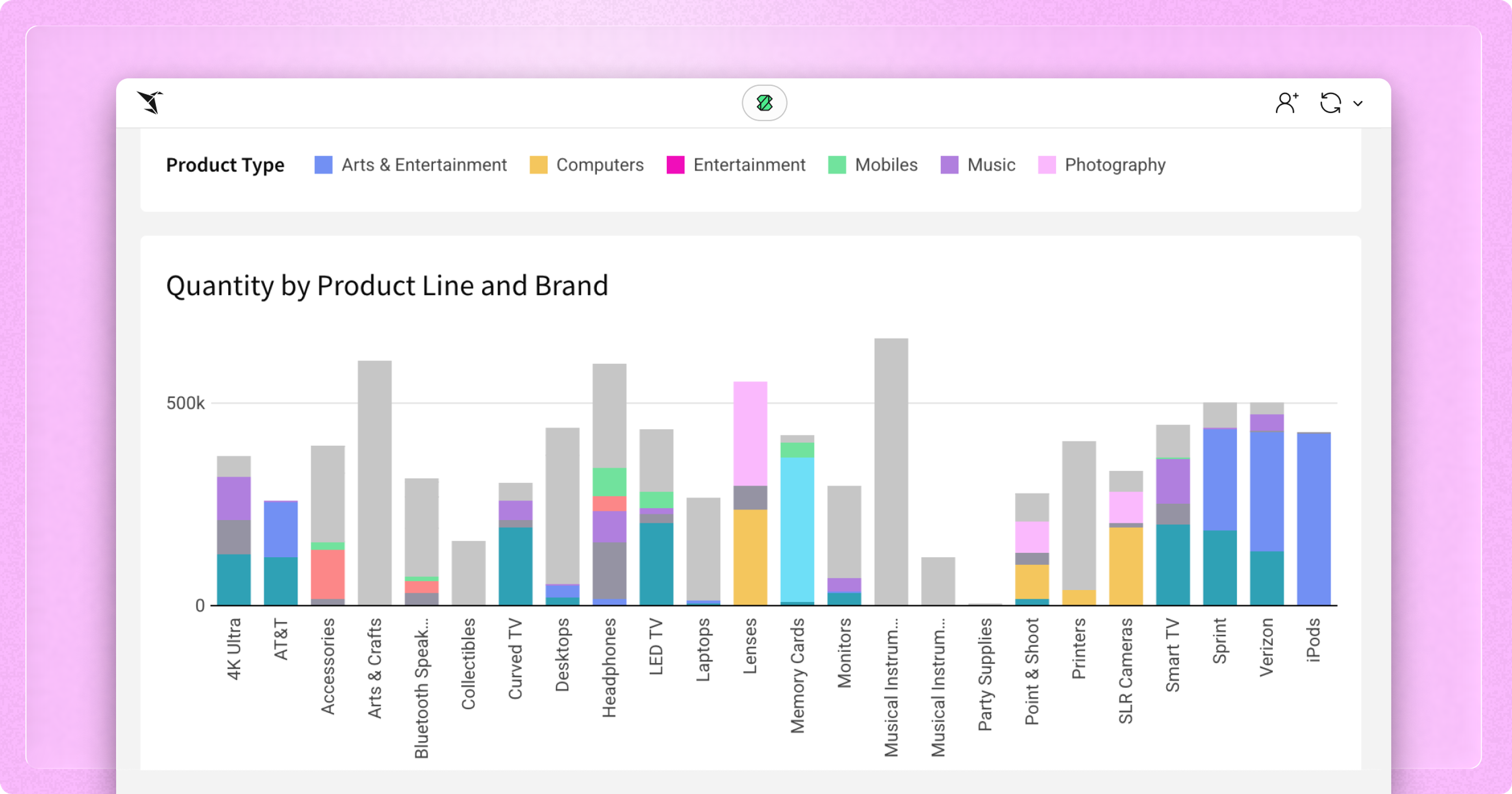
Here’s a sad example of what that could look like:
So, we got to thinking. How can we make this a better experience?
Using the right grease for the job
Once we’d identified the problem areas, the next question was whether we could solve them all at once. After collecting use cases, bug reports, and feature requests, we reviewed the must-have, should-have, and nice-to-have capabilities of an all-in-one coloring and chart control feature.
What emerged was the idea for a new kind of control: something that looked and worked just like a chart legend, but could be connected to multiple charts. Color assignments would be easily accessible in the main configuration panel, rather than being buried in the color picker. As a separate element, this feature would unlock new layout options, such as resizing the legend independently of the chart and positioning the legend outside the chart element tile. A user could also align colors behind the scenes by placing the control on a hidden page. We finalized a list of requirements, drafted a design, and began coding.
What emerged was the idea for a new kind of control: something that looked and worked just like a chart legend, but could be connected to multiple charts.
Of course, implementation raised new questions every step of the way. How should we assign the colors to the legend items—using a palette and overwriting chart-assigned colors, or leaving it up to the user to set the colors one at a time? What about categories that exist in the chart data but not in the legend configuration? How could we offer flexibility in appearance without overwhelming the user with configurations? What happens if we filter the data source for the legend control? Should we allow conversion of the legend control to a different control type?
In answering these questions, we realized that our feature could be more than just a standalone legend. What if we gave it functional parity with our list control? This capability would allow legend selections to be used as a control variable and to persist across browser sessions and users. It would also provide more consistent behavior between existing control types and the legend control. After several rounds of iteration, we had a feature ready for use.
Test driving on our own lot
While the feature was in beta, we encouraged internal users to incorporate legend controls into their existing workbooks. This testing helped surface capabilities our initial design hadn’t captured, but that the feature could naturally support. The response was overwhelmingly positive—every tester found a use case for the legend control, from painlessly unifying color assignment to making better use of dashboard real estate.
However, there was one request almost everyone shared: could we add a way to convert an existing chart legend into a legend control? Setting one up from scratch is a multi-step process, and a one-click solution would be far more intuitive. Once we landed on a design, we shipped it to customers within a week.
Here’s a quick visual showcasing consistent and increasing usage since we released legend control:
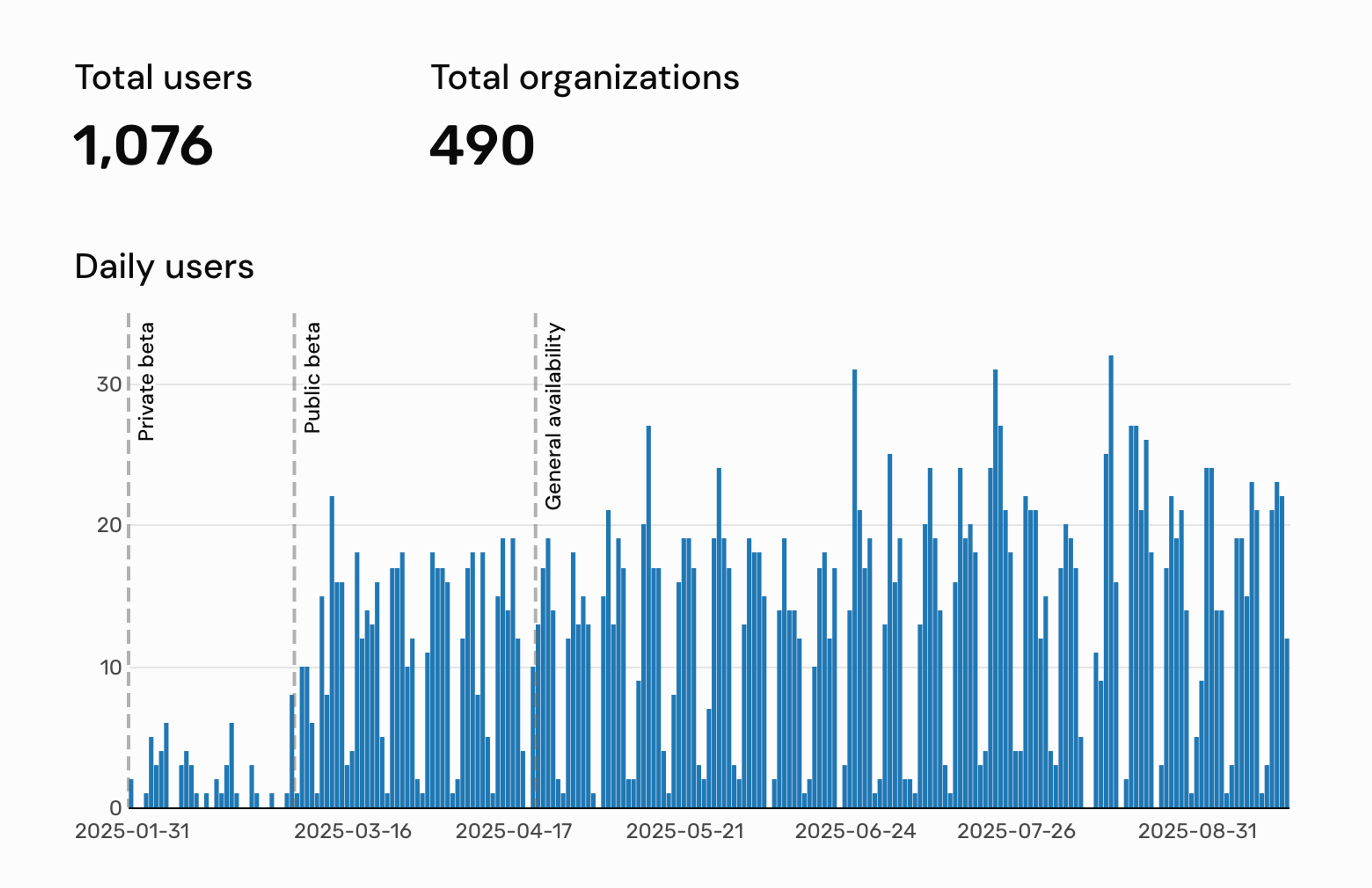
It’s also becoming the go-to solution for the exact problems that inspired us to build it. We’ve seen users in the Sigma Community describe frustrations around color unification, discover legend control through a reply, and then immediately express excitement once they realize how directly it solves the issue. Adoption is increasing because it does what we designed it to do—solve a specific, recurring pain point with as little friction as possible.
Running it on the road
Remember that sad, mismatched dashboard I shared earlier? Here it is revamped using legend controls:
Much better!
Bringing the legend control to life required collaboration with our internal design team and our customer-facing sales and support teams. Iterative feedback from and to our engineering team shaped the development of the feature from proof of concept to release. Writing code is only the starting point for a Sigma engineer’s part in guiding our product towards its ultimate goal of providing well-considered, tested solutions to real problems.
More than just a paint job
Small touches can make a significant difference, especially when they eliminate friction from everyday tasks. The legend control is a prime example of how thoughtful engineering, cross-team feedback, and user empathy come together to keep the Sigma experience smooth, sharp, and road-ready.