The Insider Guide To Sigma’s Data Modeling Revolution

Nearly two years ago, we kicked off the design journey for data models—Sigma’s first fully-fledged semantic model. If you’re new to the term, think of data models as reusable, governed building blocks that help teams create trusted data experiences without reinventing the wheel.
Curious why we built them? Dillon Morrison, our Senior Director of Product Management, breaks it down in this article.
Now that data models are generally available, we’re taking a moment to look back at the challenges, decisions, and design principles that shaped the product. And more importantly, to share what designing for trust, scale, and clarity looked like at Sigma.
Here’s what we learned.
Always lean in to your product’s differentiators
Throughout this process, we kept Sigma’s differentiators front and center. We’ve built the best self-service data tool out there, because self-service is what fuels true data culture.
For too long, data teams have been stuck maintaining pipelines and handling endless ad hoc requests—often across a fragmented toolchain. With data models, we set out to change that. They allow data teams to curate and govern reusable sources in one place, while giving business users the confidence to explore independently.
The challenge? Designing a powerful, flexible feature set that still feels approachable for all users. We had to balance capability with clarity—without compromising either.
We’ve built the best self-service data tool out there, because self-service is what fuels true data culture.
One of our core design principles is to balance flexibility and excellent outcomes. Users should be able to work in Sigma their way, without sacrificing functionality or usability. During beta interviews, we learned that because some users come from a spreadsheet background and others were more familiar with BI tools, they had very different expectations for how data modeling should look and feel.
Our early version mirrored Workbooks—great for spreadsheet minds, but it didn’t match how BI users think. So we introduced the Entity Relationship Diagram (ERD): a visual, high-level view that adds structure and clarity. To stay true to our principle, both views are fully functional. Start in ERD or Workbook—same power, different paths. It’s not a new paradigm, but a more familiar feature for modelers brought in parallel to the canvas of the workbook helped them make better decisions.
Embracing failure drives better design
Early on, we hypothesized that we could fold data models into the existing Workbook. We prototyped and tested with a small group of trusted customers. The feedback was (unfortunately) clear: this didn’t work! Cramming complex features into an already loaded experience diluted both, so we pivoted to a new document type with a clearer workflow.
That was just one of many learning moments. At one point, we tried consolidating all core modeling features—relationships, metrics, security, transforms—into a single mega modal. Power users loved the consolidation. But it came with costs: discoverability issues, info overload, and inconsistent behaviors. Eventually, we moved away from the modal approach and placed the individual features in the document inspector, remedying these drawbacks. The failure of this modal, among others, was vital in building the product we have today.
There is such a thing as too much information
Data models are powerful, but with great power comes great complexity. The challenge lies in providing consistent and understandable UX that helps users across experience levels efficiently accomplish tasks. To do that, we turned to another core design principle: focus on what matters and remove clutter. By studying user flows, we established a consistent foundation that works across all interactions, then layered on the unique needs of each feature.
Data models are powerful, but with great power comes great complexity.
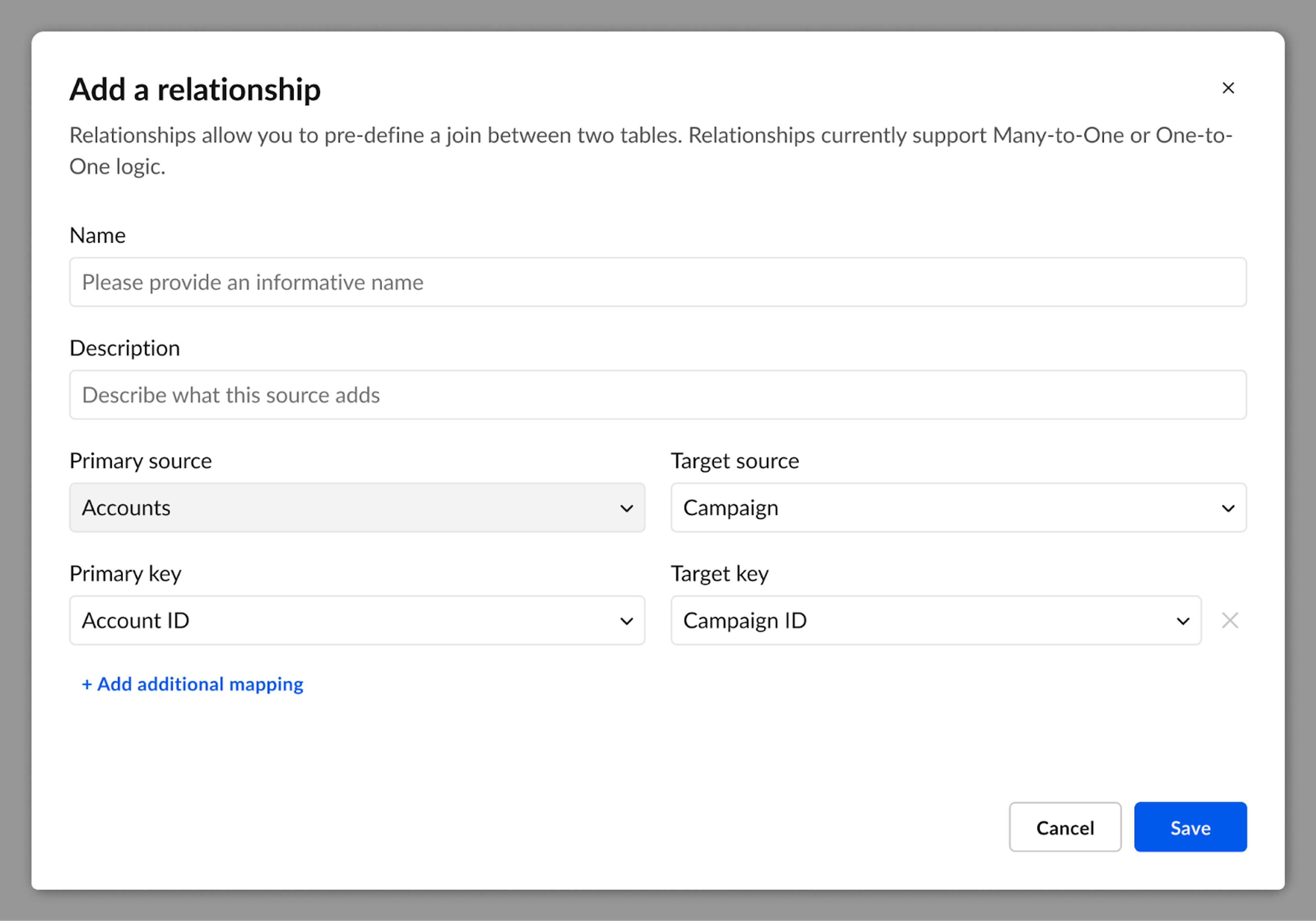
Let’s look at Relationships, one of our core features:
Relationships let modelers pre-define joins between tables so users can pull fields from multiple sources without worrying about the underlying logic. Joins are tricky, and the consequences of a bad join can be pretty drastic. For example, fanning out data can result in totally incorrect values!
To prevent bad joins, many products throw the kitchen sink at the user with overbuilt, intimidating interfaces. We knew we could do better: a guided experience, rich with info, but without overload.
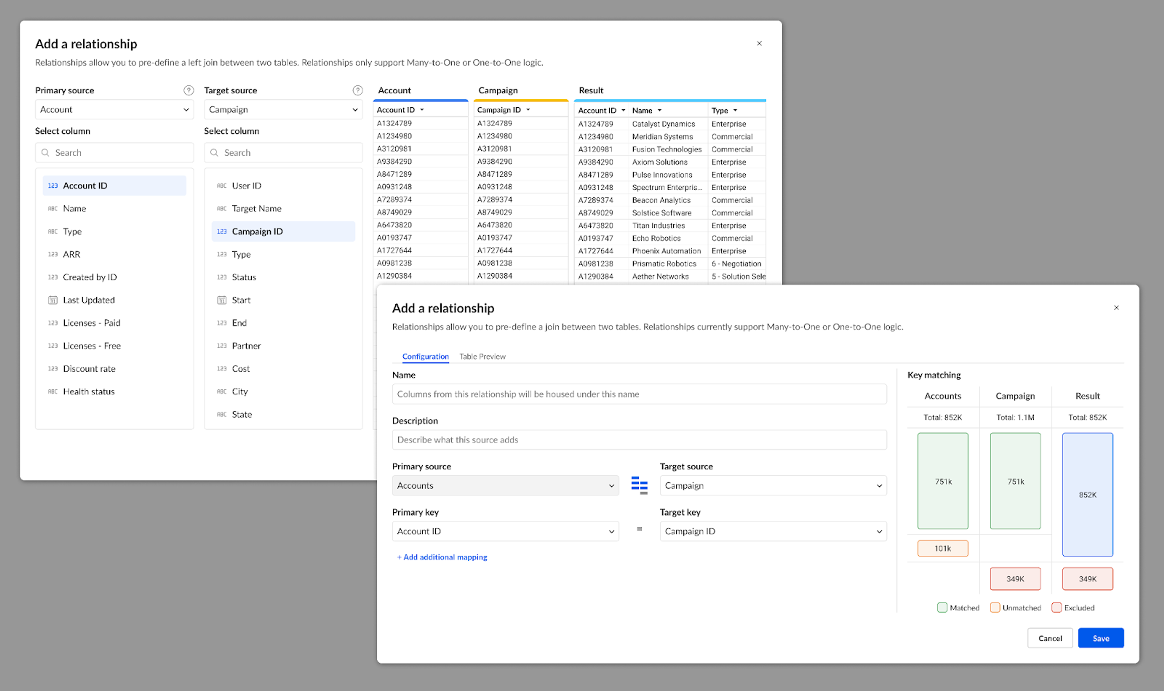
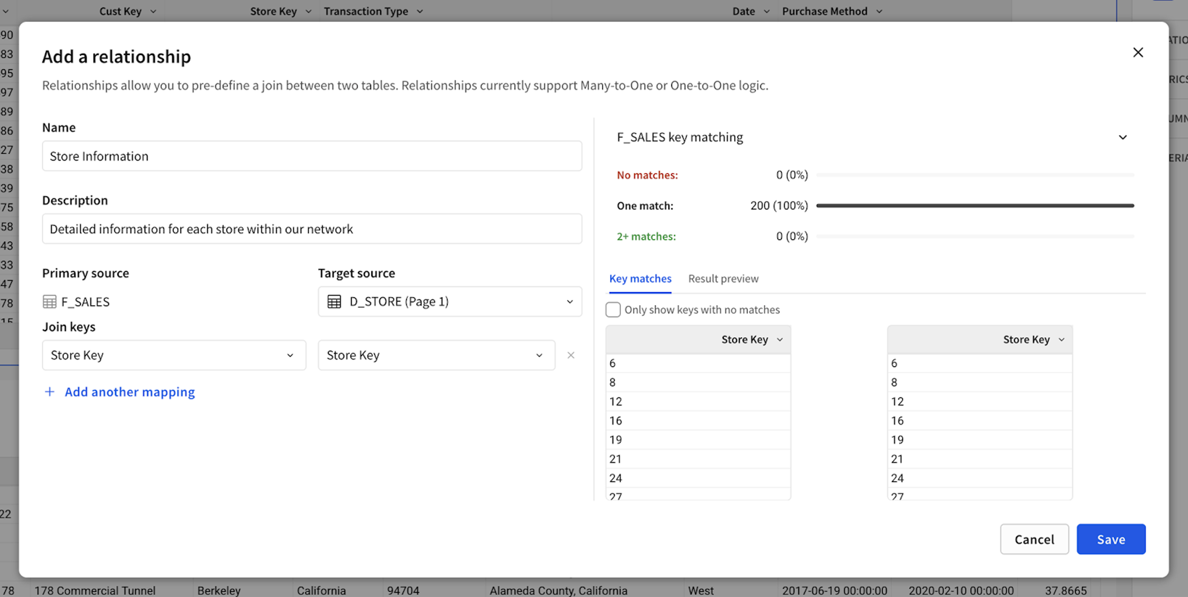
Following our design principle, we simplified the flow for creating Relationships down to a very basic pattern: a form with dropdowns. While functional, this approach didn’t provide any information to a user that they’re doing it right.
Our first approach was a simple readout of join statistics. Early testing showed users struggled to connect the numbers—key for validating joins. Users needed a visual cue, not just raw data, which is why we landed on a subtle bar chart-inspired version. Research also revealed that users rely on distinct value counts to assess join accuracy, so we added a side-by-side column view for comparison. Testing has been very positive, and we’re expanding this design to similar features across the product.
One of the best parts of designing at Sigma? We use Sigma. With access to billions of click events, we’re always uncovering insights that shape our design process. Let’s return to the Relationships feature to learn about how data informed their evolution from a precursor feature, Links.
Like Relationships, Links were designed to provide a pre-defined join path, helping less technical users access more fields. To do that, we introduced a nifty new type of column that would appear in tables and, when clicked, pop open a modal to let users add more fields. Users liked the concept, but adoption lagged. Why? The data told us: with over 20 columns per table on average, Links placed at the end were easy to miss. A user would have to scroll extensively to access the feature. No wonder folks weren’t using them! So, we repositioned Relationships alongside other columns and made them more visible whenever a new element is added.
Designing data models has been a journey, and we’re not done. We’re constantly learning, iterating, and refining as we go. In the year ahead, expect more polish, more power, and some wild new features you’ve never seen before. We can’t wait to show you what’s next.