From Overwhelm To Action: How To Improve Data Usability

Data piles up faster than most teams can handle. Dashboards are built, metrics are published, and reports are shared, but this doesn’t necessarily mean that anyone feels more confident making a decision. Having clean data is a starting point. What determines whether a chart shapes strategy or gets ignored in an inbox is usability, meaning how easily people can understand, access, and apply the information in front of them.
Think about how often you’ve seen a dashboard filled with dozens of charts and filters, each technically accurate, yet challenging to interpret. If every column name requires translation or every metric sparks a debate, the odds of that dashboard influencing action shrink dramatically. Usability is what closes the gap between data existing and data being put to work.
This blog post explores what makes data usable and what undermines it. We’ll look at how clarity, context, and access transform analytics from something overwhelming into something actionable. By the end, you’ll see why usability is the foundation for decisions that stick.
What is data usability, in a nutshell?
Data usability describes how easily people can take the information available to them and turn it into something actionable. It isn’t a matter of whether the data is clean, accurate, or complete. It’s about whether a person opening a dashboard or report knows what the numbers mean, where they came from, and how they should be applied in their work. Unlike data quality, which focuses on accuracy and completeness, or data availability, which ensures that information exists in the first place, usability asks a different question: Can people make sense of this? Even the most perfectly engineered dataset has little value if the end user struggles to interpret it.
The impact is felt in subtle but meaningful ways. A report that uses vague column names forces people to pause, double-check, or reach out for clarification. A metric that isn’t clearly defined can create different interpretations depending on who is viewing it. Over time, these small moments of hesitation erode trust in the analytics process and cause decisions to be delayed.
When data is usable, those moments disappear. People can see not only the number but the story behind it. They can explore confidently, ask questions without confusion, and act without worrying they’ve misread the information. That confidence, when it is shared across teams, becomes the foundation for broader adoption and faster, more reliable decision-making.
Signs your data isn’t usable, even if it’s technically clean
A dataset can be perfectly accurate and still fail the people who rely on it. Technical quality doesn’t guarantee that data is ready for decisions. Usability breaks down in ways that aren’t always obvious until you watch how teams interact with the information in front of them.
Unclear naming conventions
When field names look like shorthand for engineers instead of plain language, business users are forced to guess. Imagine a sales manager staring at a column labeled “rev_gross_ytd.” They might figure out that it means gross revenue year-to-date, but they’ll likely hesitate, double-check, or ask someone else for confirmation. That pause alone can stall momentum.
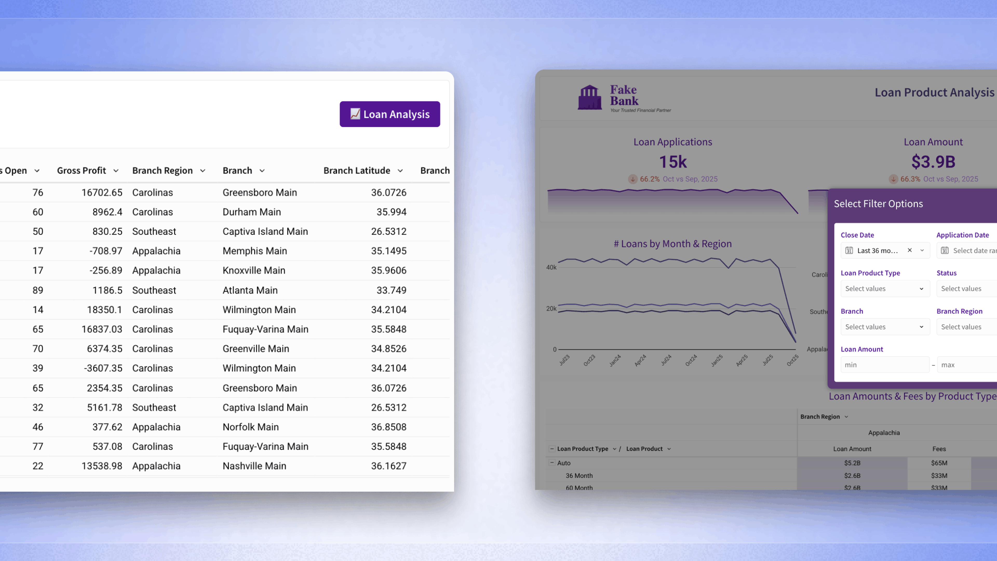
Overwhelming dashboards
Dozens of charts crowded onto a single page, all competing for attention, can be paralyzing. Instead of surfacing the most relevant signal, the dashboard creates noise. People end up clicking around aimlessly or abandoning the view altogether.
Conflicting interpretations
Siloed data creates a different kind of problem. If marketing, finance, and operations each have their own interpretation of the same metric, alignment disappears. Numbers start conflicting in executive meetings, and instead of discussing outcomes, teams debate which version is correct.
Over-reliance on analysts
If every new filter, drilldown, or metric comparison requires a ticket, then access to data becomes a bottleneck. Analysts become report factories, and business users learn to wait instead of exploring. Over time, that dynamic discourages curiosity and reduces the value of analytics across the organization.
The 3 pillars of data usability: Context, clarity, and access
When data feels easy to work with, it usually comes down to three ingredients. Context, clarity, and access create the conditions where information isn’t just stored but is ready to be applied. Each plays a distinct role, yet they work best together.
- Context gives meaning to numbers. A metric is more than a calculation; it carries a definition, a lineage, and a purpose. If a revenue figure is tied to a clear explanation of whether it includes refunds, discounts, or deferred revenue, people can act on it with confidence. Without that context, teams spend their energy debating definitions instead of discussing what the number suggests.
- Clarity shapes how information is presented. Intuitive visuals, plain-language metric labels, and consistent filters reduce the mental load for users. A chart that highlights the difference between forecasted and actual sales is far more effective when labeled clearly than when hidden behind abbreviations. Clarity turns analysis into something approachable instead of intimidating.
- Access ensures that the right people can reach the data they need without barriers. If a frontline manager can open a dashboard, explore the filters, and find their answer without sending a request to an analyst, the organization moves faster. Access doesn’t mean every dataset is wide open. It means that governed, trusted layers of data are made available in a way that respects security while encouraging exploration.
Together, these three pillars prevent data from becoming shelfware. They encourage adoption, build trust, and shorten the distance between question and action. When context explains the numbers, clarity makes them readable, and access puts them in the hands of more people, data finally becomes a resource that fuels decisions instead of confusion.
How to bring usability into your BI workflows
Making data usable isn’t only about theory. It shows up in the way dashboards are designed, how metrics are grouped, and the standards that guide everyday reporting. A well-structured workflow makes the difference between a tool people trust and one they avoid.
A first step is to reduce unnecessary clutter. Dashboards packed with dozens of charts might look thorough, but they often discourage people from digging deeper. Grouping metrics into meaningful sections and prioritizing the ones that matter most keeps attention focused. When a finance dashboard highlights revenue, margin, and expenses in clear blocks, it feels navigable instead of overwhelming.
Descriptions and tooltips also carry weight. A field labeled “customer segment” can mean different things depending on whether it is based on spend, behavior, or demographics. Adding a short description directly in the dashboard removes the guesswork. This type of documentation doesn’t need to feel heavy-handed; even a single line of explanation can save hours of confusion across teams.
Consistency across dashboards builds trust. When filters are labeled differently in sales and marketing reports, people hesitate to use them. By aligning filter logic and agreeing on naming conventions, teams can move past these small points of friction and focus on interpretation.
Finally, aligning on metric definitions before building visuals keeps rework to a minimum. A chart becomes far more reliable when everyone agrees on what “customer retention” includes before it’s displayed. That upfront alignment reduces downstream arguments and strengthens confidence in the end product.
Usability and governance go hand in hand
Good design makes dashboards approachable, but design alone doesn’t guarantee that data will remain usable over time. Without governance, even the clearest dashboard can start to create confusion once new datasets, metrics, or teams enter the picture. Governance provides the guardrails that preserve clarity and consistency as the data environment grows.
One important area is metric definitions. A company might align on the meaning of “active customer” when a dashboard is first rolled out. Still, if that definition isn’t formally documented and governed, it will splinter over time. Marketing may start counting logins, while product uses feature activity, and finance uses billing records. When definitions shift this way, the same metric begins to tell different stories, which erodes trust in the numbers and slows down decisions.
Standardization practices help address those issues more broadly. This includes everything from naming conventions to data documentation and shared calculation logic. A sales report that labels a field “net_new_cust” while another labels it “new customers” creates subtle confusion. Establishing and enforcing naming conventions helps avoid mistakes that come from misinterpretation. These conventions don’t have to be rigid; they just need to be consistent enough that people across teams know what they’re looking at.
Certified datasets and governed layers add another layer of trust. When dashboards are built on certified data, users know that what they see has been validated. This shifts the focus from questioning the numbers to discussing what the numbers mean. Over time, that reliability shapes how people view analytics across the organization. Usability, then, becomes more than a question of layout or visualization. It is a shared responsibility that combines thoughtful design with stewardship. Governance ensures that what looks clear today will still be clear months or years from now, even as data complexity increases.
How modern BI tools improve usability by default
The newest generation of BI platforms is designed with usability as a core principle rather than an afterthought. Older systems often required technical fluency just to pull a report. By contrast, modern tools embed features that allow people across an organization to explore and understand data without waiting on specialists.
One of the most important changes is direct access to live cloud data. Instead of exporting outdated spreadsheets, users can interact with data that reflects the current state of the business. Drilldowns, filters, and comparisons become part of the workflow, allowing teams to move from high-level overviews to detailed insights in one place.
Interfaces also look and feel different. Instead of complicated menus or SQL-only access, many platforms now provide no-code exploration that still respects data governance. A marketing analyst, for example, can filter campaign results or adjust a date range without needing technical support. This reduces the wait time between a question and an answer, encouraging more frequent use of analytics.
Reusable components contribute to consistency. Templates for dashboards, pre-defined visualizations, and shared metric libraries help organizations avoid the confusion that comes from one-off builds. Rather than starting from scratch each time, teams can rely on a foundation that has already been validated.
Collaboration features tie these improvements together. The ability to comment directly on a chart, annotate trends, or export views into shared documents ensures that insights don’t stay locked inside a platform. They become part of the broader conversation, connecting data to business discussions.
These design choices don’t eliminate the need for thoughtful workflows and governance, but they lower the barrier to adoption. By embedding usability into the tool itself, modern BI platforms make it easier for organizations to turn data into something actionable daily.
Data usability isn’t optional
Data by itself does not create impact. Numbers can be accurate, reports can be refreshed on schedule, and dashboards can be full of information, yet decisions still stall if people struggle to understand what they are looking at. Usability is what transforms data from a static resource into something that shapes how work gets done.
Throughout this blog post, we explored the signs of unusable data, the pillars that make it effective, and the practices that help teams design with usability in mind. We also examined the role governance plays in preserving usability and how modern BI tools support adoption through built-in features. Each piece contributes to a bigger picture: data needs to be approachable, clear, and trusted if it is going to influence outcomes.
This is a reminder that the work doesn’t stop at clean pipelines or accurate models. It extends into how people interact with the outputs every day. Usability determines whether dashboards guide action or sit on the sidelines. By emphasizing context, clarity, and access, and by embedding governance into daily practice, teams set themselves up for data that doesn’t just sit idle but informs decisions at every level.
The shift from overwhelm to action is subtle but powerful. It starts with recognizing where data feels confusing, and then building processes, standards, and tools that make it easier to apply. Once teams experience that ease of use, the value of analytics becomes far more visible, not only to analysts but to everyone who depends on the insights they produce.