How Data Lineage Visualization Tools Are Solving The “Black Box” Problem In Analytics

Anyone who works with data long enough starts asking the same frustrating questions. Where did this number come from? Why doesn’t this report match the one from last week? Who changed this field, and when?
It doesn’t matter how sophisticated the tool is. If the data itself feels mysterious, even the sharpest dashboards become suspect. One minute, a report looks solid; the next, a metric shifts without explanation, and suddenly half the team is second-guessing every decision tied to it. This is because modern data isn’t simple. Tables connect to views, which depend on SQL models, which in turn pull data from raw ingestions, which are synced from third-party systems. By the time information shows up on a dashboard, it’s passed through layers of transformations, calculations, and assumptions, many of them invisible unless you built it yourself.
Without visibility into how data flows from its original source to the final report, trust starts to unravel. It becomes increasingly difficult to debug, answer questions, and feel confident about what is being reported. This blog post explores why this problem is so prevalent, how it can quietly hinder even the most skilled teams, and how visualizing data lineage helps eliminate the guesswork. If you’ve ever sat in a meeting wondering why a number changed or debating which dashboard is right, you’re in exactly the right place.
Why your data still feels like a black box
Modern data stacks are designed to be efficient, scalable, and modular; however, this same modularity often hides what’s happening beneath the surface. A simple dashboard might pull from five different tables. Each of those tables may pull data from a combination of sources, including cloud applications, SQL models, flat files, third-party APIs, or data warehouses like Snowflake. Those sources often change quietly behind the scenes. Fields get renamed, upstream filters get adjusted, or a transformation script alters the meaning of a metric without anyone being aware of it immediately. These changes don’t trigger alerts or send notifications to the analyst opening the workbook. Data pipelines weren’t always this fragmented. Years ago, an Excel spreadsheet or a single database query covered most reporting needs. The shift to cloud platforms, ELT tools, and decentralized analytics brought huge gains in scale and flexibility. It also introduced more moving parts owned by different teams, using different tools, operating on different cadences.
That complexity comes with consequences. One tiny change to a source system can cascade through transformations and models before anyone notices. By the time it shows up as a broken dashboard or an inaccurate KPI, diagnosing the root cause feels like untangling a spider web with half the threads invisible. The problem is both technical and operational. Engineers manage pipelines, analysts build reports, and business users consume dashboards.
Each group interacts with data differently but shares the same risk: no clear visibility into how information flows from raw source to final insight. When something breaks or simply fails to meet expectations, teams scramble. Meetings pivot from decisions to diagnostics, and people waste hours manually tracing through SQL queries, asking, “Did someone change the source table?” or “Is this filter new?” Without transparency into the path data takes, it becomes guesswork, and teams lose time they don’t have, chasing problems that wouldn’t exist if the data told its own story clearly from start to finish.
What is data lineage?
When someone mentions data lineage, it can sound abstract, like something that applies to massive enterprise systems or compliance-heavy industries. In reality, it’s far simpler. Data lineage is essentially a map that shows where your data originates, how it’s transformed, and where it ultimately ends up.
Imagine pulling a number from a dashboard. That metric didn’t appear out of thin air. It likely started as a raw field inside a source system, such as a customer order, a payment transaction, or a support ticket. From there, it passed through several stages. Maybe a data engineer cleaned it, joined it with other tables, applied business logic, or built a model that finally landed in a report. Each of those steps left an invisible footprint. Lineage makes those footprints visible.
It answers questions like:
- What table does this column come from?
- Which transformations modified it?
- If I change this field upstream, what dashboards, reports, or models does it affect?
Lineage takes different forms depending on what teams need to understand. Most focus on a few core perspectives that help them navigate how data flows:
- Technical lineage: This traces the literal connections between columns, tables, queries, and pipelines, illustrating how data flows from one location to another. It’s the view engineers rely on when debugging issues or planning schema changes.
- Business lineage: A higher-level view. This focuses on how the data represents concepts like revenue, customer churn, or product engagement. It’s how analysts and business teams interpret raw data into actionable insights.
- Operational lineage: This tracks processes around the data. Consider how often a dataset is refreshed, which quality checks were run, and whether the pipeline completed successfully.
These perspectives matter most when teams are troubleshooting issues, answering tough questions, or explaining why a number changed:
- An executive asks why this quarter’s revenue dashboard doesn’t match the finance team’s numbers.
- An analyst notices that a KPI has shifted but can’t immediately determine if it’s a data error or a genuine business change.
- An engineer updates a source table and accidentally breaks five reports downstream because no one realized how tightly connected they were.
Lineage is the connective tissue that holds everything together. Without it, data work becomes detective work that is slow, uncertain, and prone to error. With it, teams stop guessing. They know exactly where a number comes from, how it was shaped, and what depends on it downstream.
Why visualization changes the equation
If you’ve ever tried to trace a metric back to its source using only SQL queries or documentation, you know how quickly it turns into a guessing game. Reading logs or scanning through transformation code might give part of the picture, but it rarely tells the full story. Even the most experienced engineers end up piecing things together from memory, tribal knowledge, and scattered notes. Data isn’t linear; it branches, loops, merges, and transforms. A single dataset might connect to ten others, each with different refresh schedules, owners, and dependencies. Trying to mentally map those relationships, especially when they change frequently, is almost impossible to sustain. That’s exactly where visualization becomes necessary.
A lineage diagram provides a clear view of the entire data flow at a glance. You can follow how raw data is transformed, joined with other sources, and ultimately displayed in dashboards, reports, or models. More importantly, it exposes how one change can ripple downstream, sometimes in ways that aren’t obvious until something breaks. Visualization transforms what was previously opaque into something the entire team can understand. Analysts don’t need to rely on engineers to explain where a number comes from, and business users no longer have to wonder why a dashboard shifted. Everyone shares the same mental model of how the data works.
It’s the difference between reading a written description of a subway map versus actually seeing the map. One forces you to memorize routes and connections, and the other lets you navigate intuitively, spotting problems or planning new paths without friction. Without a visual representation, data work becomes reactive, and teams scramble to fix problems after they show up. With it, those same problems become easier to predict, prevent, and solve. It creates clarity where confusion once existed.
How modern data teams use lineage, even if they don’t call it that
Most teams working with data are already performing some form of lineage tracing; they just do it the hard way. Think about the last time someone asked why a number changed in a report. The first instinct is usually to open the workbook, check the formulas, and then trace back to the datasets or queries feeding that metric. If the answer isn’t there, the next step is to conduct a deeper dive into the warehouse, checking which tables supply that dataset, who built it, and whether anything changed upstream. None of this is formally called lineage work, but that’s exactly what it is.
It shows up in small moments. An engineer might tweak a source table, then check Slack to see if anyone downstream depends on it. At the same time, an analyst reviewing a dataset might reach out to confirm whether the filters still align with the logic from last quarter. Someone notices a metric drift and begins piecing together SQL queries to determine where the change originated. When lineage isn’t explicit, it becomes manual detective work. The mental cost accumulates as people rely on institutional knowledge, undocumented processes, and the hope that nothing upstream has changed since the last time they checked. Lineage visualization flips that pattern. Instead of starting with a broken report and working backward, teams start with the full picture upfront. They can spot how tables connect, which models depend on which transformations, and what impact a change might have before it becomes a problem.
The real advantage is catching issues before they turn into problems, rather than scrambling to fix them after the fact. If an engineer knows that dropping a column will affect five dashboards, they can coordinate with the relevant stakeholders before making the change. If an analyst notices that a dataset is pulled from a staging table rather than production, they can flag it before relying on incorrect numbers. It also changes how teams collaborate. Engineers stop being bottlenecks for data questions, analysts gain autonomy because they don’t have to guess how data flows, and business users trust that when a dashboard shifts, there’s a visible explanation for why.
Lineage becomes a silent partner in how modern data teams work. It moves from being a reactive process to a proactive foundation for trust, accuracy, and speed.
What data lineage looks like inside Sigma
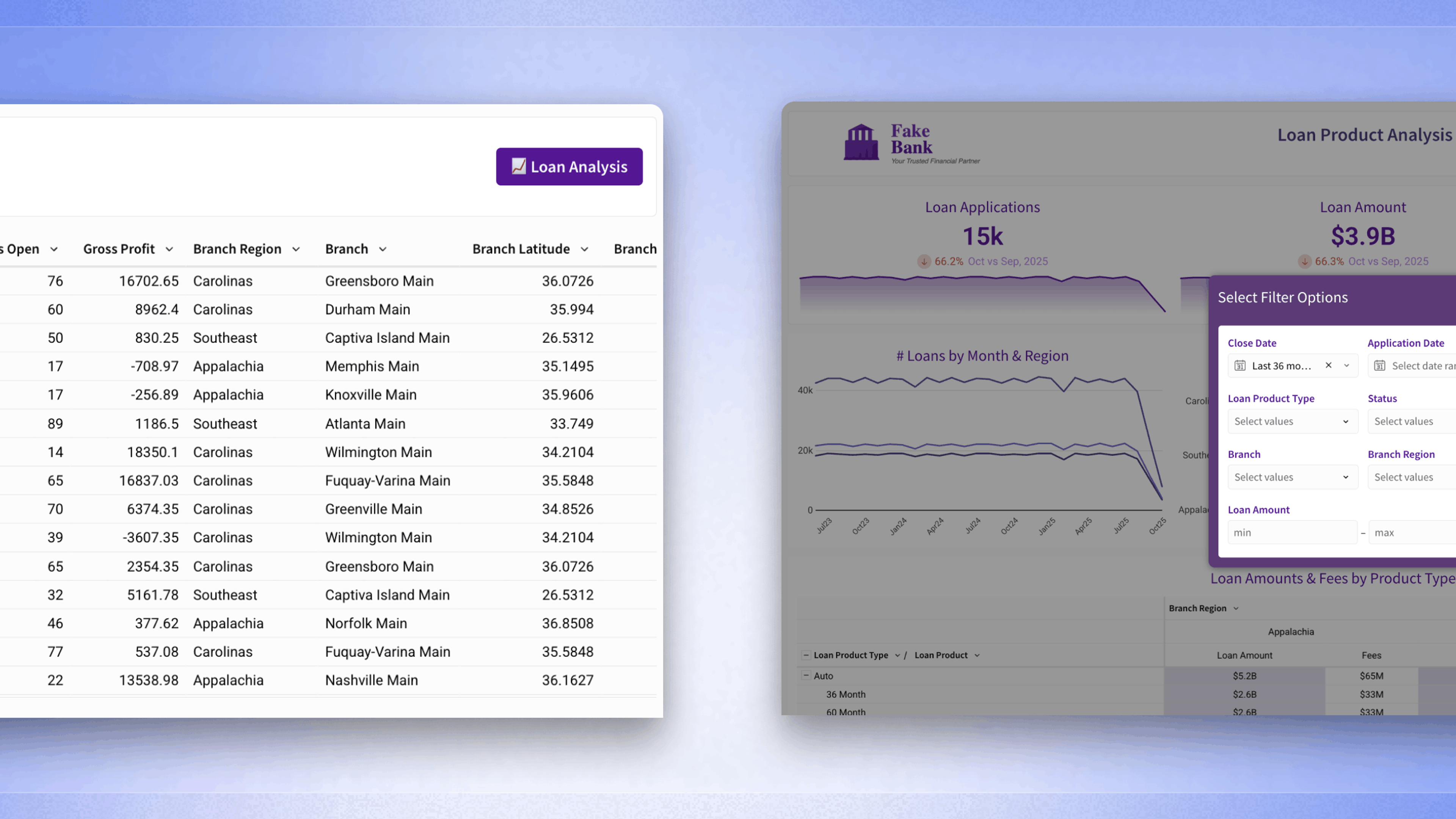
If you’ve spent any time building in Sigma, you’ve already seen the foundations of data lineage in action, whether or not you’ve called it that. Sigma’s workbooks aren’t just a place to display data; they represent how data flows. Every join, calculation, and reference between datasets creates a visible chain of relationships right inside the workbook itself. When you connect a table from your warehouse, bring in related datasets, and write calculations based on those joins, Sigma constructs a transparent structure that shows where every number comes from. You can click into any column to see its formula, track the datasets it pulls from, and understand how that field is built, step by step. The workbook’s data pane reflects how columns, tables, and derived fields connect, offering a clear view into how data moves within that analysis. This view shows how data moves within the context of your analysis in Sigma. Any transformations happening upstream, like in dbt or ingestion tools, would be visible only if those outputs are already materialized in the warehouse and brought into the workbook.
Unlike static dashboards, where the logic often hides inside upstream pipelines or SQL models that no one can easily access, Sigma puts those relationships front and center. You don’t need backend pipelines or engineering tickets to figure out how a metric was calculated. The visibility reflects how data flows within the workbook, but it doesn’t capture transformations that happen outside of Sigma in tools like dbt or your ETL pipelines. Analysts and business users can trace data issues and confirm whether timeframes, filters, and sources are accurate, all without writing SQL or consulting a developer.
For teams already working in Sigma, this is a standard part of how the platform operates. The moment you connect to live warehouse data and start building, you’re inherently constructing a data flow map that remains visible, accurate, and directly tied to how your data updates in real-time. It’s important to note that this lineage view reflects how your data flows from the warehouse into the Sigma workbook and through the calculations you’ve built there. It does not capture lineage from processes that happen before data reaches the warehouse unless those outputs are materialized as tables or views that Sigma can query.
Seeing your data should be mandatory
There’s a point every data team reaches where guesswork stops being sustainable. When dashboards break, when metrics shift without warning, and when hours disappear chasing down the source of a single number, that’s when the old ways start to feel broken. The reality is simple. Data flows through dozens of invisible steps before anyone sees it on a dashboard. Every filter, transformation, and join leaves a mark. Without a way to see that flow clearly, trust slowly slips away. It becomes harder to diagnose issues, harder to collaborate, and harder to move with speed.
Lineage changes that by transforming data from something you use to something you understand. It removes the blind spots that cause rework, frustration, and delay. More importantly, it turns scattered detective work into shared context with a clear path from source to insight. This isn’t a future capability or a new layer to bolt on. Lineage happens the moment you open a workbook, connect to your cloud data, and start building. Every table connection, calculation, join, and filter leaves a visible trail you can follow in real time, without needing someone else to explain how everything fits together. The days of crossing your fingers and hoping the data is right are over. When you can see the full story behind your data, you stop guessing and start working with real confidence.
Data lineage visualization FAQs
What’s the difference between data lineage and a data catalog?
Catalogs provide metadata about datasets, including their descriptions, owners, and definitions. Lineage visualizations display the relationships between datasets, illustrating how data flows from one table to another and how changes in one location can impact reports downstream. They serve different purposes but often work together. Catalogs help you find the data. Lineage helps you trust it.
How does data lineage help during audits or investigations?
When auditors ask how a number was calculated or where a dataset came from, lineage removes the guesswork. You can see exactly which datasets feed a report, how they’re transformed, and what might have caused the discrepancy.
Can lineage visualization tools work across cloud and on-prem systems?
Some tools only trace lineage within specific cloud ecosystems. Others are designed to connect to hybrid setups, mapping data flow across both cloud warehouses and on-prem databases.