Data Exploration: The Missing Ingredient to Improve Growth

Welcome to my blog series on Data Exploration! In this monthly column, I explore the common challenges and pitfalls that functions within an organization often run into and how they can solve for it with Sigma. We are a company of innovators who believe in pushing the boundaries of what’s possible with data, and we also pride ourselves in being the model Sigma customer. Read on.
Sales analytics is a key ingredient to driving your business forward. Every sales and revenue leader that I’ve interacted with deeply cares about getting actionable insights around user growth trends to inform their pipeline, revenue planning, and expansion opportunities. Understanding how your user base is growing, as well as usage patterns in each segment, is critical to understanding your users and how they’re served by your product. It helps you make decisions about the product and where to invest, and which customers to go after.
In this blog, we explore how we use Sigma to understand our growth and how our customers use Sigma.
The Challenge
We look at growth and usage through different lenses. In this blog I’ll talk about two:
- Overall user growth. While we sell to companies, are users actually using the platform more and more?
- Usage patterns within companies (customers): Are people adopting? Are they going deep in usage of the product? Are there particular companies and segments in which adoption is stronger?
You can use off-the-shelf product analytics software to give you the first step of the analysis. For example, the most popular platforms will tell you how many users visit your site on a daily or monthly basis but when you try to do deeper analysis, they fall short, forcing you to export the data. Further, doing a bespoke analysis on how users grow within organizations is hard to achieve off-the-shelf. Generating different cohorts of users based on certain engagement metrics or events presents challenges of their own.
Laying the Groundwork
This blog will get a bit more technical than usual. Consider it an introduction to how to do things with Sigma, i.e. how YOU can self-serve and do the analysis yourself, without needing an analyst to build complex pipelines or spend months creating the needed calculations. Using Sigma, you should be able to create this for your organization in less than a day.
Our product generates user events, for example:
- User Opened Document
- User Added a Table to a Document
These events are stored in a warehouse table, and we use Sigma to analyze the data.
The basic information you'll need for the analysis here is an event table that has the following data:
- User ID: Some value that uniquely represents a user
- Timestamp: When the event happened. The resolution here could be a day (date)
- Event: Something the user did. We’ll only use this for usage pattern analysis. General growth analysis doesn’t require this, since the two columns above already state the user was ‘seen’ at a specific date.
We include other data either directly from the event table, or via Joins or Lookups from other tables (e.g. our Salesforce data that’s also synced into our warehouse) in order to allow for further analysis. For example:
- Company: Allows for organization level analysis
- Company size: Our best guess at the size of the org allows breaking usage patterns by company sizes
- Device: Allows for mobile and web access analysis
If you want to try this out yourself and don’t have an event table available, there’s a suggestion on how to get a sample data table you can use in the first Appendix.
Is Our User Base Growing Well?
Looking at overall users over time can give you a false sense of security. Your user base might be growing due to the money you’re spending acquiring new users, while you’re churning users at a high rate. Growth accounting frameworks look at user growth as follows:
Total Users in Current Period = Previous Period Total Users
+ Resurrected Users
+ New Users
- Churned Users
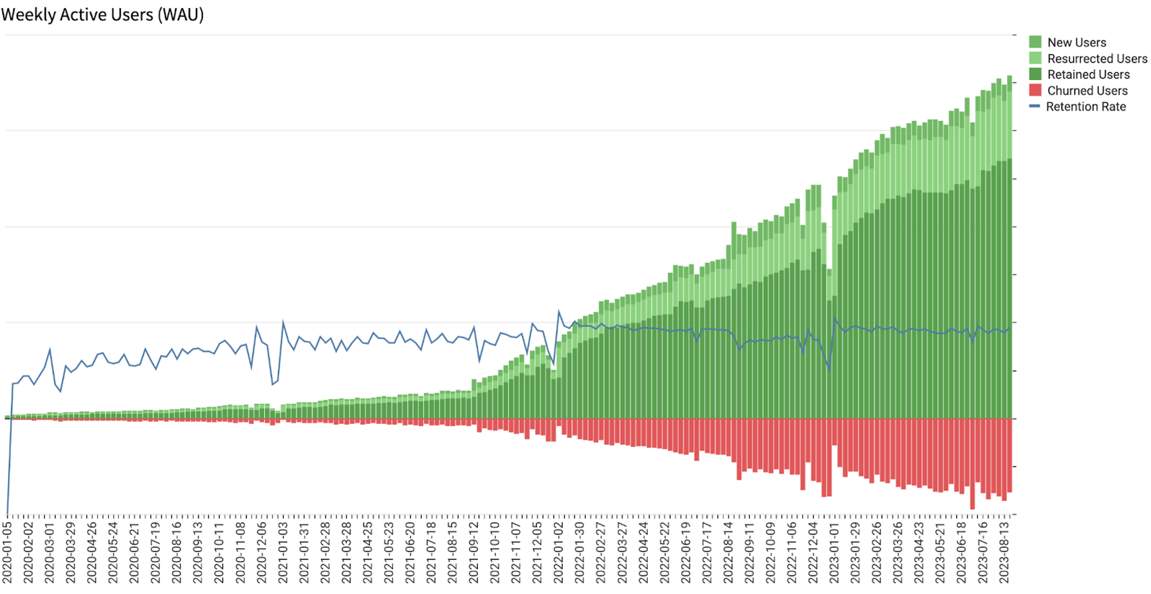
While this seems simple, building this for Daily, Weekly, and Monthly Active Users (DAU, WAU, and MAU respectively) is not trivial. Doing so and allowing for various cuts and filtering gets even more complicated. Getting an initial view could take your data scientists a few weeks by itself. You will immediately have follow up questions, for example: What does user growth look like in your SMB segment? What does it look like for a specific feature usage? What does it look like on mobile vs desktop?
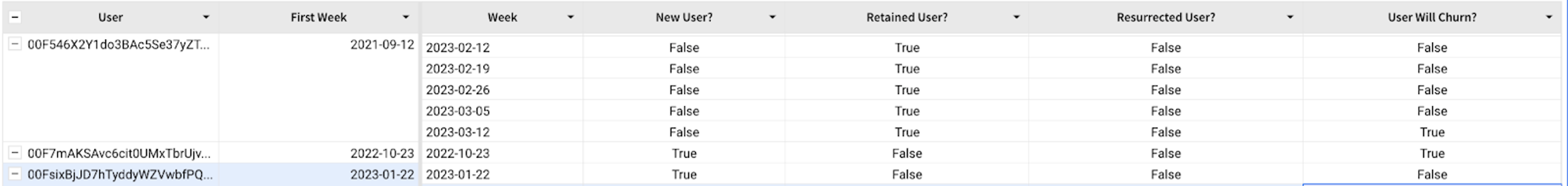
So how do we get the data for this chart? We need to create a table that looks like the one here. It’s constructed with Excel-style expressions.
- Since the chart we’re building is weekly active users, truncate the dates to the closest week.
- Group the table by [User].
- For each user, add a column for the first week they showed up. This marks the beginning of their journey with your product. Call this “First Week”. Formula:
First([Week]) - Next, group their activity by week, and sort it by ascending order. We want to see every week they come to visit the product.
- In the next steps, we’ll add columns to identify whether the users are New, Resurrected, Retained, or Will Churn in that week.
- “New User” formula:
[Week] = [First Week] - Retained users are ones who were here last week and came back this week. We’ll use the Lag function to get the previous row’s value. They also aren’t new users. “Retained User” formula:
Not ([New User]) and DateDiff("week", Lag([Week]), [Week]) = 1 - A resurrected user is then one who isn’t new this week, and wasn’t retained. “Resurrected User” formula:
Not ([New User]) and Not ([Retained User]) - Churned users are the most tricky. Ideally we’ll check if they were here last week, but not here this week. The problem is that there won’t be an entry in the warehouse for them for the week they aren’t in, so there will not be a row in which to run the calculation. Instead, we’ll calculate whether they are about to churn, i.e. do we see them this week but not next week, and also check if this is their last week in the system. When we plot this for many users, we can look at how many users will have churned last week and plot them on the current week (there’ll be entries for each week due to other users’ activity).
“User Will Churn” formula:IsNull(Lead([Week])) or DateDiff("week", [Week], Lead([Week])) != 1 - The last step is to generate a visualization out of the table, and plot the following four values along the [Week] X axis. The first three just add up any user that is of the same type. You can choose any color you want for them. The last one takes the count of the previous week’s users who will churn, and reverses the sign to show them as negative:
CountIf([New User])CountIf([Retained User])CountIf([Resurrected User])-Lag(CountIf([User Will Churn]))
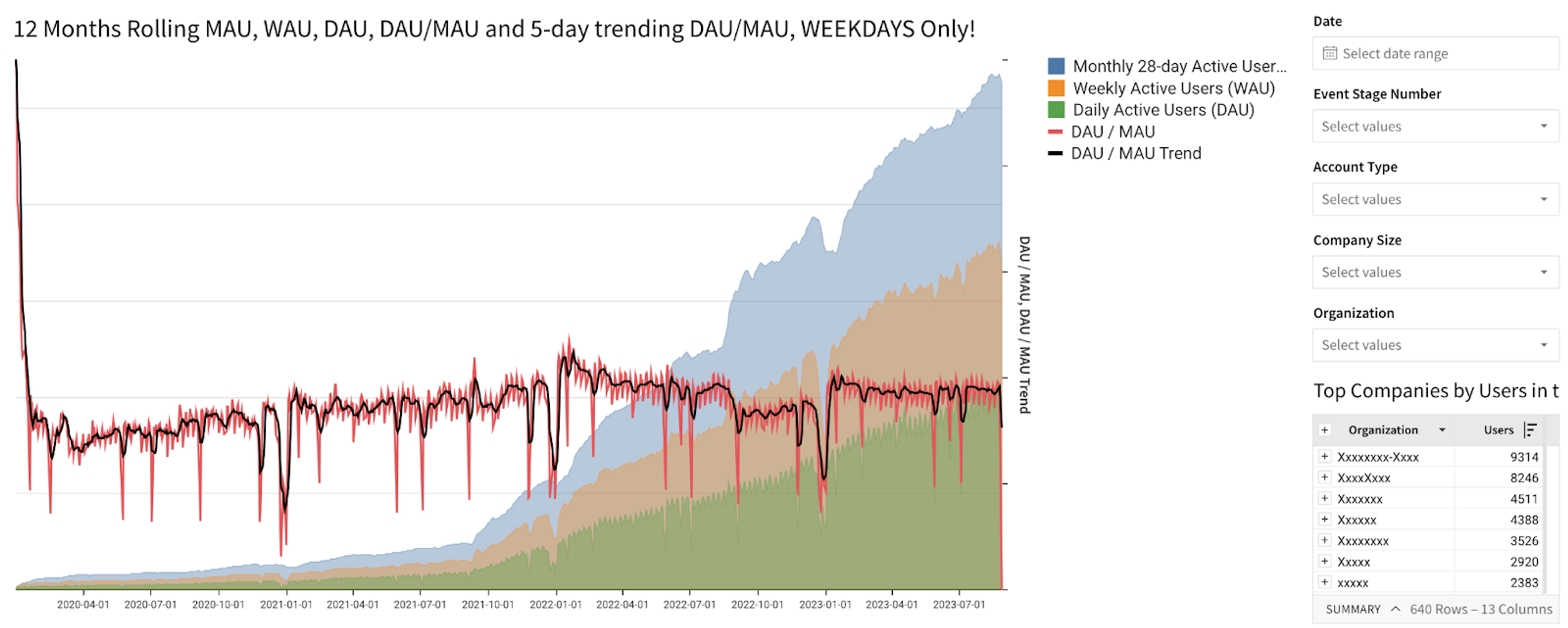
You can do much more complicated analysis, including the chart below that shows daily, trailing 7-day, and trailing 28-day users and allows you to drill down by a number of parameters. The appendix talks in great detail on how to set this up.
One way to analyze the health of your user base is by looking at cohorts and their health over time. A cohort of users is one that start at the same time. Understanding how cohorts behave can provide insights into your user base, as well as issues in the service.
There are multiple ways to view this. One interesting way is to look at heat maps (aka triangle charts) of cohorts.
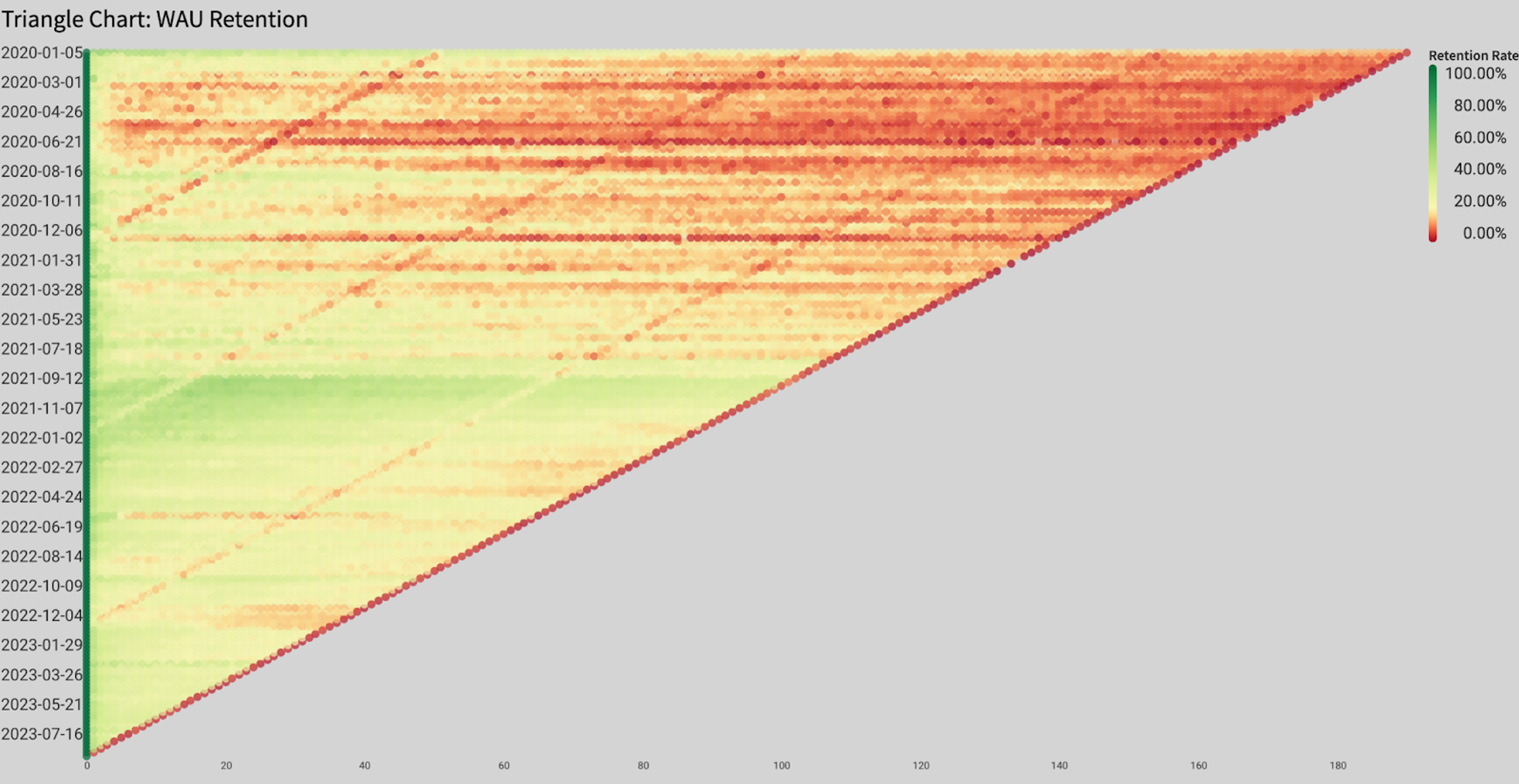
- Each row (of very small pixels) represents a cohort of users who started at the same week.
- The leftmost column is their first week on the platform when 100% of them were logged in, hence it’s green.
- The color represents the percent of users who used the service every week. You can use other metrics to analyze these cohorts.
- Over time, some will churn, making the chart go yellow and eventually red as it goes to the right.
- The shape of the chart is a triangle since newer cohorts (bottom rows) started more recently and have less history.
- The diagonal red line is the most recent week and is red since it has the least amount of visitors (it’s the middle of the week, data is still accumulating).
- Diagonals across the chart represent periods when the entire user base did something in unison. This could be a holiday (for example, the New Year’s Day), or an indication that you had some issue with the platform.
- Horizontal lines represent a specific cohort that might be stronger than usual or might be having problems.
The chart is a visual way to identify areas to go explore. It behaves a bit differently in consumer products vs B2B products. In consumer products, a cohort of users is probably unconnected and therefore a horizontal line is worth exploring since it tells you something happened during the onboarding of this cohort. Alternatively if the line is green, it might tell you that you found an extremely strong cohort of users, so you’d want to figure out how to replicate that.
In B2B services, lines could turn red for a number of reasons:
- Cohorts have more in common since companies often onboard many users together, hence the cohorts are inter-connected.
- Companies churn, causing a line to go red as all of their users offboard together.
- People eventually leave employers, inevitably dropping their engagement from the row at some point.
To construct this chart, we’ll start with the same table we constructed in the section above. We’ll create a child element table called Cohorts from it, and manipulate it to create the visualization:
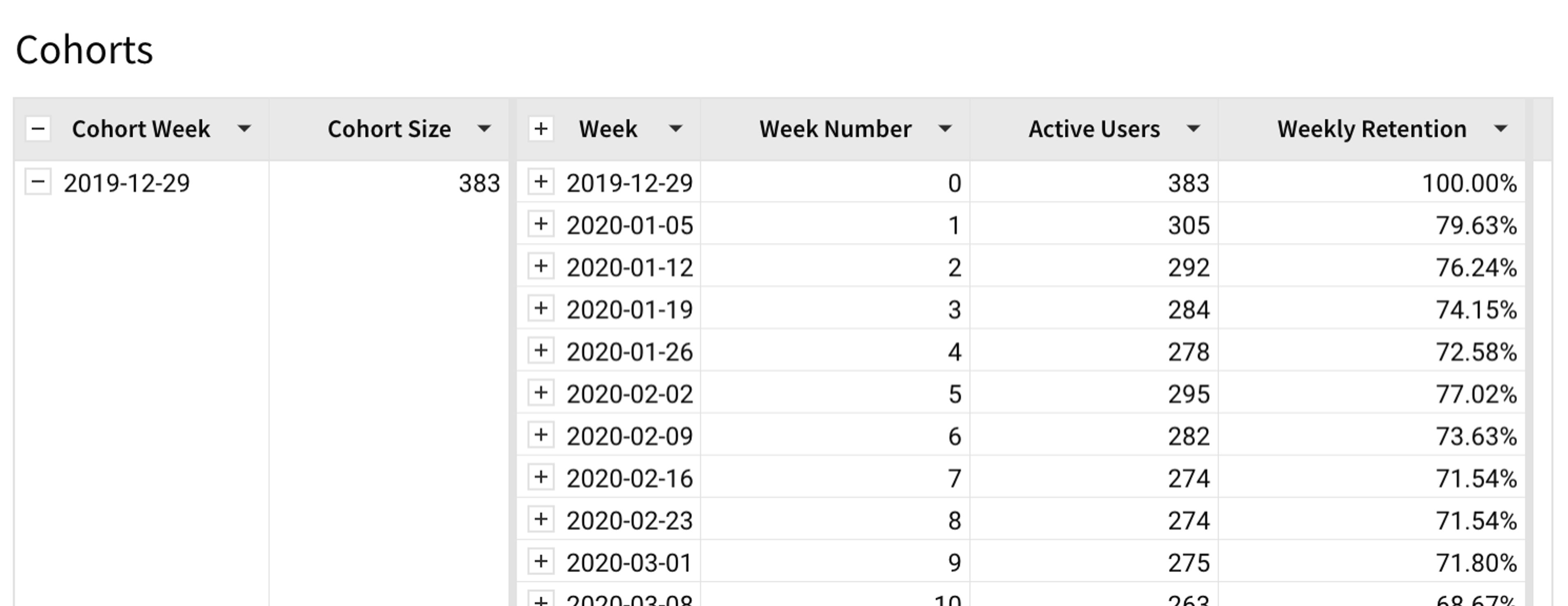
Creating a child table flattens any grouping we created, allowing us to re-group, as needed. To create this Cohorts table:
- Group by [First Week]. Rename this new column [Cohort Week]. This groups all users who started in the same week together.
- Add a new column called “Cohort Size” in the grouping. Formula:
CountDistinct([[User ID]) - Create a second grouping using the [Week] column. This collects every user who visited within a specific week together. Create the following three columns in that grouping:
- “Week Number” (i.e. 0, 1, 2) for each week they visited, to allow us to plot all these relative to the left-most axis.
“Week Number” formula:DateDiff(“week”, [First Week], [Week]) - “Active Users” for the number of users we saw that week.
Formula:Count([User ID])
Note: The table already has only one entry per user per week, so no need to CountDistinct here. - “Weekly Retention” is the percentage of users from the cohort who showed up that week.
Formula:[Active Users] / [Cohort Size] - Collapse the values after the [Week] grouping. We don’t need the individual user columns. It’s the little “+” near the [Week] column header.
The chart can then be constructed as follows:
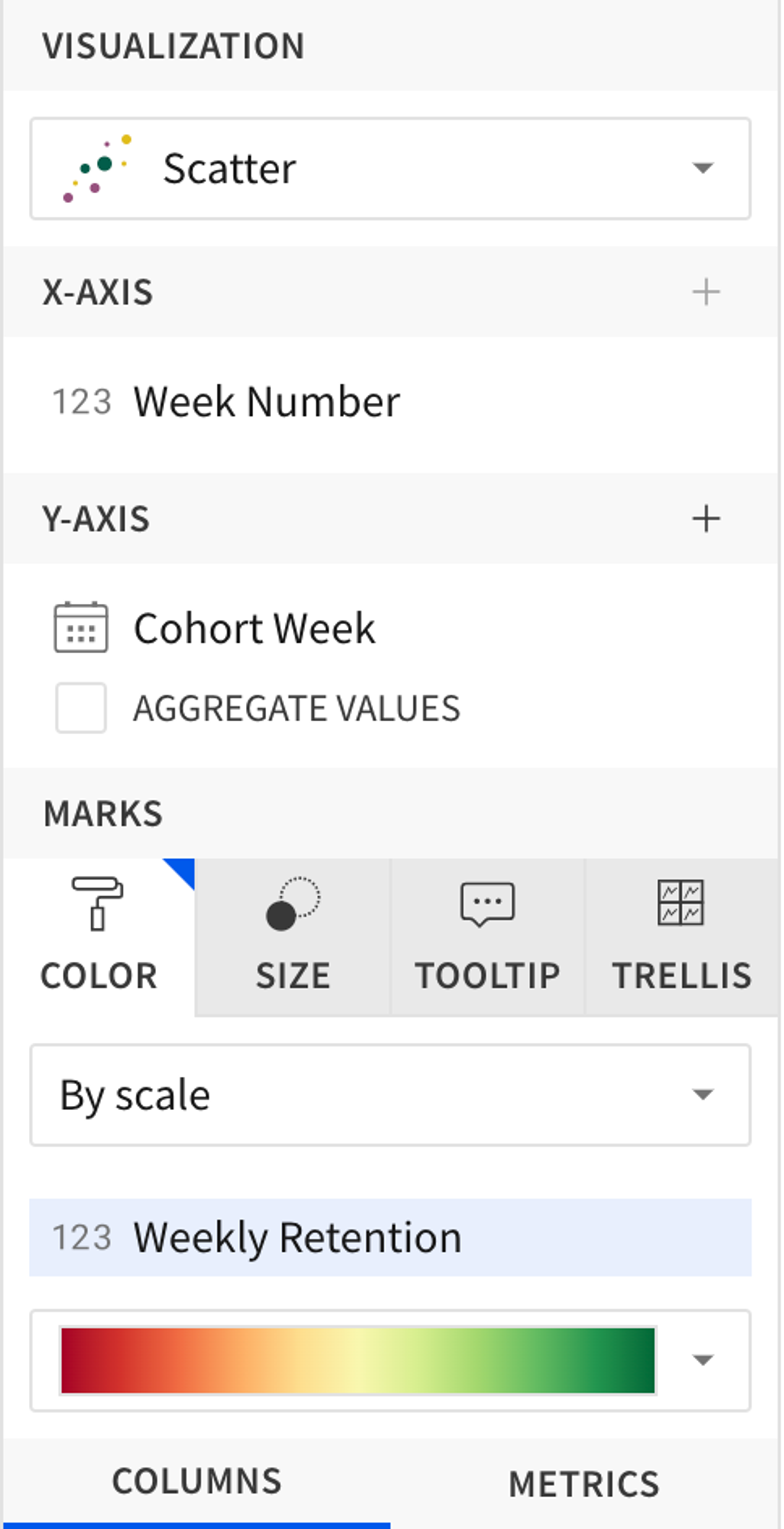
- The X axis is [Week Number]
- The Y axis is [Cohort Week], not aggregated. You might need to set the Y axis type to Ordinals in the Element Format menu.
- The color is of type Scale using [Weekly Retention].
- Choose the color scale you want, for example, from Red...Green.
How are Specific Customers Adopting Our Product?
Our customers span different fields, from finance to product and engineering to operations. How they adopt and use our product changes significantly depending on their needs and how well we’ve been able to explain the value they can derive from the product. We don’t see the specific analysis our customers do with our product nor do we see their data, but usage patterns help us understand our customers better.
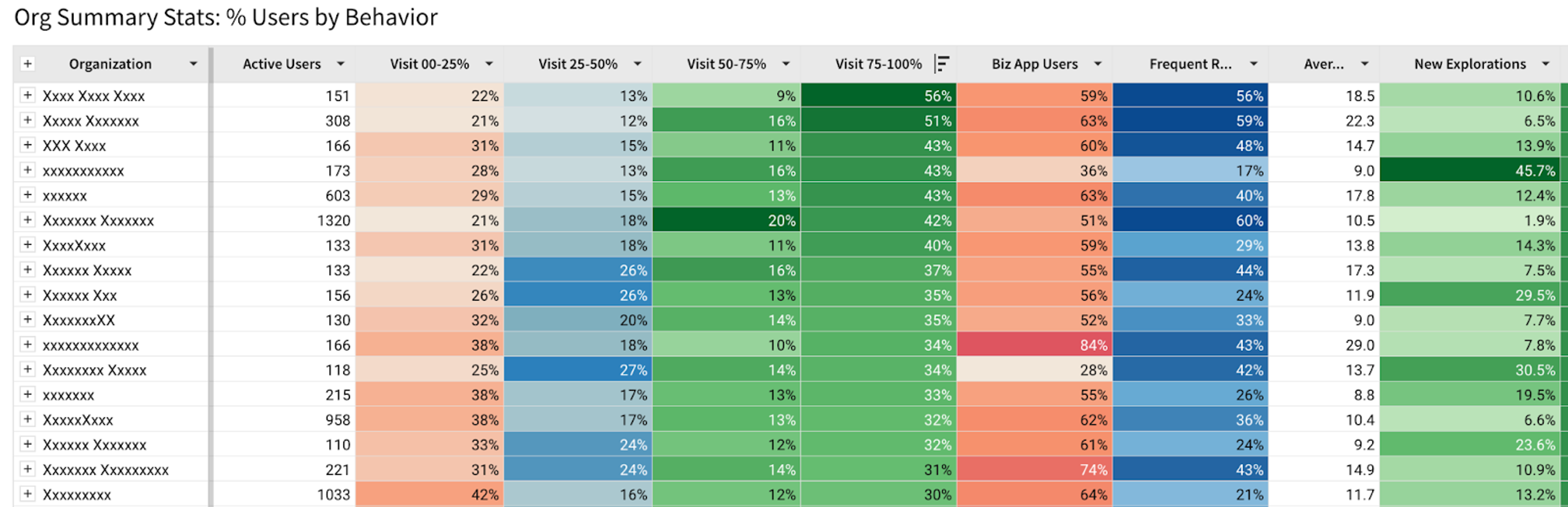
- What percent of their active users showed up 25% of the time? 25-50%? 50-75%? 75% or more?
- We’ve also defined some hypotheses of user types, and added columns for the percentage of users who fall into those categories.
This kind of analysis is possible by using our own analytics events to define these categories, timeframes, and use our tables and conditional formatting to call out specific things. This allows further categorization. For example, a follow up table uses this one as a base, but only shows the companies that have more than half the users who show up more than 50% of the month.
Data Makes the World Go Round
We use Sigma to understand how our customers adopt and use Sigma, and to inform our product development and sales processes. What kind of analysis do you wish you could do and find difficult?
Want to learn more? Schedule a demo today!
Read about the missing ingredient to reduce development bottlenecks.
Appendix 1: Sample Dataset
For most of these, you need a table that has at least two fields, specifically a unique User ID and a date field. If you don’t have one readily available, you can generate one from a large enough open source repository. You can treat every commit as a user event, and look for how frequently a user “visits” (i.e. commits) and whether or not they are sticky. A large enough repository will also give you a lot of history, though I’d use Monthly instead of Weekly analysis with it. A good one to try this with is the linux repository:
- Pull a copy of the repository locally, i.e.
git clone https://github.com/torvalds/linux.git - Go into the linux directory
cd linux - Generate a CSV of the commits, when they were generated, and by whom. This command prints and adds the header to the file in addition to generating the log. This is the MacOS command line which should also work on linux:
{echo "User ID|Day|Event" & git log --format=format:"%ae|%as|%H" } > linux-events.csv
Note that the delimiter we’re using here is the | symbol since some of the commits have multiple users and will have a comma separating them. - Upload the CSV to Sigma through the Create New menu. Make sure the delimiter is set to the | symbol.
Let’s define Daily and Monthly active users:
- Daily users are easy enough. They either had some activity during that day or they didn’t.
- Monthly users are more complex. For any given day, we’ll consider a user a monthly active user if they’ve had some activity in the past 28 days. That means that if they’ve done something today, they’d be considered active for the next 27 days. They’d have to do something during the next 27 days to be considered active 28 days from now.
This section will get very prescriptive and technical quickly, so let’s talk about the concept first. We’re going to take three steps to get the data to a state where we can chart.
- First, for each user, we’ll identify when they first joined the platform, and what sessions they’ve had (i.e. sessionizing their time). We’ll also derive some other interesting information we can use for follow up analysis. A session is a continuous usage of the platform where the user has not stopped using the platform for more than 28 days at a stretch.
- Next, for each day, we’ll add up all the sessions that have started and ended since the beginning of our history.
- Lastly we’ll identify for each day how many users were active on it (DAU) and how many sessions were active (MAU).
- Once that’s done, we’ll be able to chart our data.
To parametrise our sessions (i.e. 28 days now, but we might want to look at 7-day sessions):
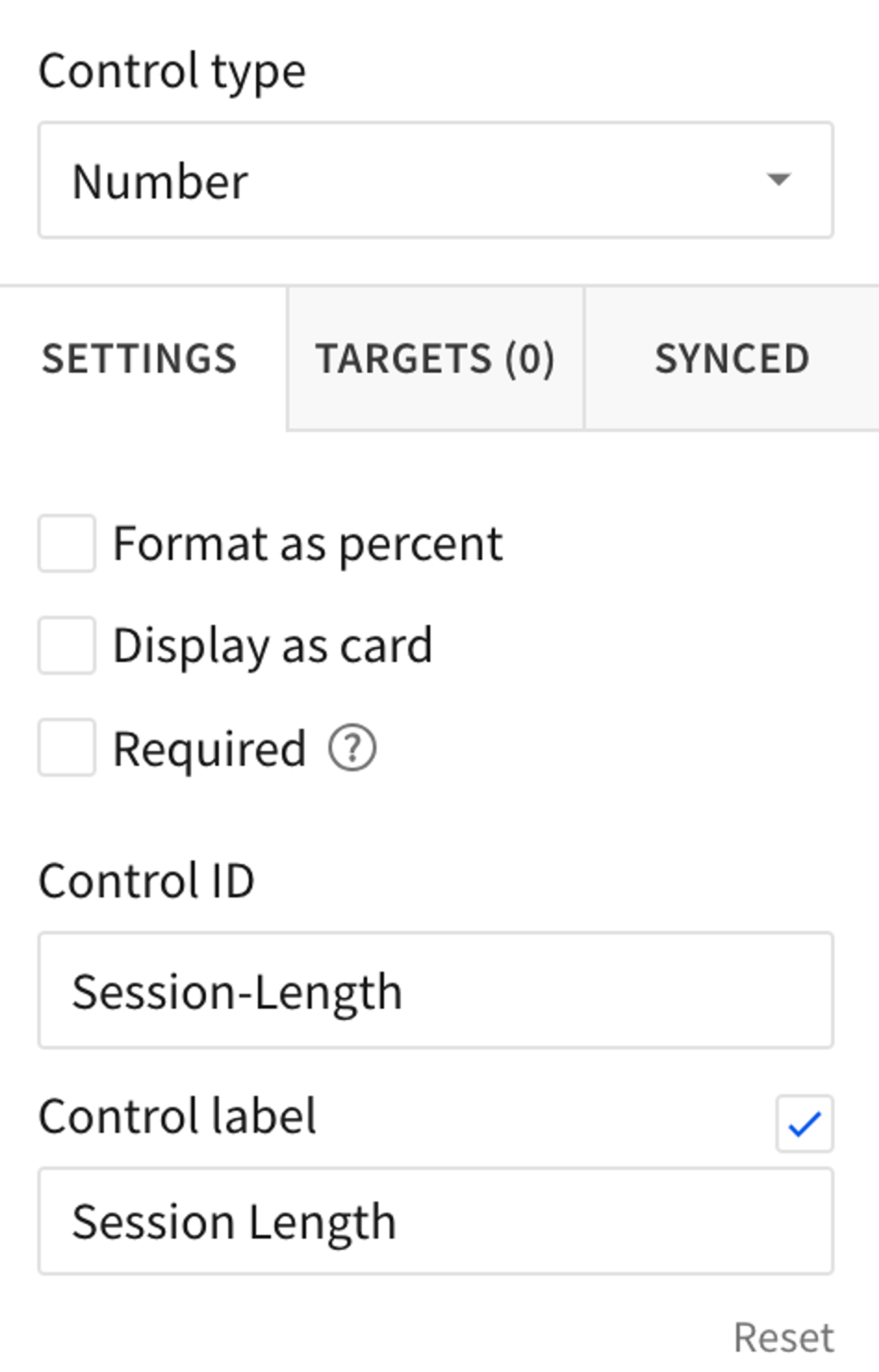
- Add a Text Box (not a Text element) to the document. A Text Box is a type of control. Title it “Session Length” and set its ID to “session-length.” Make sure the type is set to Number. We’ll use this as a field in our calculations later.
For the initial phase, we need a table that has a User ID, and a Date. For this tutorial I’ll use the table generated in Appendix A which assumes a commit made to the Linux Kernel github repository is the same as a user visit to a site.
In the first phase, we’re going to generate this table:
- Starting from the events table, rename it to “First Usage and Sessions”
- Group the table by [User ID]
- Truncate the [Day] to a Day resolution and rename the field to “Date”
- Group by [Date] and sort ascending. What we’ve done so far is look for each user, at their visits, and grouped their visit to a day’s resolution since multiple visits within the same day don’t interest us.
- In order to sessionize our user’s visit, we need to know when their last visit was. Add a new column called “Previous Visit” next to [Date] with the formula:
DateDiff("day", Lag([Date]), [Date]) - A user’s session has started if there was no previous visit, or the previous visit was longer ago than our session length. Add a field called “Session Start” with the formula:
If(IsNull([Previous Visit]), 1, [Previous Visit] > [Session-Length], 1, 0) - A user’s session has ended if there is no next visit or the next visit is further in the future than our session length. Add a field called “Session End” with the formula:
If(IsNull(Lead([Previous Visit])), 1, Lead([Previous Visit]) > [Session-Length], 1, 0) - Collapse the rest of the columns by hitting the [-] next to the [Date] column header. We don’t need the raw events.
Now let’s add a couple of useful fields we can use for future filtering and analysis. These are purely optional.
- Next to [User ID], add a field called “First Day.” Use the formula:
first(date)
This is the user’s first ever visit to our platform. We can use it for various cohort analyses. First works since the [Date] column is sorted. - We have the email of most users. Let’s extract the company domain to use for filtering by company. Add another column called “Organization.” Use the formula:
SplitPart([User ID], "@", 2)
Phase II
Next, we’ll count our cumulative sessions to construct this table:
Derive a table from the “First Usage and Sessions” table we created in the first phase. This flattens the groupings and gives us a flat table.
- Name the table “Cumulative Sessions”
- Sort Ascending by the [Date] field
- Next to [Session Start] add a “Cumulative Session Starts” field, formula:
CumulativeSum([Session Start]) - Next to [Session End] add a “cumulative Session Ends” field, formula:
CumulativeSum([Session End])
You’ll notice that days repeat in this table, since multiple users showed up on the same day. This means that the cumulative session value for the same day has a different value depending on which row for the same day we look at. We’ll deal with this in Phase III.
Phase III
Let’s create our Rolling Session Usage table:
This analysis relies on information being present in each date (i.e. consecutive dates). This isn’t always true and you’ll see this in the early days of this repository, but it fixes itself pretty quickly as adoption picks up.
Derive a table from the “Cumulative Sessions” table we created in Phase II.
- Group the data in this table by [Date]
- Let’s figure out how many distinct users were present that day. These are effectively our DAU. Create a field called “DAU” using the formula:
CountDistinct([User ID]) - Now let’s figure out how many sessions were actually started from the beginning of time until this date. Remember we had a discrepancy for the current date, since there might be multiple entries for each day. We’ll use the maximum number we can find for this date. Create a field called “Max Session Starts” using the formula:
Max([Cumulative Session Starts]) - Create “Max Session Ends” using the formula:
Max([Cumulative Session Ends]) - Our active monthly users in theory are Session Starts—Session Ends, but there’s a hitch. A session end is the last day we saw the user, but in reality we still count them active for 28 days (or whatever session length we decided they should be active for). So we really should be looking at the number of sessions that ended 28 days ago. Let’s figure that out. Create a field called “Lagging Session Ends” using the formula:
Lag([Max Session Ends], [Session-Length])
This takes the value from 28 rows back. If there are missing dates in the warehouse (i.e. no user activity at all). This won’t pick up the right date, but this isn’t really an issue once our usage picks up. - Finally, create a field called “Active User Sessions” using the formula:
[Max Session Starts] - Coalesce([Lagging Session Ends], 0)
The Fun Part
With me so far? Let’s chart out some growth charts:
- Derive a chart from Phase III’s “Rolling Session Usage” table
- Note that we’re only going to be using the first grouping date to avoid duplication
- For the X-Axis, select the [Date] field
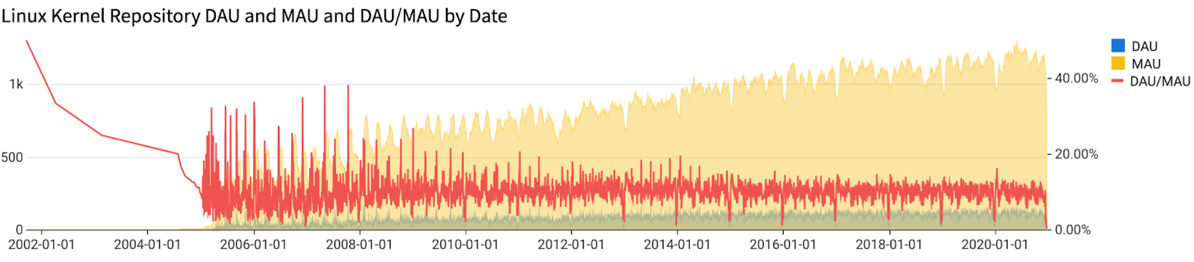
- Add the [DAU] field to the Y-Axis. Make it an Area Shape.
- Turn off aggregation
- You’ll notice a lot of random data with weird dates in this data set. I recommend filtering to only dates from 2000-2024.
- Add the [Active User Sessions] field the Y-Axis and rename it to [MAU]. Make it an Area Shape.
- Add a new column to the Y-Axis. Formula:
[DAU]/[MAU]. Make it a Line Shape, and change the axis to use the right-hand-size Y axis. Mark the column a percentage.
Extensions
You’ve now got a chart similar to the one above, but much a much noisier DAU/MAU line. What’s going on is that less people make commits over the weekend, causing the ratio to drop significantly. We can deal with this by dropping (in the chart only) any weekend values. Do this:
- In the chart, add a column of data called “Weekday” using the formula:
Weekday([Date]). - Add a filter on it to exclude the values 1 and 7 (Sunday and Saturday, respectively). This will make the line more readable.
If you want to look at adoption by a specific company, you can add a filter in the table we derive the chart from. Add a filter on the [Organization] field. You’ll notice that gmail.com is the most common one (people’s personal addresses), but intel.com, redhat.com, amd.com and others have a lot of commits in the system. You can easily include or exclude them to see when and how they joined and started participating in the kernel repository.
You can use the [First Day] field to analyze specific cohorts of users. This doesn’t have to be a day's resolution. You can filter to a month, a year, or a decade, and see if those users stick around.
These extensions are examples of how merging your own organizations’ data to your events table can help you create custom cuts and do your own analysis of specific user cohorts.