A Guide To Creating Data Charts For Color Blindness

When color fails, so does the story. When your visuals don’t speak clearly to everyone in the room, people start looking for clarity elsewhere, and the chart loses its voice. Color is one of the fastest ways we communicate insight, but for people with color vision deficiencies, your red might look brown, and your green might look gray. The visual story breaks down, and no amount of design polish can fix it if the core cues are missing.
This guide is for users who want to make their dashboards more inclusive without sacrificing clarity or complexity. We’ll walk through how color blindness affects perception, what kinds of visuals work best, and how to design charts that stay readable regardless of how your audience sees color.
Why inclusive data visualization matters
Charts are how we communicate intent, risk, impact, and performance. In meetings, dashboards are often the single source of truth guiding decisions, setting priorities, and framing progress. But when your visuals aren’t accessible, that truth gets lost in translation. Color blindness affects millions of people, and the numbers aren’t marginal. Roughly 8% of men and 0.5% of women worldwide have some form of color vision deficiency. In any reasonably sized organization, someone in your audience is affected.
You might not get direct feedback, but for someone with color blindness, a red-green comparison might appear as two shades of the same color, or a gradient heatmap might blur into a single tone. These are recurring, predictable design flaws that go unnoticed until they cause real damage.
It’s easy to think of accessibility as something extra, like an optional layer of polish. In practice, it’s foundational. Clear visuals reduce questions, speed up understanding, and make your analysis easier to trust. When everyone can interpret the same message, alignment happens faster, and decisions are made more confidently. That’s good communication.
How color blindness affects chart reading
A common misconception is that most colorblind users see the world in black and white. What they experience is more subtle and, in many ways, more disruptive. Colors that appear muddied, indistinguishable, or oddly similar when they shouldn’t be. When scanning a chart, looking for a signal, that slight shift in perception can throw everything off.
The most widespread forms of color vision deficiency are red-green types: deuteranopia and protanopia. Deuteranopia affects sensitivity to green light, while protanopia affects red. Both distort how people perceive color contrasts, especially when red and green are used to show differences or extremes.
Think of a pie chart showing good versus bad performance, or a bar chart using red for risk and green for progress. What looks clear to most viewers can appear completely flat to others. There’s also tritanopia, a less common condition that affects blue-yellow discrimination. In this case, cooler color schemes, often used to show neutral-to-positive ranges, can collapse into similar tones. It makes charts that rely on color gradients, like heatmaps or diverging line graphs, especially hard to follow.
When someone has to stop and decode which color means what, it adds friction to their experience. Every pause in interpretation increases the risk that the takeaway will be wrong or abandoned altogether. Even well-designed charts can create problems if they rely too heavily on color without a fallback. Color blindness doesn’t make data unreadable by default, but it requires designers to think more intentionally about building visual meaning.
How to choose colorblind-accessible palettes
Color selection is a design decision with real consequences. When a palette works, readers can scan and understand your chart at a glance. When it doesn’t, people second-guess the meaning, hesitate on interpretation, or misread the data entirely.
The most common mistake is choosing colors that rely solely on hue. Red and green, for instance, are frequently used to indicate good versus bad, positive versus negative, or go versus stop. However, for someone with red-green color blindness, those colors can blur together into a neutral tone. Even with the best intentions, the message gets lost. Instead, focus on combinations of lightness and saturation, not just color. For example, pairing a deep blue with a lighter orange can provide better contrast than two hues at the same brightness. The goal is to ensure each color stands out even when someone can’t perceive the full spectrum.
There are tools built for this kind of evaluation. The Coblis simulator allows you to preview how your visuals appear to individuals with different types of color blindness. David Nichols’ Color Oracle offers a desktop-based solution that applies filters across your screen. These are practical checkpoints for analysts building everyday dashboards, and a quick preview can flag issues you might never notice otherwise. If you need somewhere to start, certain palettes have been tested and proven to perform well across multiple types of vision. Combinations like:
- #D81B60 (a strong magenta),
- #1E88E5 (a medium blue),
- #FFC107 (a bright amber),
- #004D40 (a rich teal), and
- #757575 (a mid-tone gray)
tend to hold their contrast well, even under visual strain. What makes them effective is that they differ meaningfully in tone and intensity. These aren’t just different colors; they stand apart in brightness and intensity, making them easier to distinguish for more users.
Finally, keep your palette consistent. Switching color assignments between charts or pages adds confusion for all users. Assign a color to a concept, and stick to it.
Go beyond color: Design techniques that do more
Even the best color palette has limits. That’s why it helps to think about color as just one piece of the larger communication puzzle. Strong chart design doesn’t rely on color to do all the work. It builds in other visual cues that reinforce meaning, reduce confusion, and make interpretation easier for everyone.
Start with direct labeling. Whenever possible, skip the legend and put labels right where the reader needs them: on the bars, next to the lines, or above the dots. This removes an extra step from the reader’s process. They don’t need to glance back and forth between a color key and the visual; the meaning is embedded in the chart itself.
Pattern fills are another option. Instead of using color alone to separate categories, you can layer in texture like diagonal stripes, crosshatching, or dots. This is especially helpful for bar and area charts, where you work with large blocks of space. It gives people a second way to distinguish what’s being shown, even if the colors look the same to them.
Shape also matters. In scatter plots or dot matrices, assigning a unique shape to each category or group provides another visual anchor. A square and a triangle won’t be mistaken for each other, even if they share a color. These reinforcements give users multiple paths to understanding the chart’s structure. Then there's the layout.
Thoughtful use of white space, hierarchy, and alignment helps guide the eye. When the most important data point is easy to find, it doesn’t need bright colors or animation to stand out because it's placed intentionally or grouped logically. Simplicity becomes an advantage.
Designing with these layers in mind strengthens the message. If the color fails, the meaning holds.
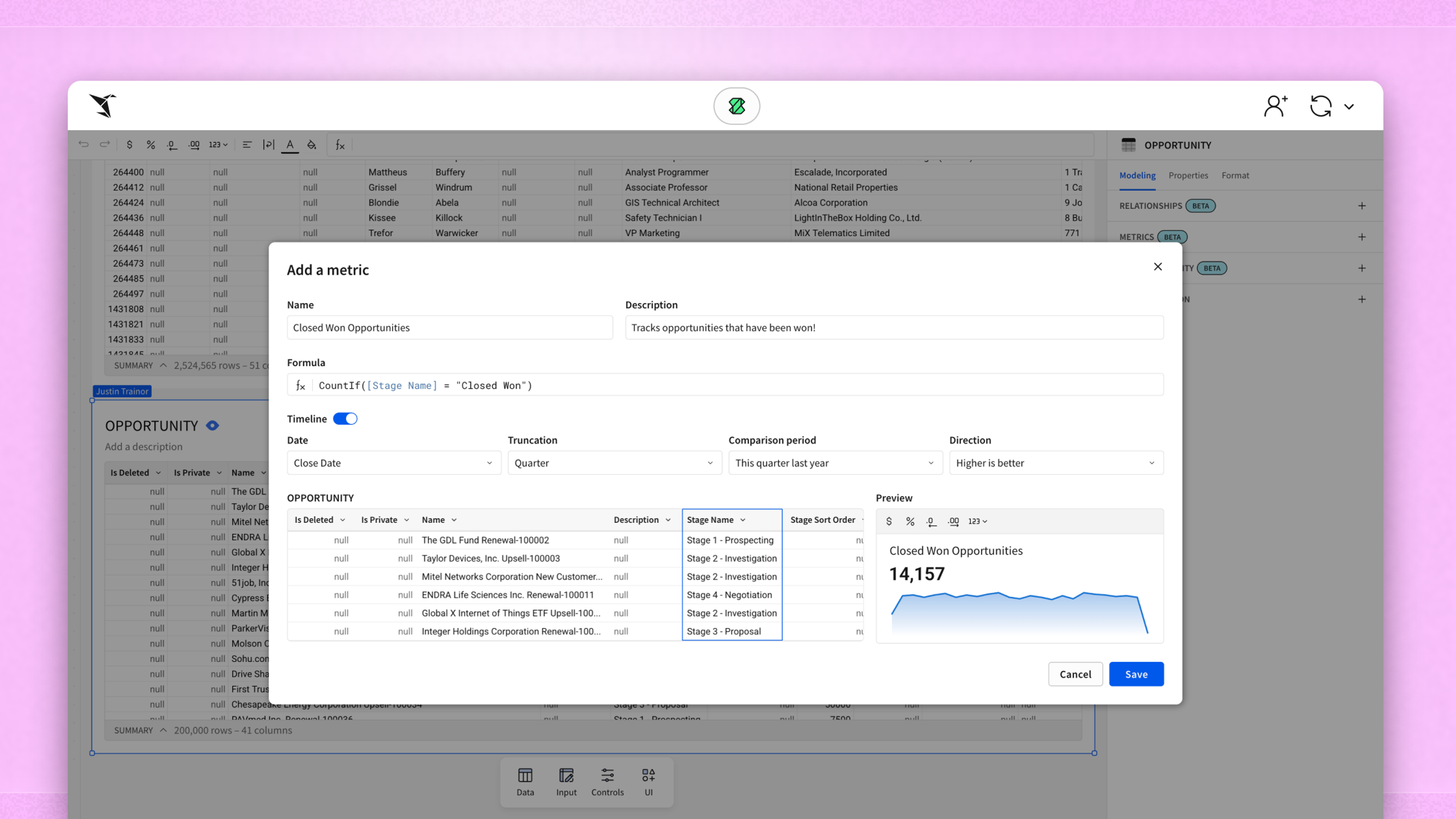
How Sigma supports accessible chart design
If you’re already working in Sigma, the good news is that most of what you need to design accessible charts is already built into the platform; you just have to know where to look and how to use it with intention. Start with labels. Sigma allows you to place labels directly on your visualizations, removing one of the most common barriers to accessibility: relying on color-coded legends. Rather than asking someone to match blue with “Q1” and red with “Q2,” you can simply show the category next to the value. This makes the chart easier to scan, share, and more reliable across audiences.
Sigma’s Workbook interface gives you control over layout and spacing, which is essential when designing for readability. Dense charts with little separation between elements are hard to follow for everyone. Still, Sigma's drag-and-drop experience lets you rearrange visuals, group components, and add annotations without jumping between tools. That flexibility makes it easier to create dashboards where meaning doesn’t rely on any single visual cue.
You can also adjust color formatting directly within your visual elements. That means you’re not locked into default palettes. If your chart uses a red-green comparison by habit, you can switch to higher-contrast pairings using the formatting panel. Combined with preview tools like Coblis or Color Oracle outside the platform, this lets you test and adjust your color decisions before publishing.
Another strength is the Explore mode, which helps you catch accessibility issues during the analysis phase. As you experiment with dimensions and measures, you can quickly see when a chart depends too much on color or when values would benefit from annotation. This makes inclusive design part of your workflow, instead of an afterthought.
Sigma doesn’t force you to build accessible dashboards. It just makes it easier if you choose to. The tools are there, and the control is in your hands.
Which chart types support accessibility
Some charts do more harm than good, especially when color is the only thing separating one data point from another. For users with color vision deficiencies, certain visuals become puzzles that take too long to solve, or never quite make sense. Choosing the correct chart isn’t about simplicity for simplicity’s sake. It’s about reducing confusion without watering down your message.
Bar charts are among the most accessible formats, especially when paired with direct labeling. The spacing between bars gives each value its own visual territory, and labels and patterns can reinforce or replace colors. When the data allows, horizontal bars can improve readability further, since they leave more room for annotations and category names.
Dot plots offer similar benefits. They minimize clutter, are easy to scan, and don’t require large amounts of color differentiation to show contrast. Each dot stands on its own, which makes it easier for users to compare values even if they’re seeing the chart in grayscale or with altered color perception. Labeled line charts also perform well when built carefully. Problems usually emerge when multiple series are plotted with only color separating them. That’s where Sigma’s ability to add labels directly to the lines becomes useful. A label at the end of each line removes the need to hover, guess, or refer to a separate legend, reducing ambiguity for all readers, not just those with visual impairments.
On the other end of the spectrum, pie charts and stacked area charts often introduce more problems than they solve. These visuals rely heavily on color to define segments, and the differences between values can be subtle, especially in datasets with many categories. If two adjacent segments use colors indistinguishable to someone with red-green blindness, the whole message can collapse.
Even with labels, there’s often too little space to provide clarity. Heatmaps are a special case. They’re popular for dense data, but their reliance on gradients makes them difficult for colorblind users to interpret. A smooth shift from red to green may appear flat or muddied, and if there are no numbers or pattern overlays, the viewer is left guessing.
You don’t have to abandon these charts entirely; you just have to adapt. A stacked area chart might become a grouped bar chart, a pie chart could shift into a treemap with texture overlays, and a heatmap might be paired with a table displaying the same values numerically. The format isn’t sacred; the understanding is.
Accessibility in practice
Accessibility often gets treated like a compliance issue: something to check off once a year or bake into a corporate policy deck. However, data visualization is about creating visuals that actually work for the people reading them.
Take a common scenario. You’re building a dashboard that’s going to circulate across departments. Finance, operations, and marketing each have a stake in the data, and you’re presenting to a VP next week. You already know the numbers are right, but will everyone interpret them the same way? A few changes, like choosing a better color palette, adding direct labels, or replacing a heatmap with a dot plot, can differentiate between a chart that gets a nod and one that sparks follow-up questions, alignment, and action.
Even if no one on your team has mentioned being colorblind, assume someone in your wider audience is. Or consider the other ways that perception can be challenged, like a bright screen on a laptop outdoors, a smartphone user glancing at a chart in low light, or a stakeholder rushing between meetings who doesn’t have time to interpret a legend. Accessibility isn’t only about visual impairment; it’s also about reducing obstacles.
Some teams have begun using WCAG 2.1 guidelines to guide color contrast in charts and visuals because it results in cleaner, more universally readable work. Others informally test reports with coworkers with color vision deficiency, asking for feedback before publishing widely. These are small steps that lead to better communication.
When visuals are inclusive, they feel effortless, and the reader doesn’t have to work hard to understand what’s happening.
Better visuals lead to better communication
A well-built chart speaks clearly, even in a rush, even on a small screen, even when the audience doesn’t see colors like you do. Accessible design leads to more than improved visuals; it strengthens communication.
This is about producing work that stands up under pressure. The moment someone pulls your dashboard into a meeting or shares it with a cross-functional team, clarity becomes the most important feature. Clarity comes from deliberate choices surrounding contrast, structure, spacing, and context. When you build with color vision in mind, you reduce the number of follow-up questions, eliminate the need for workarounds, and make your reports easier to share, discuss, and act on. This improves outcomes for the people consuming your analysis.
None of this requires starting over. It’s a shift in mindset, not a rebuild. Review a dashboard you built last month. Would someone who can’t distinguish red from green still walk away with the same takeaway? If the answer is no or even maybe, that’s the opportunity. Accessible charts are a reflection of your professionalism. They show that you’re thinking about how the data lands, how it’s understood, and how it moves people to act.