Beyond The Ledger: What BI Reveals About Your COGS

Cost of goods sold (COGS) is often treated as a line on a financial report, tallied and filed away after the fact. Yet behind that number are shifting costs in labor, materials, freight, and storage that directly affect profitability. When viewed only in static reports, those signals are easy to miss, leaving leaders reacting after the damage is done.
Business intelligence (BI) changes this perspective. Instead of a backward-looking measure, COGS becomes a way to spot trends, compare performance across products and channels, and connect costs to strategy. This post explores how BI reframes COGS from a routine accounting figure into an operational tool that guides sourcing, pricing, and margin decisions.
What COGS tells you
Cost of goods sold is one of the most closely watched figures on a company’s financial statements. At its simplest, it reflects the direct costs tied to producing what you sell. This typically includes raw materials, labor, and the overhead directly associated with production. The number is indispensable for calculating gross margin, which tells leadership how efficiently resources are being used to generate revenue.
However, while COGS is central to understanding profitability, it is also incomplete. Traditional accounting treatments consolidate costs into broad categories, which makes sense for compliance and reporting, but leaves out the texture of what is happening inside the operation. For instance, you might know that labor made up 40 percent of COGS last quarter, but you cannot see whether that increase was due to overtime, seasonal demand, or inefficiencies on the factory floor.
The same limitation exists when looking across products or channels. A consolidated COGS figure does not tell you which SKUs are driving margin erosion or which distribution channel is absorbing higher shipping costs. This blind spot matters because decisions on pricing, promotions, or even discontinuing a product line rely on understanding those differences in detail. Without them, leaders are working with a blurred picture of cost.
Business intelligence tools begin to change this dynamic by offering ways to look beneath the surface of the aggregate figure. Instead of waiting for quarterly summaries, leaders can analyze patterns over time, compare costs across product lines, and identify root causes that would be invisible in static reports. What emerges is not just a number to file away, but a set of insights that inform how the business operates day to day.
Common pitfalls of analyzing COGS in spreadsheets
Many organizations still rely on spreadsheets to monitor and report COGS. The format is familiar, inexpensive, and flexible enough for basic calculations. Yet once businesses grow beyond a certain size, the cracks begin to show. What starts as a quick way to track costs often turns into a time-consuming and error-prone process that leaves leaders questioning the accuracy of the numbers in front of them. One major limitation is that spreadsheets do not refresh automatically. By the time an analyst has exported data from source systems, cleaned it, and rebuilt formulas, the information is already dated. In industries where material costs swing daily or labor availability changes week to week, decisions made on stale data can set teams back months.
Cross-comparisons add another layer of complexity. Evaluating COGS across hundreds of SKUs, multiple regions, or different distribution channels requires building intricate formulas and maintaining large pivot tables. Even a minor error in a reference cell can throw off an entire analysis, and detecting the mistake can take hours. Instead of focusing on why costs shifted, analysts spend their energy maintaining the mechanics of the spreadsheet. Tracing anomalies back to their source is equally frustrating. When a sudden spike in freight costs shows up in a report, the spreadsheet alone cannot explain whether it was tied to a single vendor contract, seasonal demand, or inefficiencies in logistics. That detective work falls on analysts who must manually stitch together information from procurement, operations, and finance.
Perhaps the most overlooked issue is the human cost of this process. Analysts who spend their time reconciling numbers and checking formulas are not available to guide decisions or explore opportunities. Over weeks and months, that repeated cycle of wrangling data diverts attention from more strategic work, keeping teams locked in reporting mode instead of analysis.
The value of real-time COGS tracking in a dashboard
When COGS data lives only in static reports, leaders are left analyzing events that have already passed. That lag forces teams to explain what went wrong instead of addressing issues as they emerge. Dashboards change this pattern by allowing leaders to see costs as they develop, not just as they are tallied at month-end.
Consider the impact of sudden fluctuations in raw material pricing. If leadership only notices the change weeks later, the business has already absorbed the additional expense. A dashboard that updates continuously makes those shifts visible early enough to adjust orders, renegotiate supplier terms, or adjust production schedules before the impact cascades through financials.
The same applies to labor costs. Over time, seasonal surges or unexpected downtime often push expenses upward, but those factors are rarely captured in standard accounting reports until it is too late to respond. With an interactive dashboard, operations managers can see cost overruns as they happen and act on them while adjustments are still possible.
Another advantage comes through planning. Forecasts built on delayed information carry more risk, since they do not reflect the latest conditions. Dashboards give finance and operations teams a more accurate base for budgeting and scenario modeling, providing inputs that complement structured planning models. Instead of relying solely on historical averages, leaders can plan against the cost conditions that are unfolding now.
Dashboards also add a layer of proactive monitoring through alerts. Threshold rules can be set so that when costs rise above expected levels, the system notifies the right people. This ensures the problem is addressed before it materially affects margins. It shifts leaders from reactive explanations to proactive action.
Comparing COGS across products, channels, and time
COGS on its own tells you how much was spent to produce what you sold, but the figure becomes far more meaningful when compared across different slices of the business. Dashboards allow leaders to break down costs by product, channel, or time period, creating a sharper lens into how the company operates.
Product-level comparisons
Product-level comparisons often reveal the most immediate insights. Two items may bring in similar revenue, yet their cost profiles can differ widely. A product that requires specialized components or additional handling may be far less profitable than its sales figures suggest. With side-by-side COGS views, leaders can decide whether a product should be repriced, redesigned, or phased out altogether.
Channel comparisons
Channel comparisons bring another dimension. Selling through a direct-to-consumer site may carry different fulfillment and shipping costs than selling through retail partners. Depending on accounting policies, those distribution costs may appear in COGS or as operating expenses, but comparing them across channels still highlights which routes to market absorb more expense.
Time-based comparisons
Time-based comparisons help surface patterns that would otherwise remain hidden. Looking at COGS over multiple years can reveal seasonality, supply chain strain during peak months, or cost differences that align with vendor contracts. Leaders can use those insights to time promotions more effectively, negotiate supplier agreements with evidence, or anticipate where margin pressure is likely to return.
The strength of these comparisons lies in spotting anomalies and connecting costs back to decisions. By tying COGS to specific products, sales channels, and timeframes, leaders can decide where to double down, where to adjust pricing, and where to cut back. This moves the measure from being descriptive to becoming a basis for strategy.
Identifying hidden cost drivers
Some of the most significant pressures on COGS don’t appear in plain sight. They’re spread across categories that mask their actual impact, making it difficult for leaders to understand where costs are rising or why margins are slipping. To get a complete picture, it helps to look beyond direct inputs and examine the hidden drivers that quietly shape profitability.
Costs hidden in the background
The most challenging costs to manage are often the ones buried in the background of operations. Inbound freight frequently rolls into inventory cost and then COGS, while outbound shipping is commonly treated as a selling expense. Storage is usually a period expense unless it is required during production.
Shrinkage is typically recognized through COGS, while product returns affect both revenue and cost of sales through refund liability and right-of-return asset accounting. When these drivers accumulate without clear visibility, margins suffer quietly and may not trigger immediate alarms.
Connecting data across systems
Data integration across systems is where the picture begins to sharpen. By linking procurement, logistics, and sales data, leaders can see how much freight contributes to total costs for a specific region, or whether a spike in returns is concentrated in one product category. This level of connection is difficult, if not impossible, to maintain in spreadsheets, but becomes far more manageable in a BI platform.
Operational inefficiencies
Operational inefficiencies contribute as well. Rework caused by quality issues, production delays from machine downtime, or bottlenecks in fulfillment can all increase costs, yet they often do not appear explicitly in COGS reporting. Analysts must connect dots across multiple teams to understand why costs rose in a given quarter. With a BI view, those inefficiencies can be tied directly to the metrics leaders already watch, making them part of the same story rather than an afterthought.
Accountability across teams
Identifying these hidden drivers brings accountability to the right places. When storage costs rise, finance can work with operations to understand warehouse utilization. When returns spike, product teams can examine whether quality or design changes are needed. Costs no longer sit in isolation on a ledger; they become signals that point directly to teams and processes that can address them.
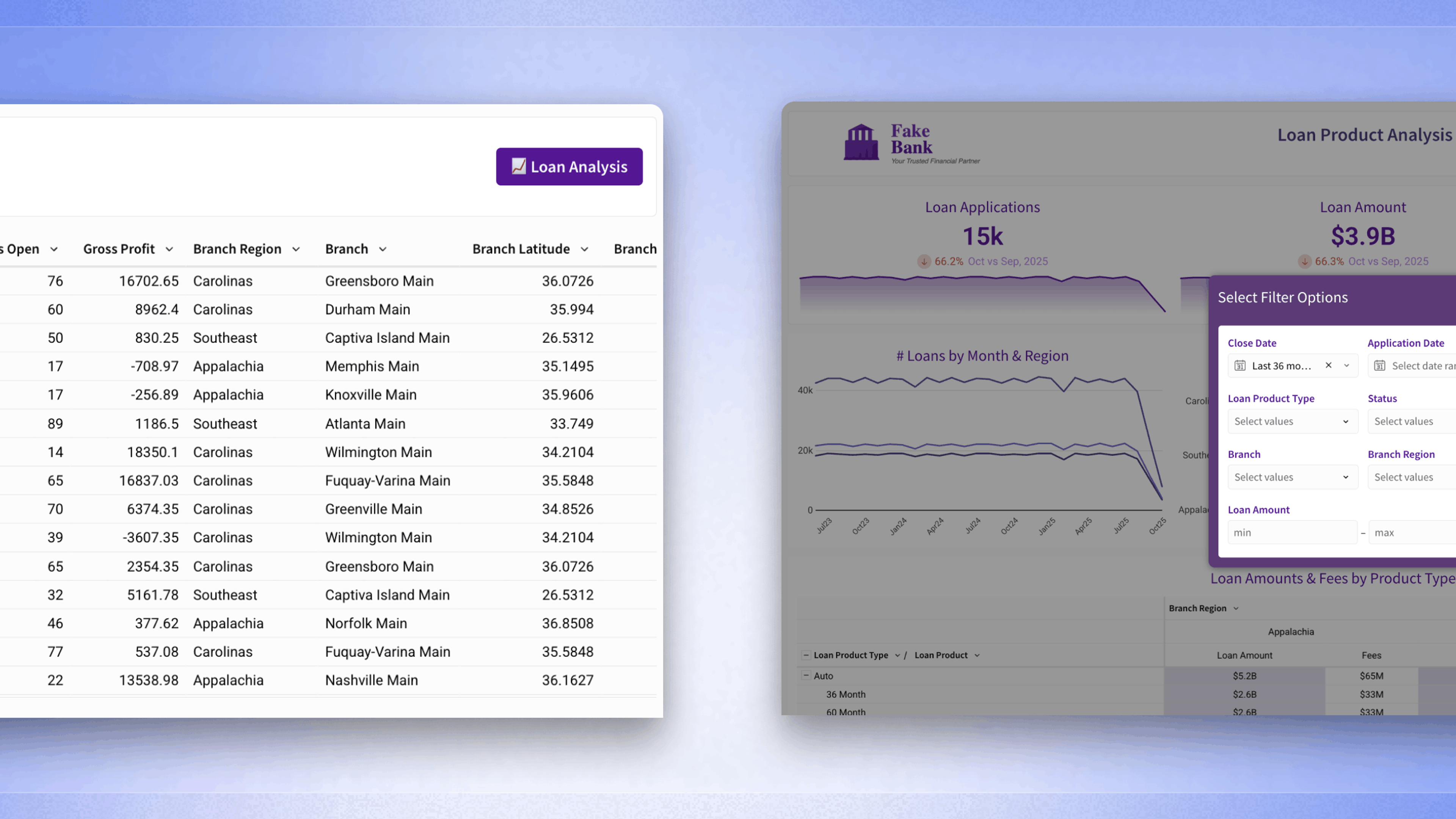
Building a BI dashboard for COGS: What to include
Designing a dashboard that focuses on COGS requires more than simply dropping numbers onto a chart. Leaders need a view that combines accuracy, clarity, and flexibility so the data becomes a practical tool for decision-making. The best dashboards balance high-level summaries with the ability to drill into detail when questions arise.
- Core metrics: set the stage. Leaders will want to see total COGS, how that figure breaks down by product or channel, and how it changes over time. Pairing these views with gross margin trends creates an immediate link between costs and profitability. A dashboard that shows COGS variance against budget or forecast also helps highlight where expectations diverge from reality.
- Filters: give the dashboard its adaptability. By allowing users to slice by product line, vendor, region, or time period, teams can ask more specific questions without building new reports. This flexibility is what turns a static financial number into a living measure that can adapt to the business conversation in the moment.
- Visualization: choices matter too. A stacked bar chart can make cost composition clear at a glance, while line graphs are effective for spotting upward or downward shifts over time. Heatmaps bring attention to outliers, such as products, vendors, or regions where costs deviate significantly from expectations. Each visualization adds a different layer of insight, helping teams connect patterns to decisions.
- Context: critical for adoption. Field-level documentation, definitions of metrics, and even short notes explaining how certain costs are categorized reduce confusion and keep everyone aligned. A dashboard is only as strong as its shared understanding, and providing definitions directly alongside the numbers ensures consistency across teams.
Using COGS analysis to improve margin strategy with data
COGS analysis becomes most valuable when it feeds directly into decisions about margin strategy. Understanding costs at a granular level gives leaders options: adjust sourcing, refine pricing, or change how products are positioned in the market. Instead of reacting to financial statements, teams can actively shape profitability with evidence in hand.
One of the first places to start is with products that consistently carry high costs relative to revenue. If margins are thin, leadership can evaluate whether alternate suppliers, redesigned production methods, or smaller production runs could improve the balance. This is not just about cutting costs; it is about asking whether the current approach to production aligns with the business strategy. Pairing COGS insights with sales data can also reshape decisions. A product that sells well but has an unfavorable cost profile might not deserve continued investment. On the other hand, products with modest sales but healthy margins could warrant stronger promotion. Viewing cost and revenue together highlights where to shift resources for greater impact.
Dynamic pricing is another lever. When costs fluctuate, prices that remain static can quickly undermine profitability. Analyzing COGS trends helps leaders decide when to adjust pricing for specific products or channels. This does not mean constant price changes, but rather thoughtful adjustments that keep margins intact while staying competitive in the market. Margin strategy also benefits from experimentation. Bundling, promotional offers, and product redesigns all carry implications for costs. With COGS data available in detail, teams can model scenarios before committing to changes. Leaders gain the confidence to test approaches, knowing they have visibility into how those changes will affect both revenue and margin.
Making COGS insights accessible across teams
COGS has long been viewed as a financial figure reserved for accountants and executives. Yet when broken down through BI, it becomes a source of insight that every team can use. Operations, procurement, finance, and even sales each play a role in shaping costs. The more visible COGS data becomes across functions, the easier it is to align decisions and move toward shared goals.
Shared dashboards and self-service exploration allow teams to investigate questions directly, whether it’s vendor-specific costs or regional shipping differences. This accessibility builds accountability and frees analysts to focus on higher-value work. When all teams rely on the same definitions and measures, COGS turns into a common language for decision-making. For data leaders, the opportunity lies in creating the culture and systems that make these insights available to everyone. It reframes COGS from a backward-looking number into a shared guide for how the business produces, sells, and grows.